- Cliente Dánica
- Servicio Branding & Identity.
- Año 2022
Background
In Argentina Dánica is synonymous with margarine. It is the leading brand in the category, a privilege it has enjoyed for many decades. However, the client carried out qualitative and quantitative studies in order to gain an in-depth understanding of the needs, expectations and desires of consumers and understand how to address them.
The brand is highly remembered and also trusted due to its history, but consumers asked for it to be modernized and made to look more attractive and more appetizing. The consumers felt that the brand was old fashioned and far from the 21st century.
Objective
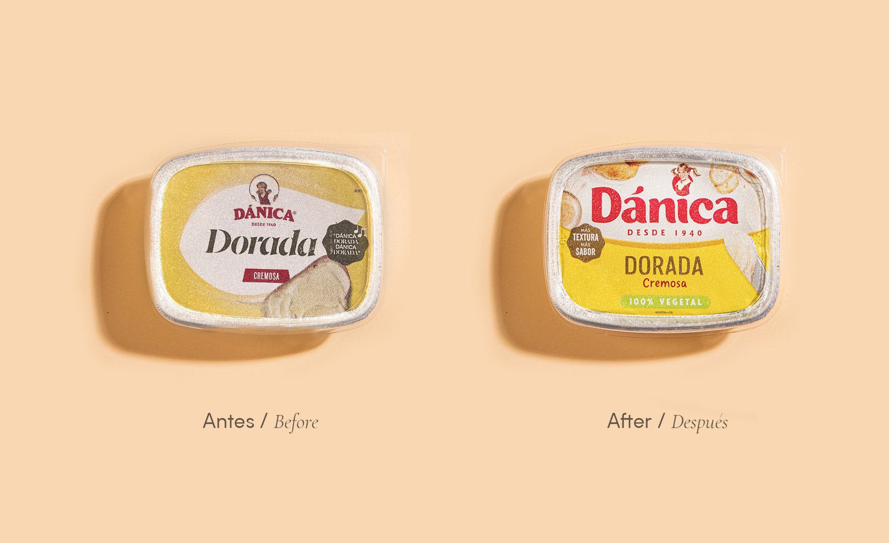
The design goal was clear: to renew and modernize Dánica. We had to give it vitality and make it look up to date.
Developing
To achieve these objectives we went back in time and there we found different illustrations of the character, 'the girl' and without hesitation we chose the original version that had a 'Rockwell' type style, the renowned American illustrator.
As good 'surgeons' we only changed some features and details to update the illustration and bring it to the 21st century.
When we put hands on the logo design, we respect the color red and seeing the different historical designs we define a round typeface, in uppercase and lowercase letters that allow a clearer reading.
Once the identity was resolved, we moved on to the design of the packaging.
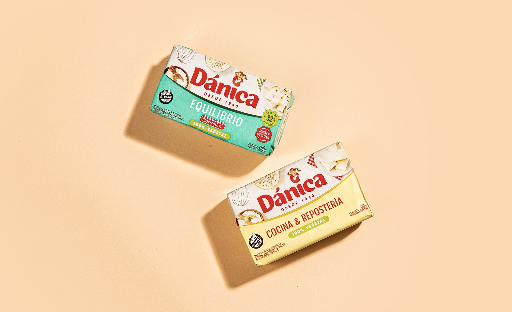
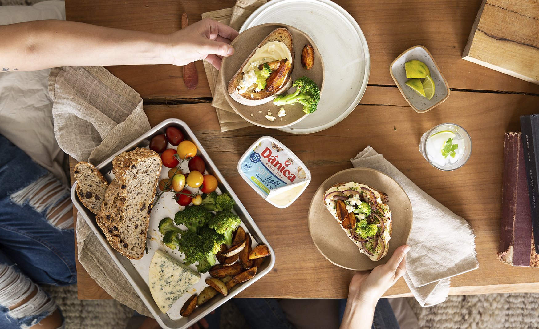
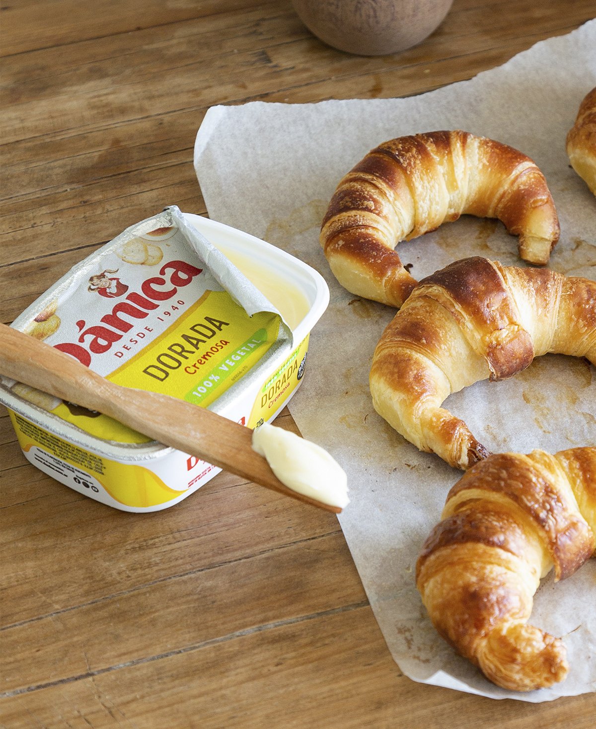
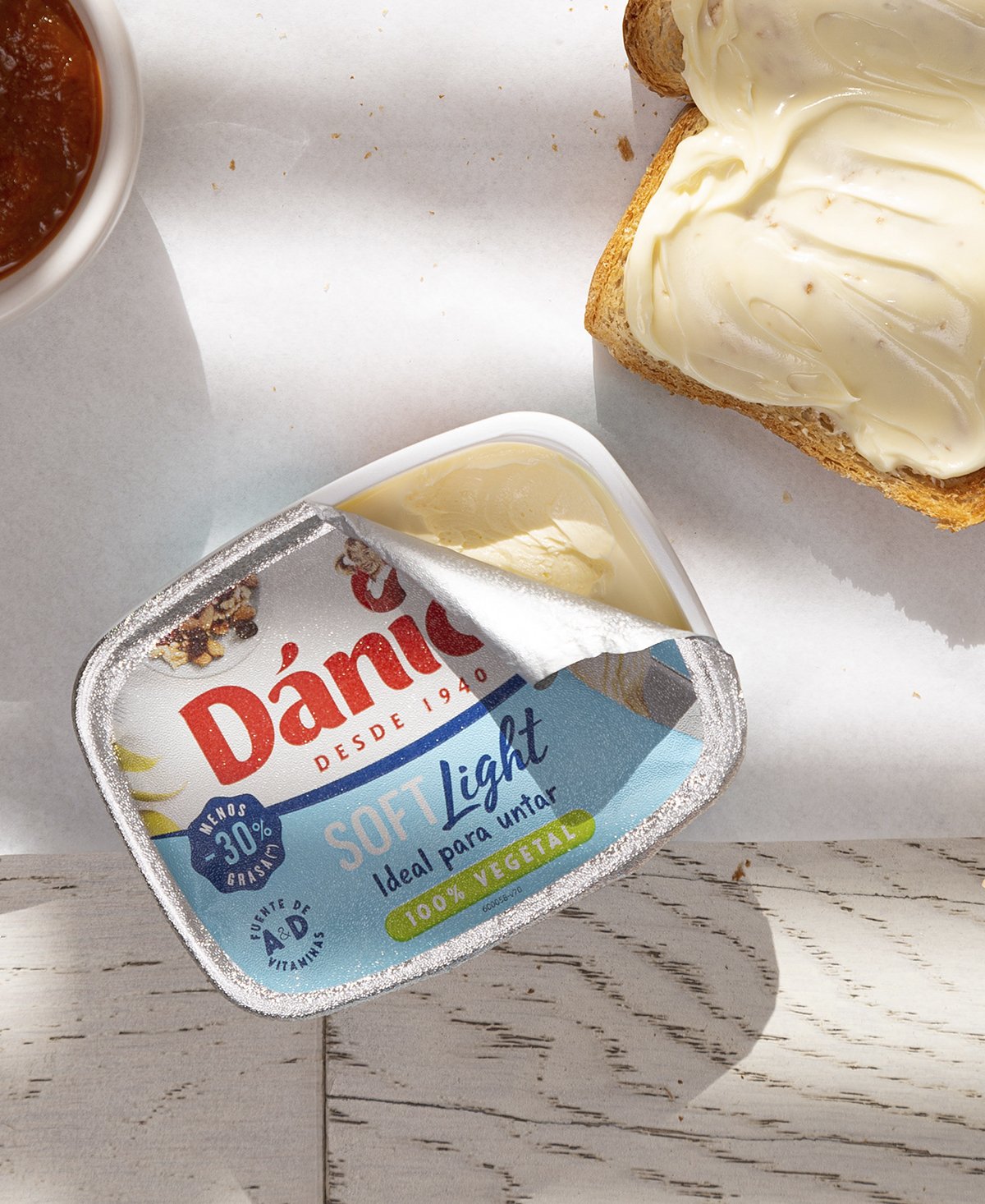
First we highlight the visibility of the brand, the great difference of any leading brand is its name and we took care that it has an excellent reading. Then we took photographs of the real product that always grants realism and appetite appeal.
We also highlight the “100% vegetable”, which is a great attribute of the brand and on the sides of the packs we add recipes with tempting photos.
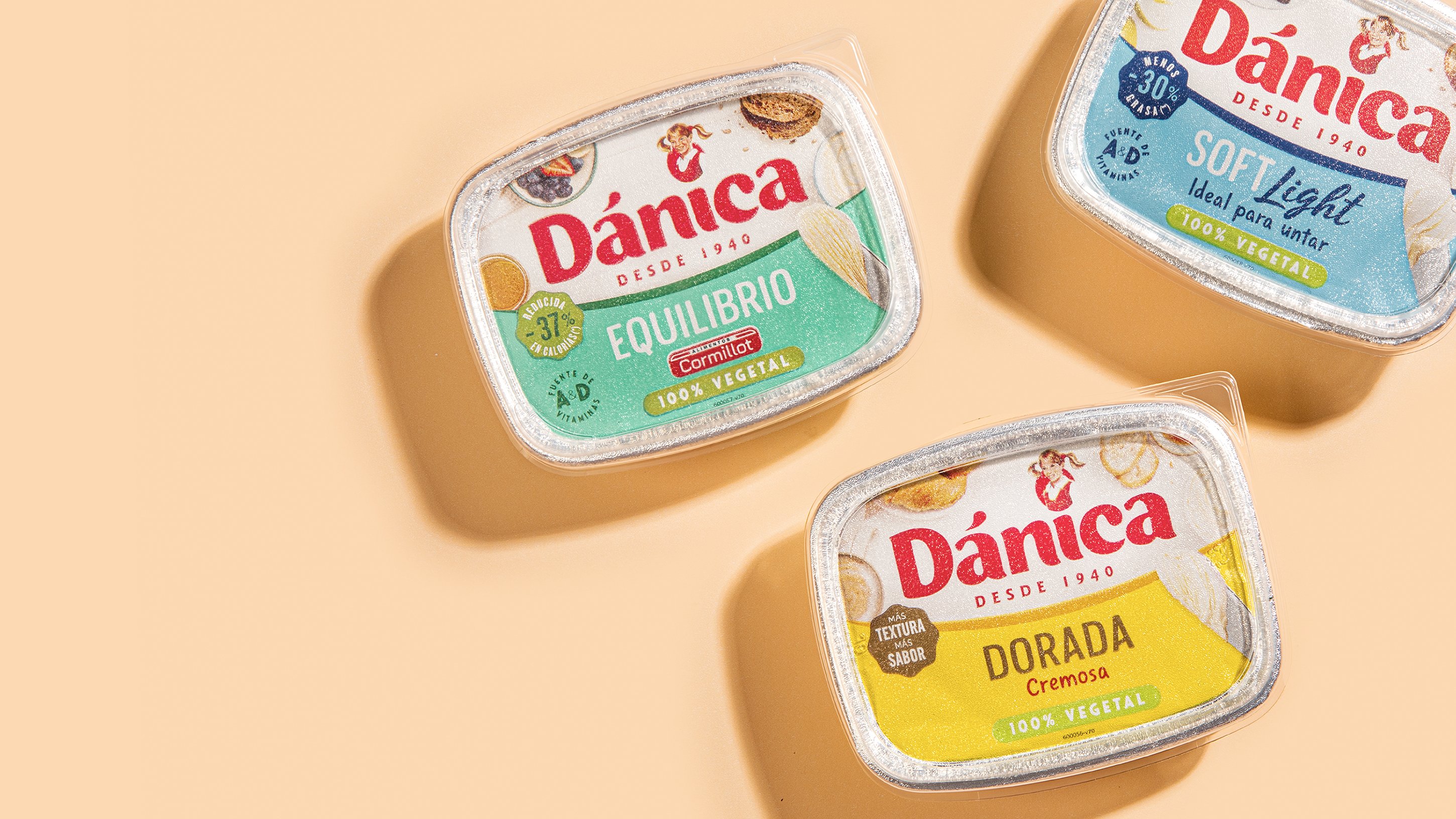
Each product is part of a whole family without losing its own personality, ensuring a brand block at the point of sale.
Result
Today we see a renewed branding, a packaging design that stands out on the shelf and gives hierarchy and visibility to the brand.
Dánica looks current, she looks current and dynamic to continue growing and maintain her leadership position.
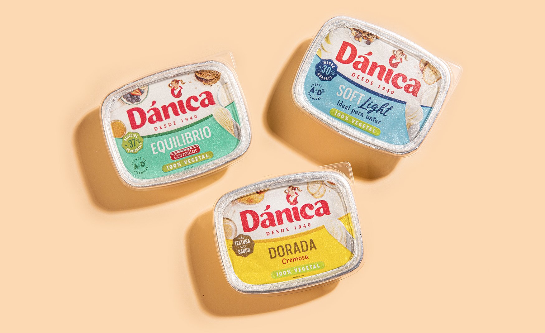
First we highlight the visibility of the brand, the great difference of any leading brand is its name and we took care that it has an excellent reading.
