- Cliente O'reilly
- Servicio Branding & Identity. Naming. Packaging design.
- Año 2017
The new brand identity of a real estate company that keeps on growing.
Background
Design is lucky to participate in key moments of companies and their brands. When Michael O'Reilly, Gonzalo Torrado and Juan Pablo Sanguinetti called us to rethink their identity, it was no exception.
A real estate company with more than 13 years of history, with a sustained growth based on the clarity of its three partners about the future of their venture.
Along with a coach, they had split their career in seasons, following the Netflix series style. Each important stage of its history represented a new season.
The challenge
Clearly significant milestones were the key elements to define the first three seasons. And know there was a new one for the beginning of fourth season, a good reason to call Grupo Berro.
How do we have to call?
What is the identity that best represents us?
How does the communication of our company have to be?
All important questions when defining a brand strategy in a highly competitive environment.
The brand includes a long name, formed by the 3 surnames of the partners, accompanied by a symbol with the acronym O'R.
Internally each person named the company in different ways . For some of them the brand were the three last names, for others were their initials, OTYS. Others were comfortable summing up simply calling the company just O'reilly.
There was no coherence. While the company had a logo, it did not have a clear name.
The development
In an environment plagued by visual pollution, every day it becomes more complicated to communicate. And it is imperative to give simple and clear messages.
We did a survey of the brand and the real estate market. We evaluate the existing identity and compare it with its competitors. We analyze the color code of the whole category.
With all this information we develop a diagnosis and work on new identity proposals.
We always try to understand and value everything that brands have been doing. Especially when the Project is made to keep growing and not because something is not working.
In a category where the dominant colors are red and white with the presence of blacks and blues, we decided to continue using green colors from the existing design. When defining the name, we heard both what they said internally and what others said about the brand.
'Branding is what they say about us when we're not there.'
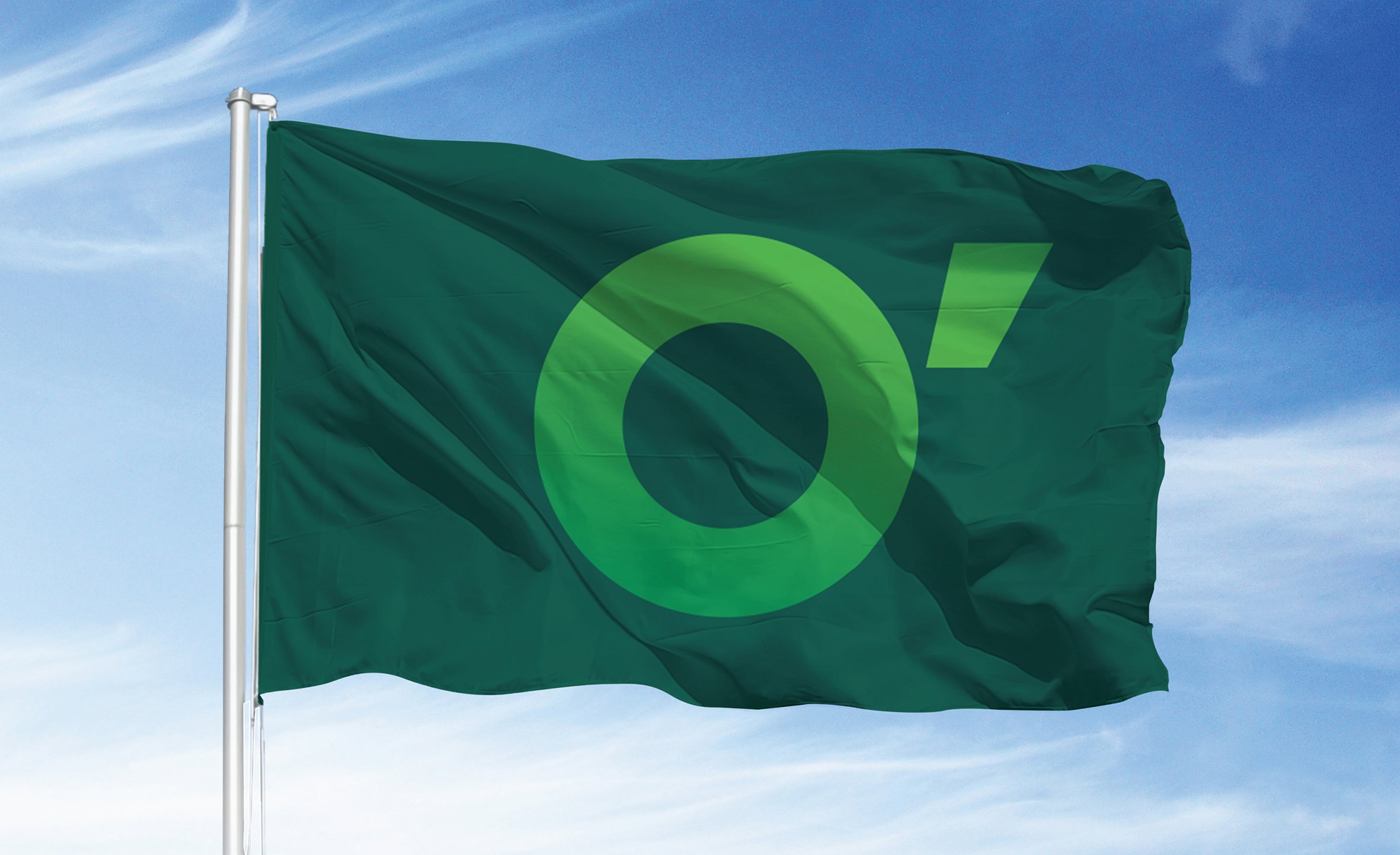
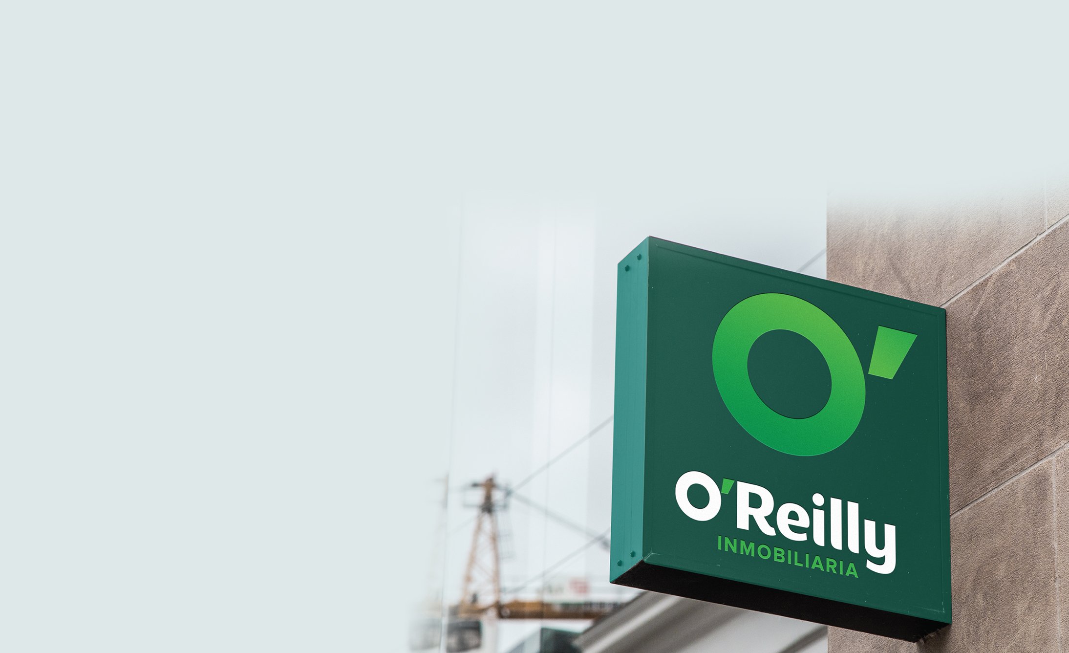
Most of the people we consulted did not mention Otys (which was the name with the acronym of each surname) nor did they mention the 3 surnames. O'reilly was the name that was most comfortable with the brand. It was the name of the founding member and also had the visual opportunity to work with a synthesis made up of the letter 'O' and its apostrophe.
The result
The new design presents a brand with a simple but innovative symbol of easy recognition. A symbol that allows it to be applied in flexible ways for diverse uses and varied platforms where the brand communicates.
We respect the color, we respect the DNA and the trajectory of the company and introduce a brand renewed. A clear evolution that is aligned to the communication strategy that the partners had defined for the new season of their enterprise.

