- Cliente Ajinomoto
- Servicio Branding & Identity. Packaging design.
- Año 2024
José Olé — Brand and Packaging Redesign
Ajinomoto Foods North America
José Olé is an iconic frozen Mexican food brand in the U.S. market. However, its visual identity had become trapped in a stereotypical and unconvincing style, failing to convey the true cultural richness and joy that characterize Mexico.
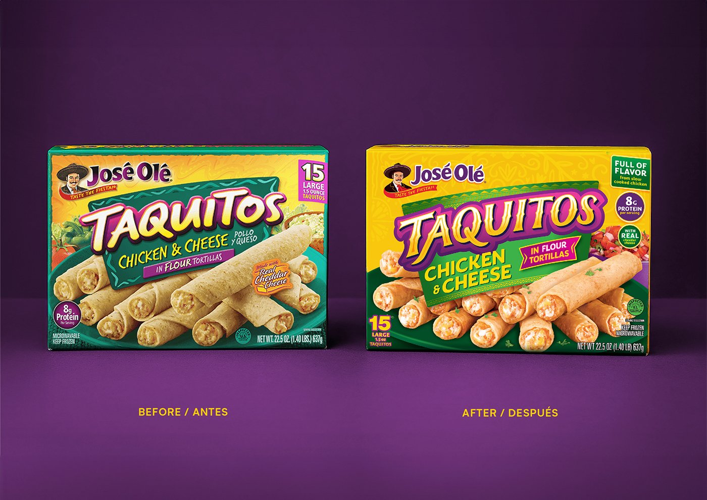
At the early stage of the project, Gonzalo Berro traveled to the United States to visit supermarkets, observe how the brand appeared at the point of sale, and compare it with its direct competitors. The diagnosis was clear: the previous design tried to “look Mexican,” but lacked authenticity and failed to connect with the brand’s original spirit.
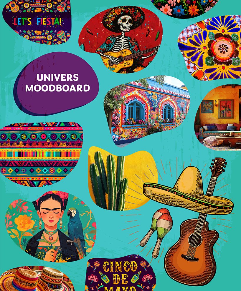
Based on this insight, we defined a new direction: to rebuild the brand’s visual DNA from a genuine, respectful, and contemporary perspective, recovering real elements from Mexico’s graphic universe without falling into clichés or caricatures.
To achieve this:
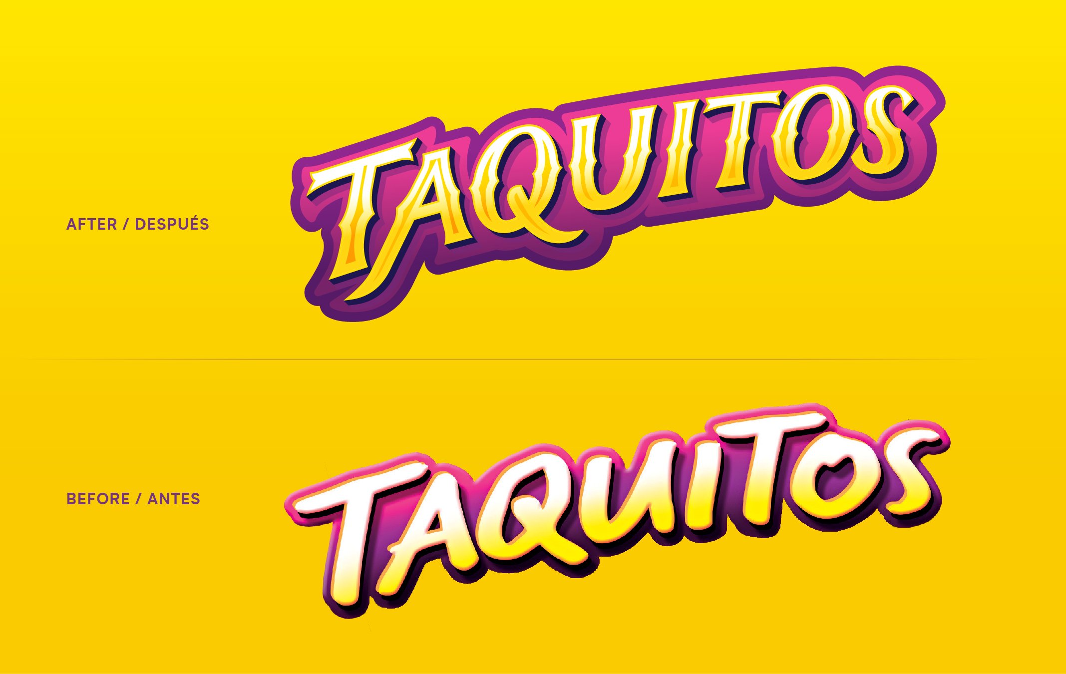
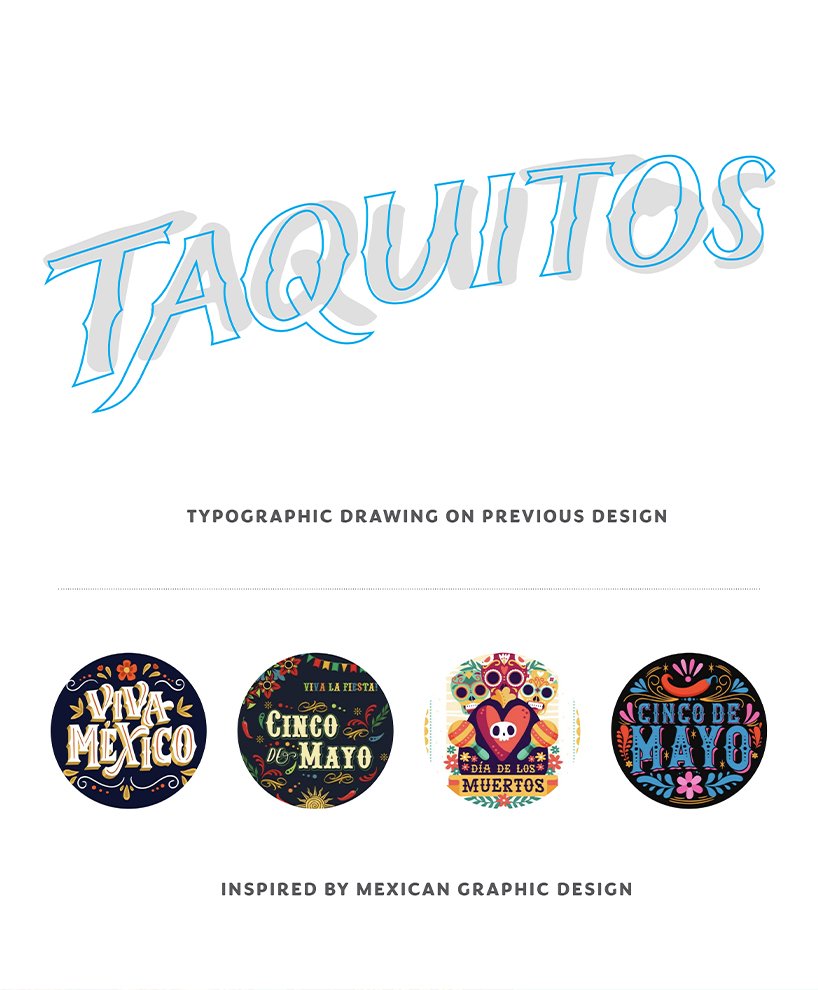
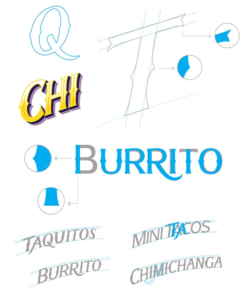
We studied authentic typographies and visual codes: street signage, markets, hand-painted lettering, and popular signs from different regions.
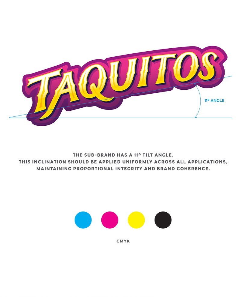
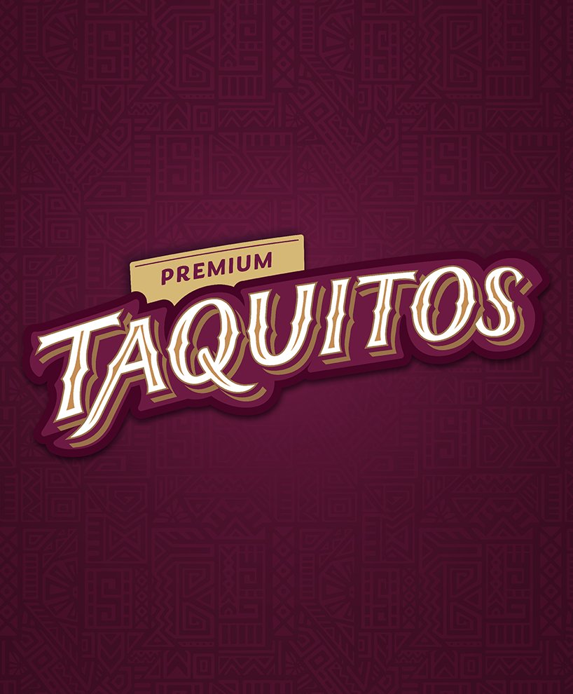
We redrew the brand letter by letter, creating custom typography inspired by traditional graphics but executed with modern clarity.
We incorporated graphic and ornamental details drawn from Mexican cultural patterns, reinterpreted with a contemporary sensibility.
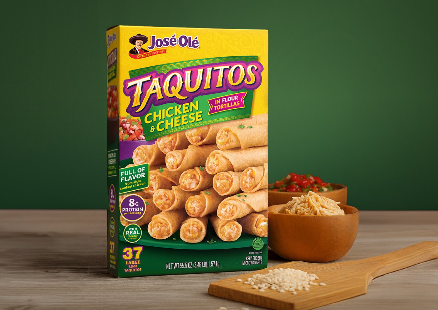
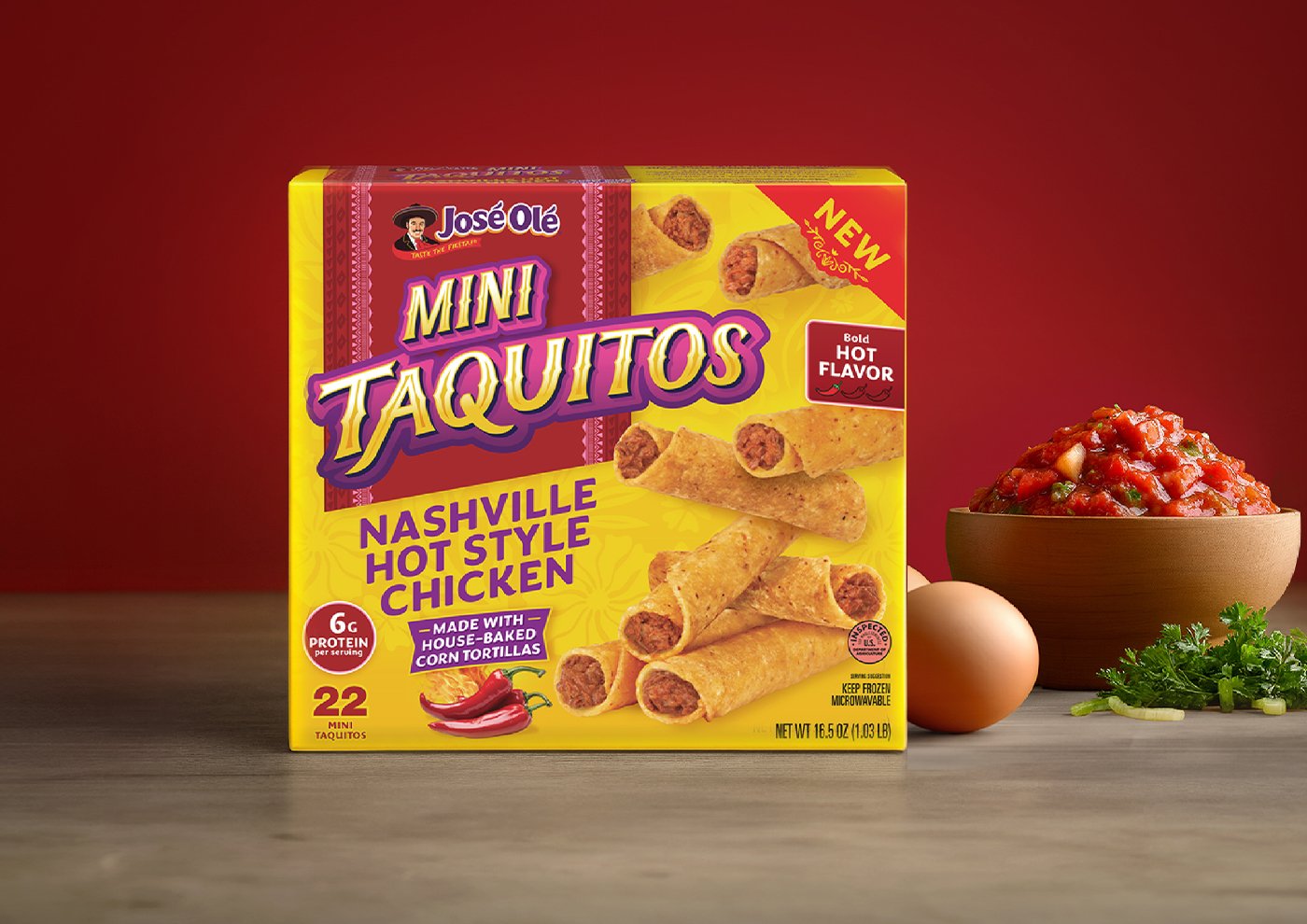
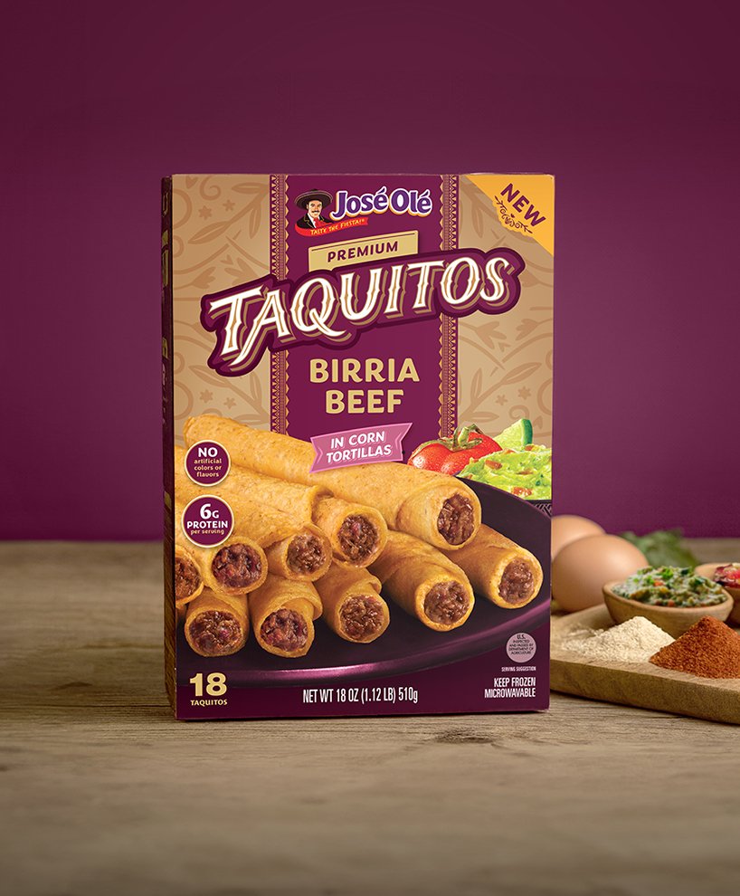
We strengthened the packaging architecture, improving hierarchy, product presence, and the impact of the brand block.
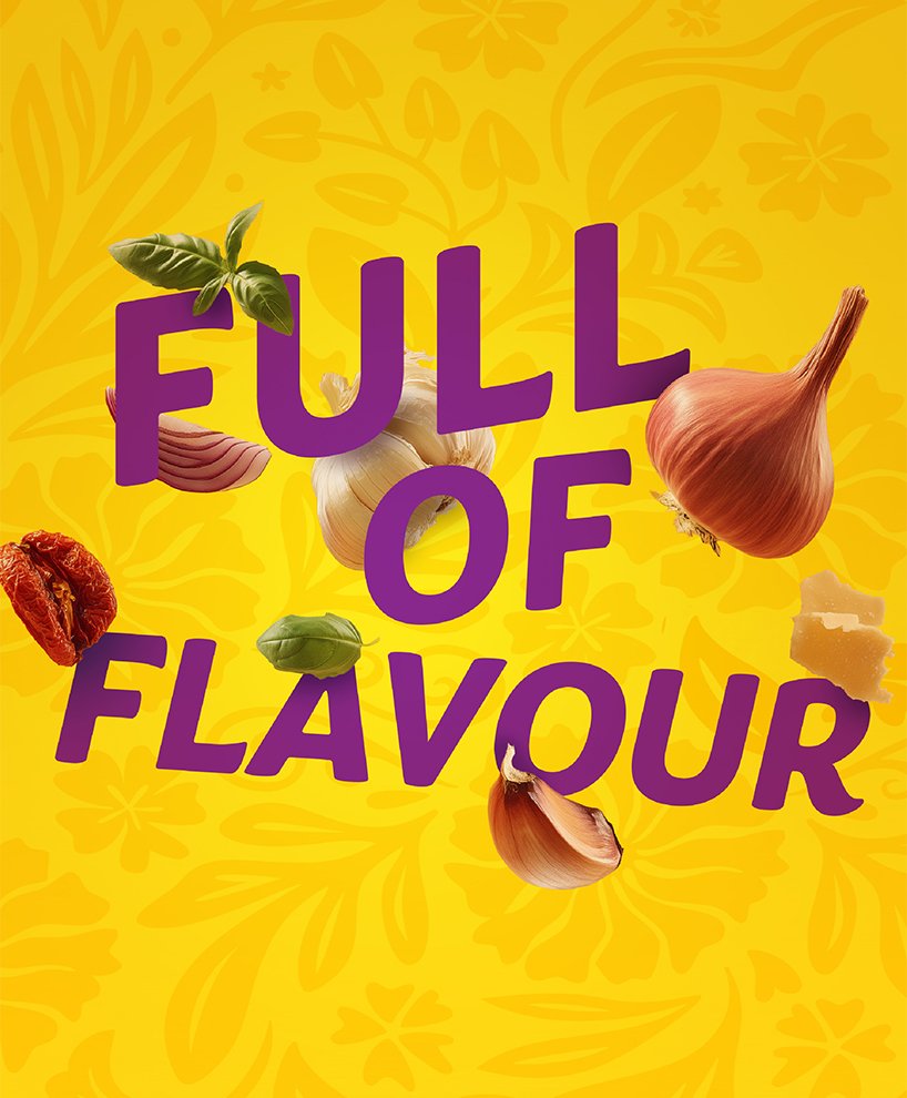
We updated the color palette, selecting vibrant, joyful, and warm tones that remain true to the Mexican spirit while being well adapted to the U.S. market.
José Olé, present in the U.S. since the year 2000, was built on a very clear premise: to offer delicious, comforting Mexican food made with real ingredients — tender cuts of meat, authentic cheese, oven-baked tortillas, and traditional seasonings.
That same passion for quality and flavor became the starting point for our redesign.
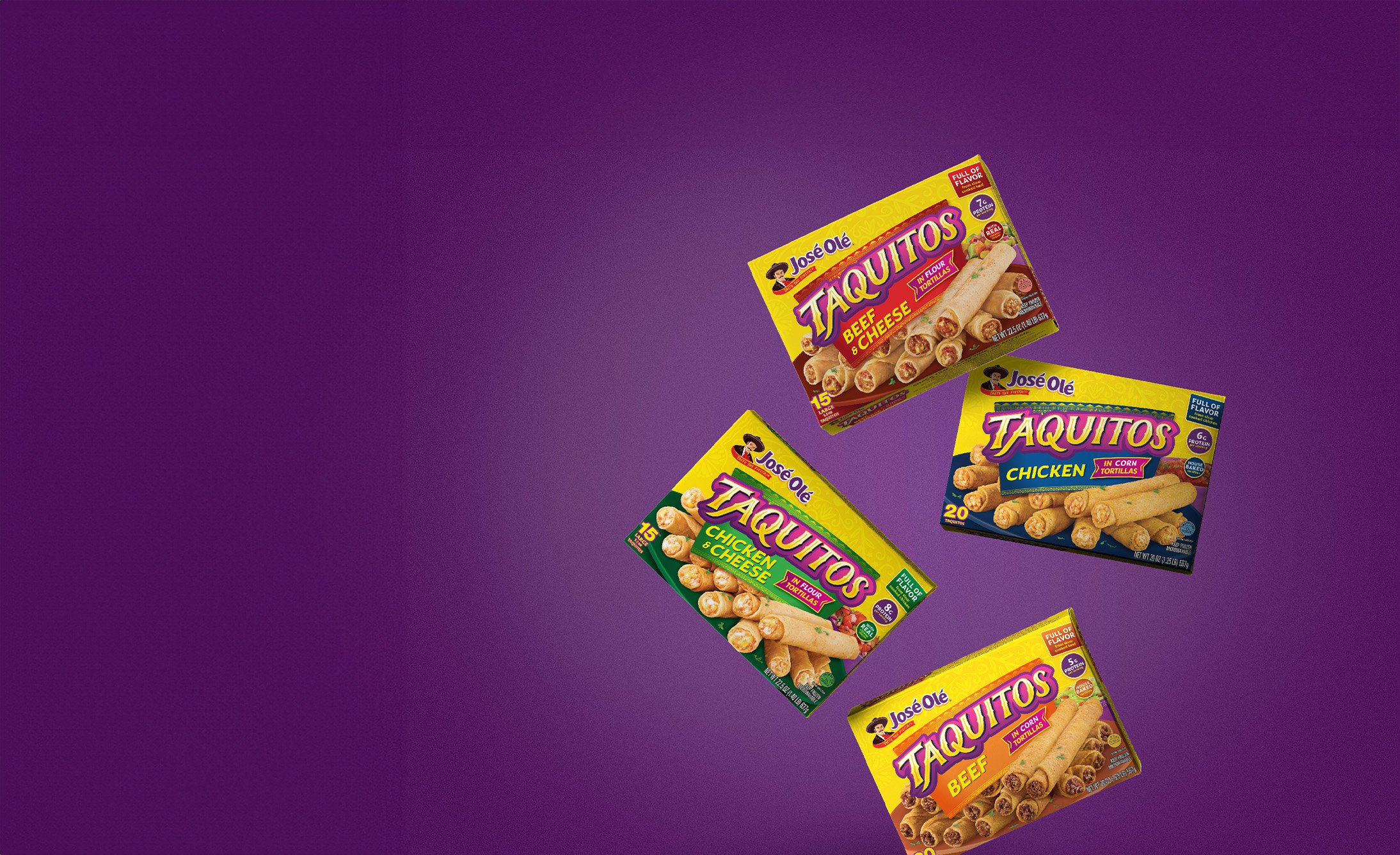
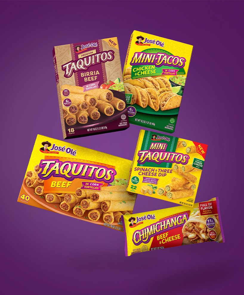
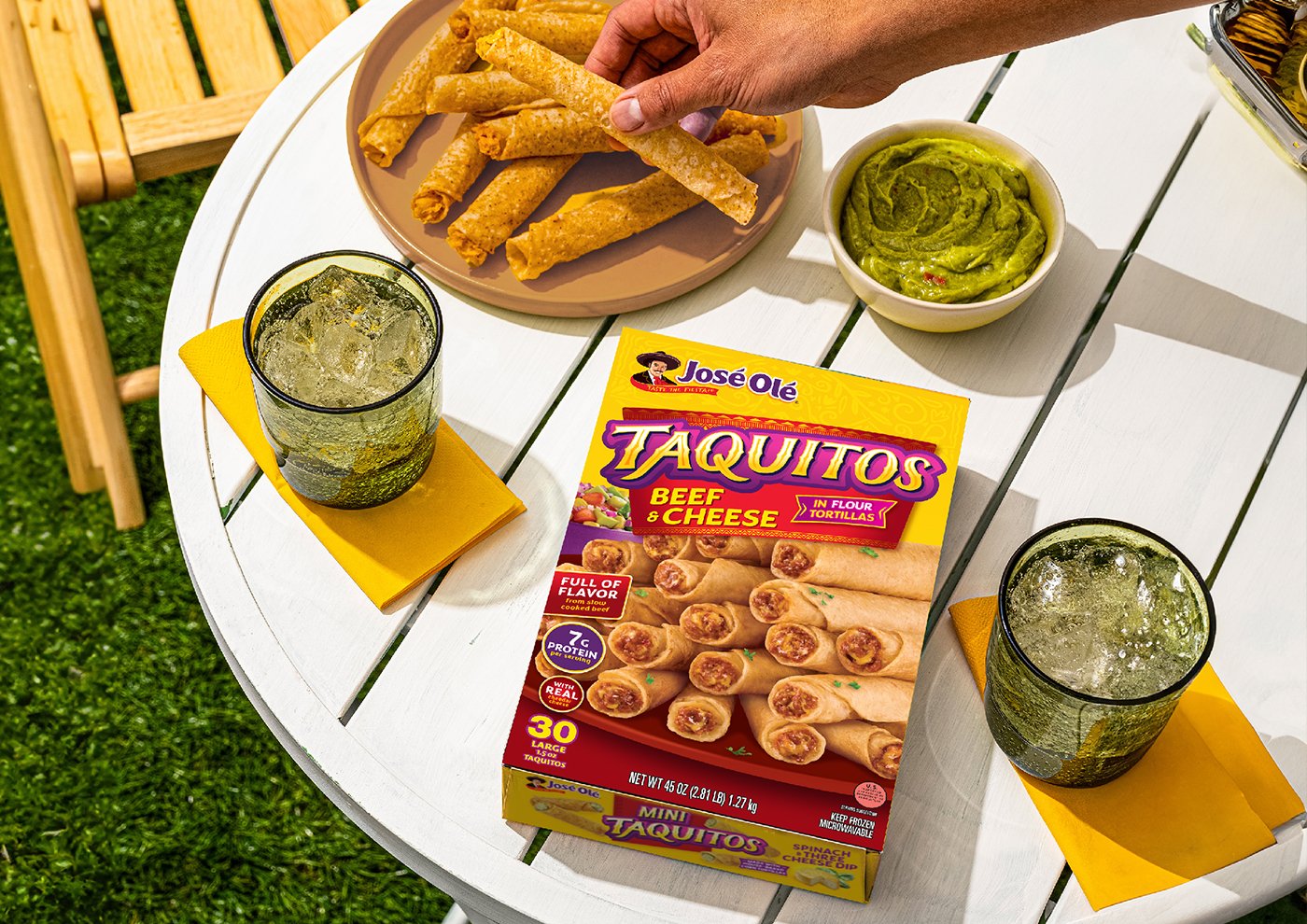
The new packaging system balances the artisanal with the modern. The brand now looks renewed, more authentic, and full of personality, while maintaining its familiar, friendly, and cheerful spirit.
Today, José Olé once again stands out on shelf, with packs that celebrate its cultural roots and communicate what has always been its greatest promise: bringing the flavor, color, and fun of Mexican food to any moment of the day.
El nuevo sistema de packaging equilibra lo artesanal con lo moderno. La marca ahora se ve renovada, más auténtica y con personalidad propia, pero mantiene su espíritu familiar, cercano y alegre.

Hoy, José Olé vuelve a destacar en góndola, con packs que celebran su origen cultural y comunican lo que siempre fue su mayor promesa: llevar el sabor, el color y la diversión de la comida mexicana a cualquier momento del día.