- Cliente Ilolay
- Servicio Branding & Identity. Packaging design.
- Año 2024
The challenge of redesigning one of Argentina’s most beloved brands.
Our strong relationship with Savencia Argentina has been a cornerstone of successful projects over the years, including the development of Milkaut, Bavaria, and Adler. This trusted collaboration led us to an exciting challenge: redesigning Ilolay, an iconic brand cherished by many Argentine families.
Two years ago, Savencia reached out to us in the early stages of what was still a dream—the acquisition of Ilolay. From day one, even before the purchase was finalized, Savencia’s team wanted us to be involved, anticipating the necessary steps to ensure the project’s success.
Gonzalo Berro had the opportunity to meet with José Williner, former CEO of Ilolay and a member of the founding family, to share Savencia’s vision: not just to acquire the brand, but to honor its legacy and elevate it to new heights. The goal was to enhance Ilolay’s value, respecting its history while giving it a modern projection.
As negotiations progressed, we worked closely with Savencia’s senior team to develop the new branding, convinced that a deep, well-considered change had to be ready when the acquisition became official.
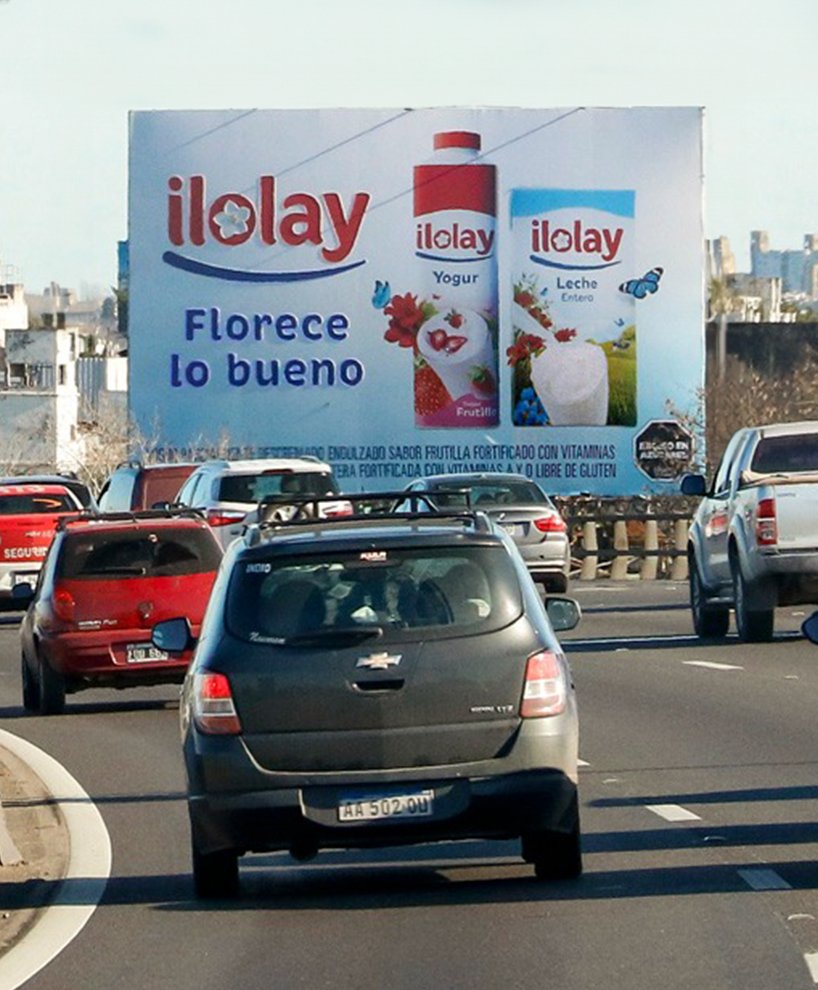
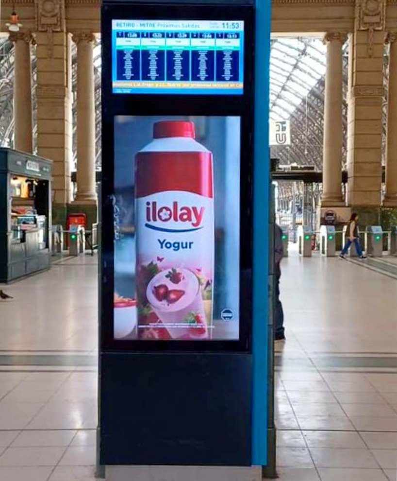
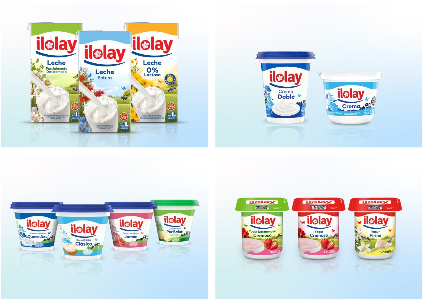
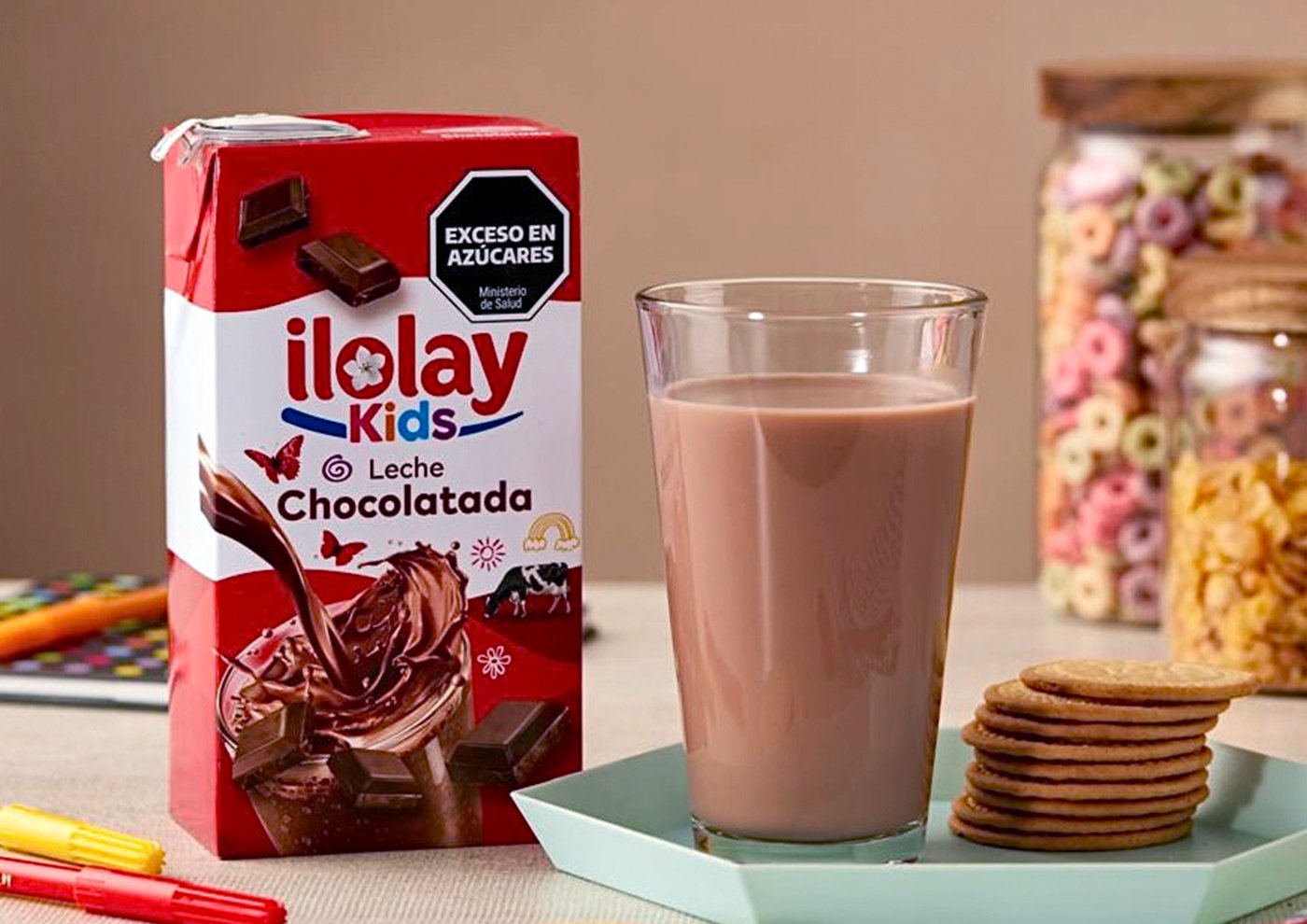
The first key question we asked was: What does Ilolay mean? The name is not just a creation; it is inspired by a special flower from a northern Argentine legend. This concept was central to defining the brand’s essence: ‘to blossom’. We modernized the logo, refining the typography and incorporating the flower within the letter “o.”
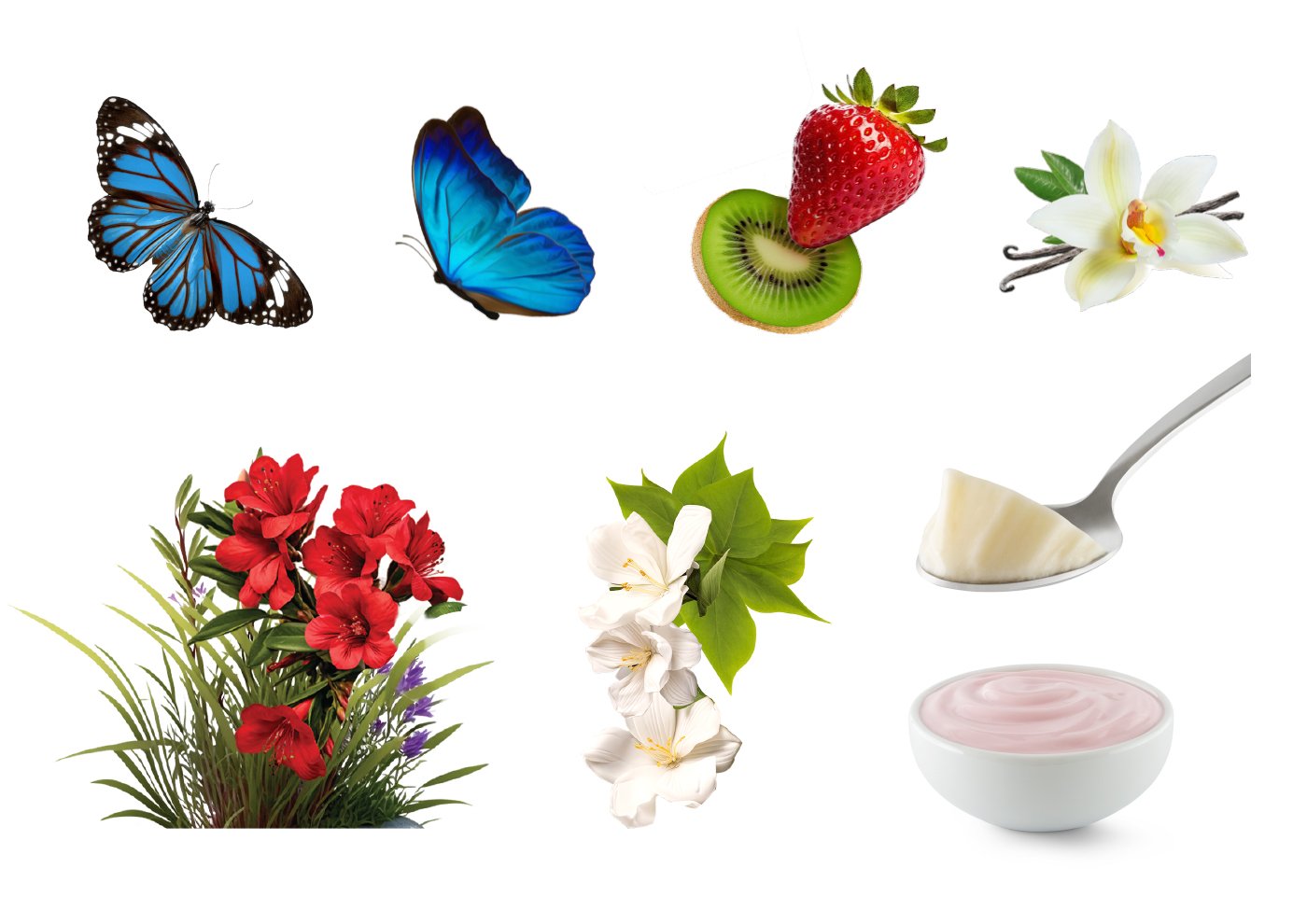
To capture the uniqueness of this flower, we conducted an extensive study of hundreds of white flowers and, using artificial intelligence, created an exclusive five-petal flower. This design represents elegance, simplicity, and Ilolay’s natural connection to the purity of its origins.
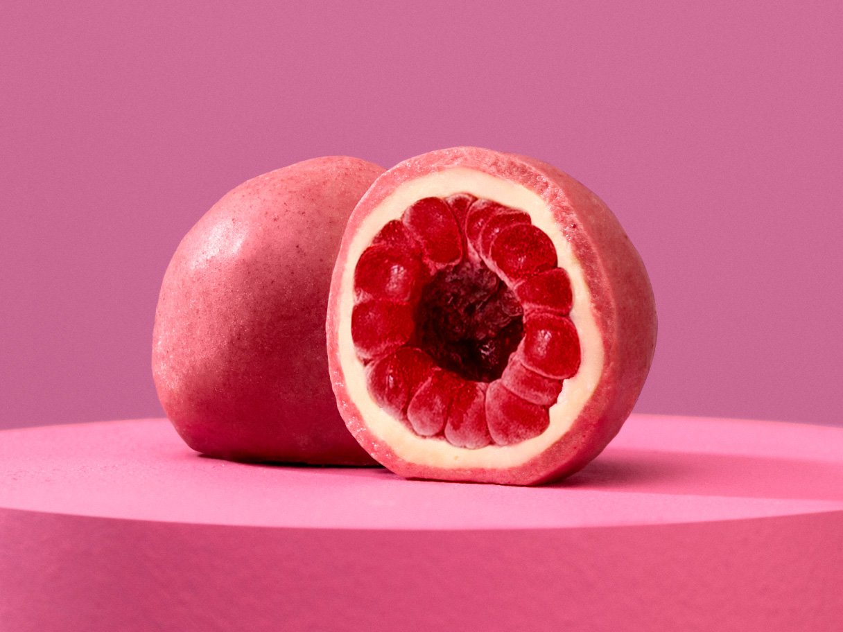
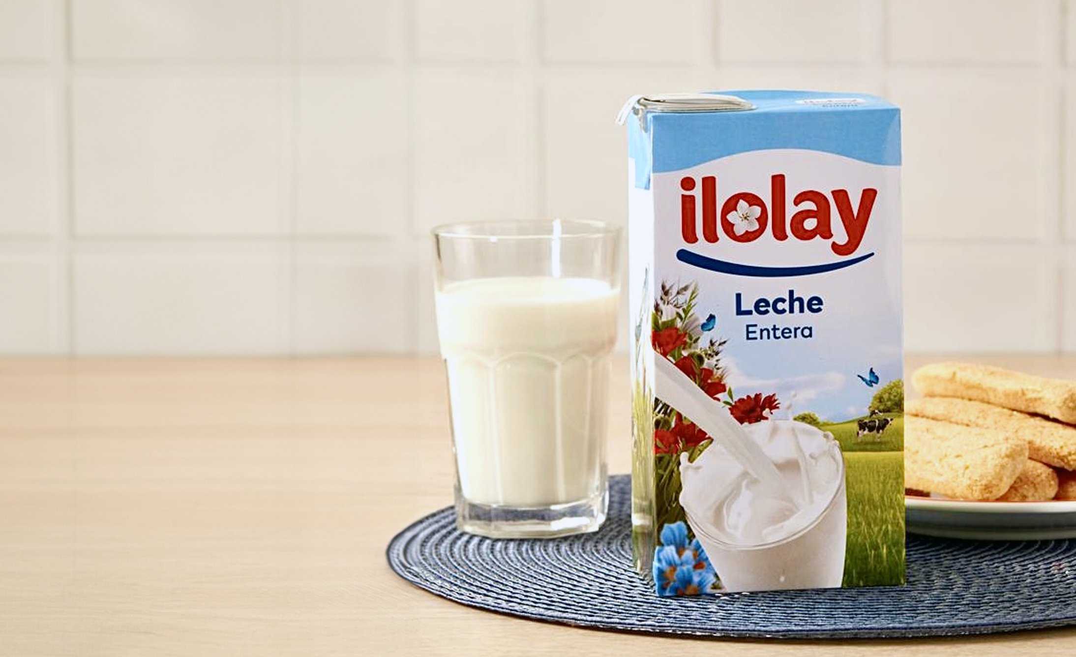
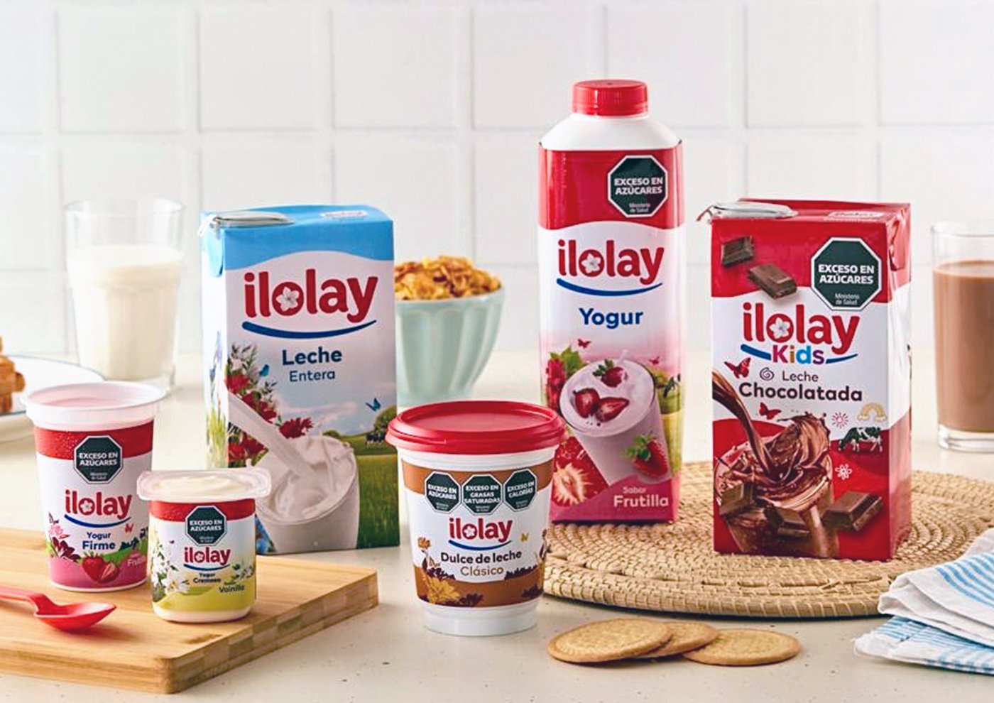
The packaging design reflects this same natural essence. We featured close-up images of the products within their natural environment: open fields filled with flowers and butterflies, alongside the cow that symbolizes the source of the milk. This harmonious setting celebrates the place where Ilolay begins.
Finally, the brand’s new claim: “Florece lo bueno” (The Good Blossoms) encapsulates the idea of a brand with over 95 years of history, flourishing once again to bring its finest products to Argentine homes.
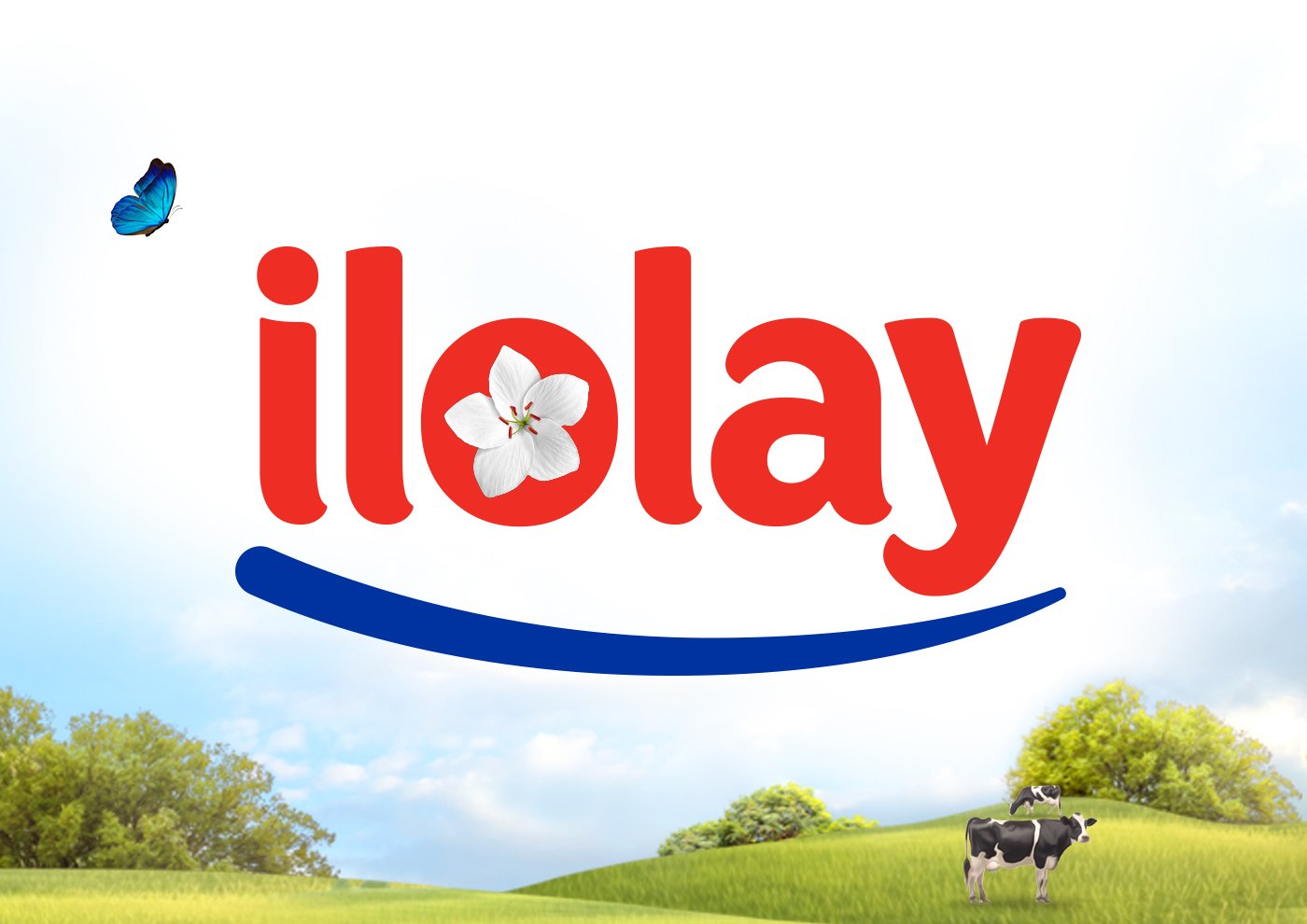
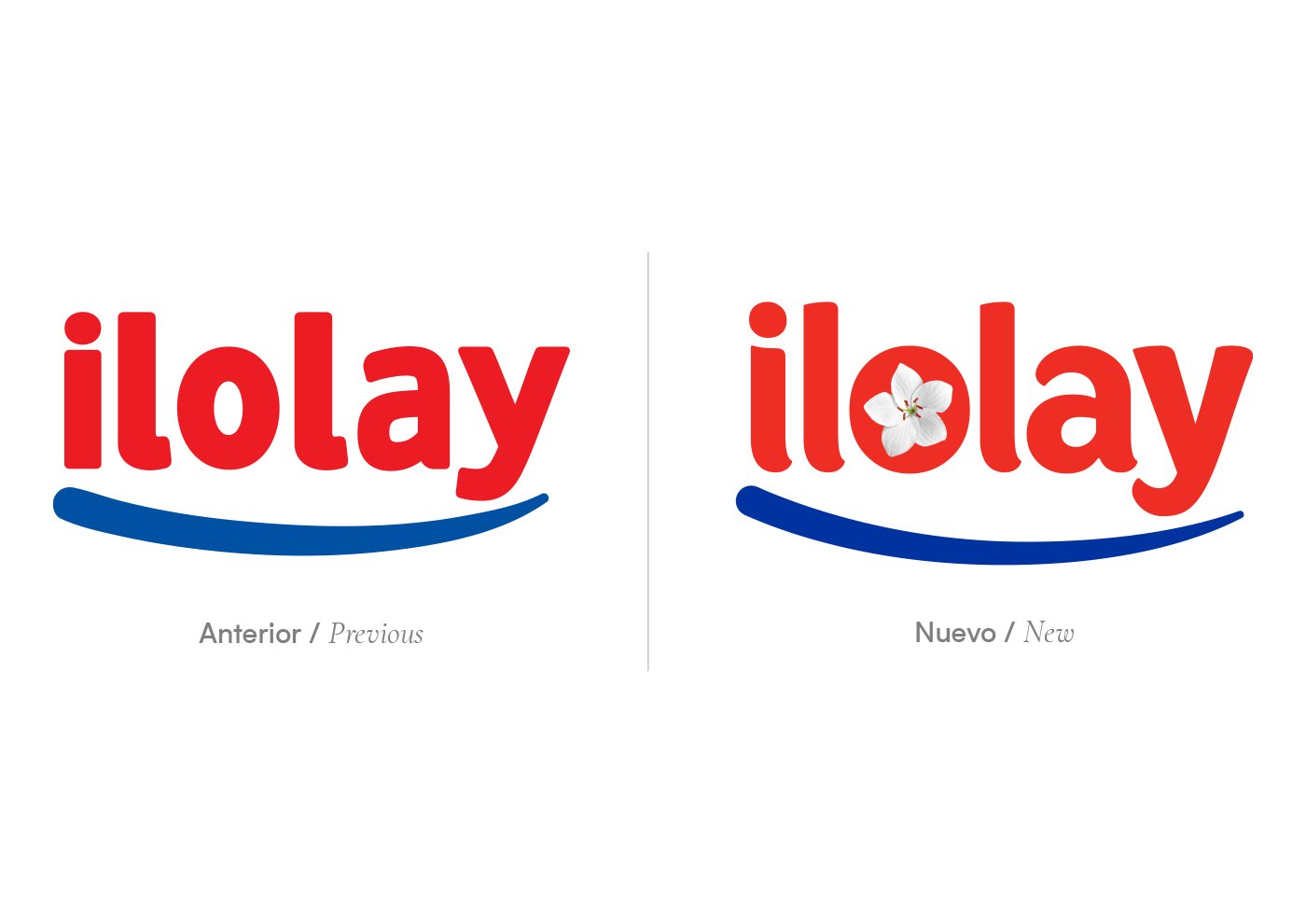
La primera gran interrogante fue: ¿qué significa Ilolay? El nombre no es simplemente una invención, sino que está basado en una flor especial de una leyenda del norte argentino. Este concepto fue clave para definir la esencia del rebranding: el ‘florecer’. Así, modernizamos el logo, ajustando la tipografía y añadiendo la flor en el interior de la letra “o”.
El diseño del packaging refleja esta misma esencia natural. Incorporamos imágenes de los productos en su entorno natural: campos abiertos, llenos de flores y mariposas, y, por supuesto, la vaca que simboliza el origen de la leche. Todo esto crea un ambiente armónico que celebra el lugar de donde nace Ilolay.
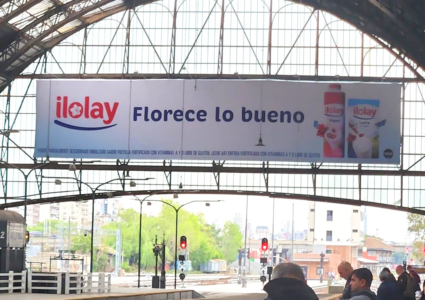
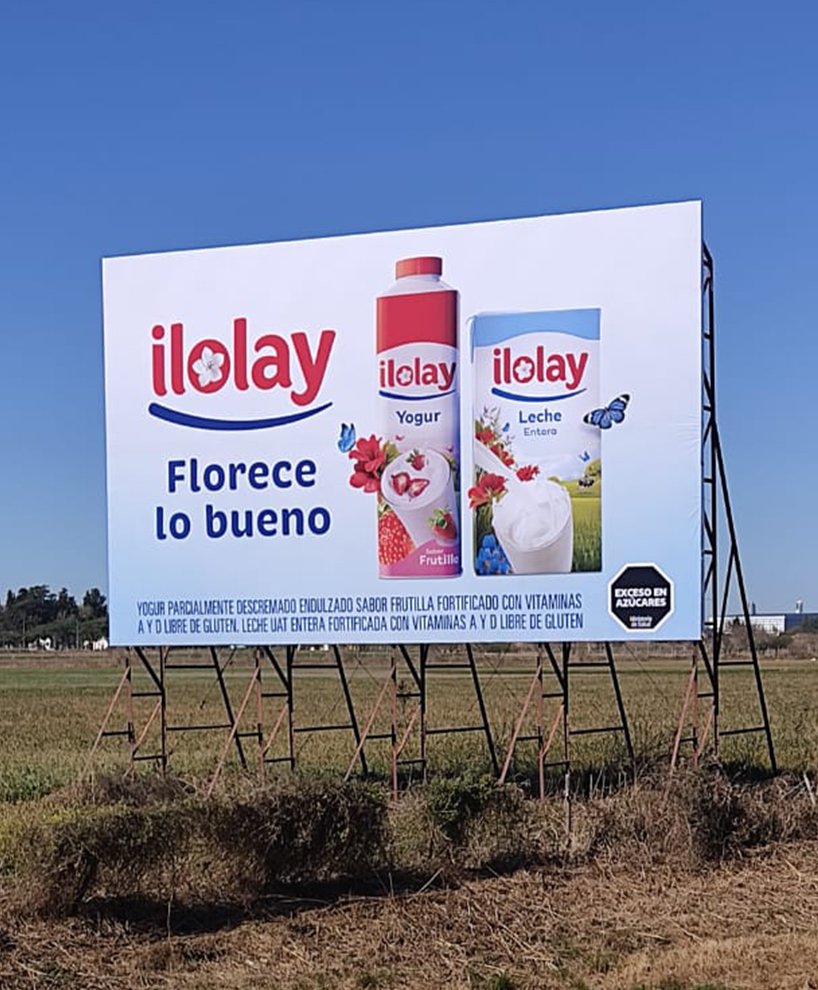
El nuevo claim de la marca: “Florece lo bueno” encapsula la idea de una marca con más de 95 años de historia que se renueva, floreciendo una vez más para llevar lo mejor de sus productos a los hogares de Argentina.