- Cliente Dole
- Servicio Branding & Identity. Packaging design.
- Año 2022
With presence in more than 90 countries, Dole is an iconic fruit brand with a history of 120 years.
The company's philosophy 'sunshine for all' is based on the fact that good nutrition should be available to everyone, just like sunlight.
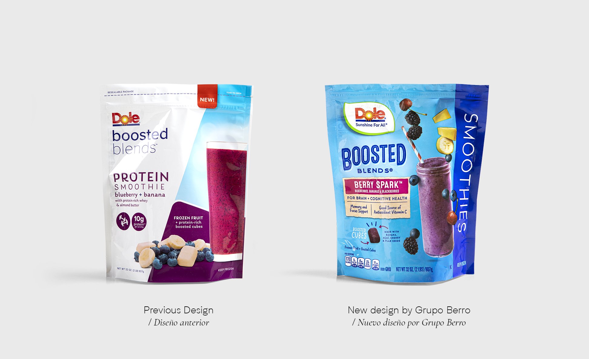
The Company made a design change for its products, leaving aside a packaging style that had accompanied the brand for several decades.
At the beginning of 2021, a new management took over and they noticed that some of the brand's DNA had been lost with these new designs. It was at that moment that they contacted Gonzalo Berro to see if Grupo Berro had the experience for the challenge in front of them.
After a series of meetings, Dole hired Grupo Berro so that we can help recover the DNA of the brand and also strengthen the appetite appeal of its products.
In the first stage, taking advantage of the launch of a new product within the line, we urgently took charge of working on this 'bridge' design.
This new product was going to share space with the existing line and the challenge was to achieve unity in the family so that there was visual harmony but at the same time the new design shows the first features of a new branding criterion.
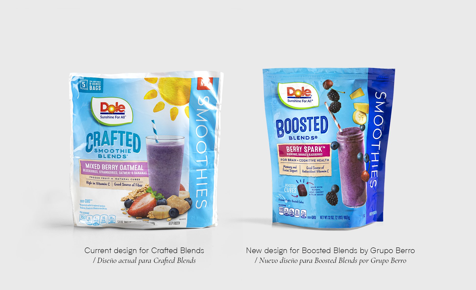
The new Berry Spark Boosted Blend respects the graphic structure of the Crafted Smoothies Blends (see comparison) but presents a new, more modern and relaxed image where the glass and fruits are in motion with much more naturalness and freshness. On the other hand, we define removing the illustrated image of the sun so that the brand and image have the leading role.
When we see the before and after, it is clearly noticeable how Dole is regaining prominence at the point of sale.
And this project is just the beginning!
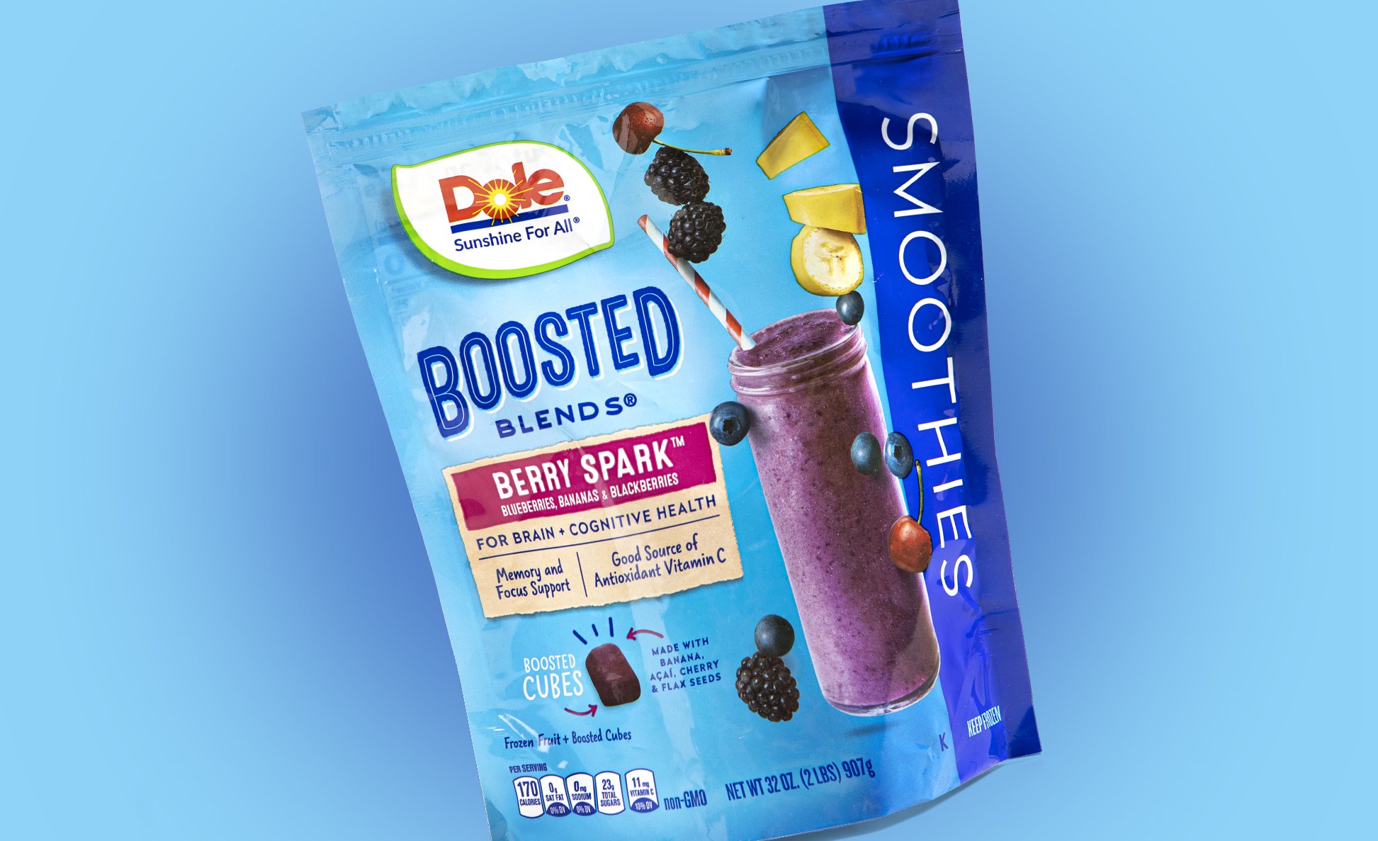
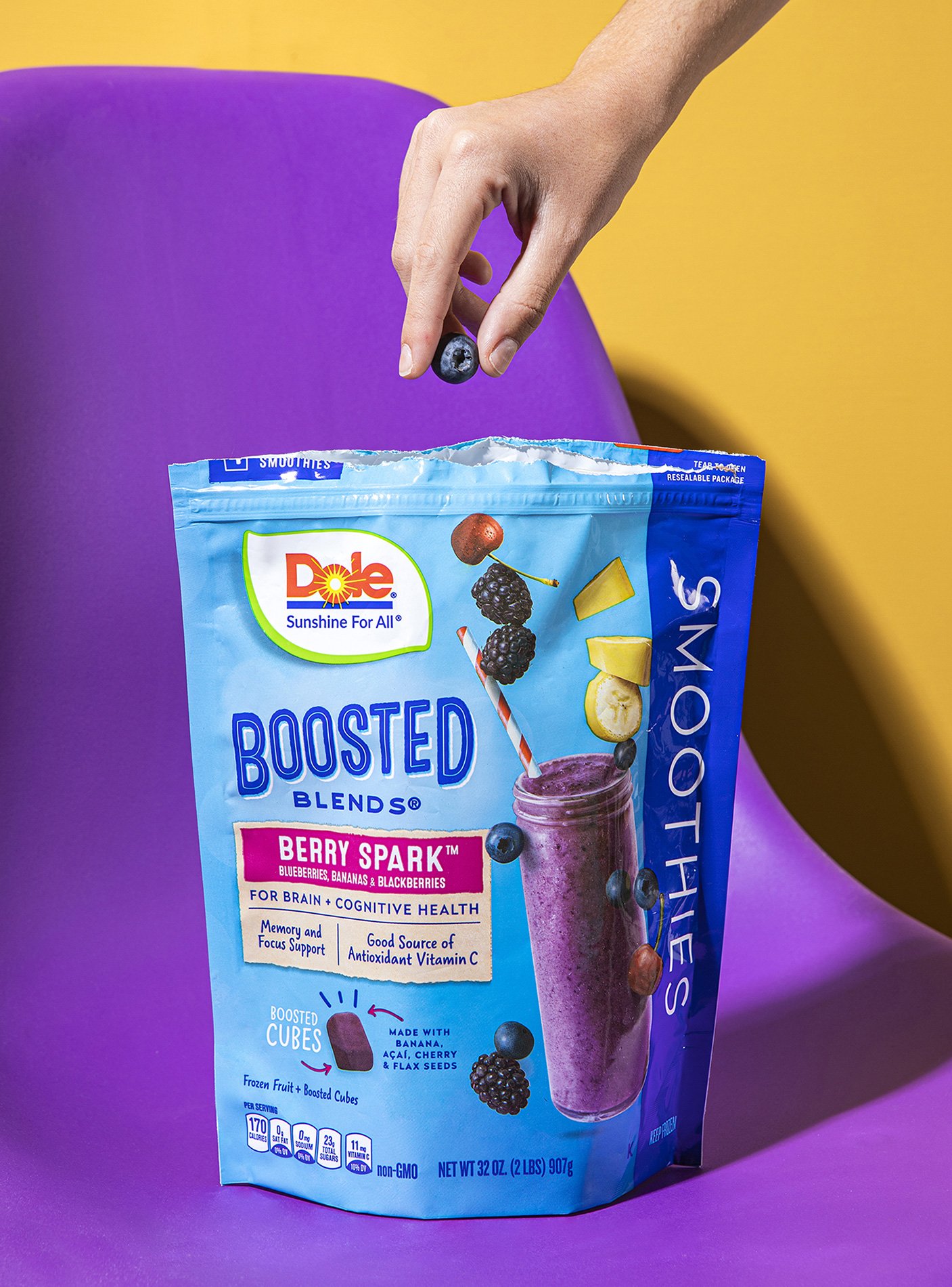
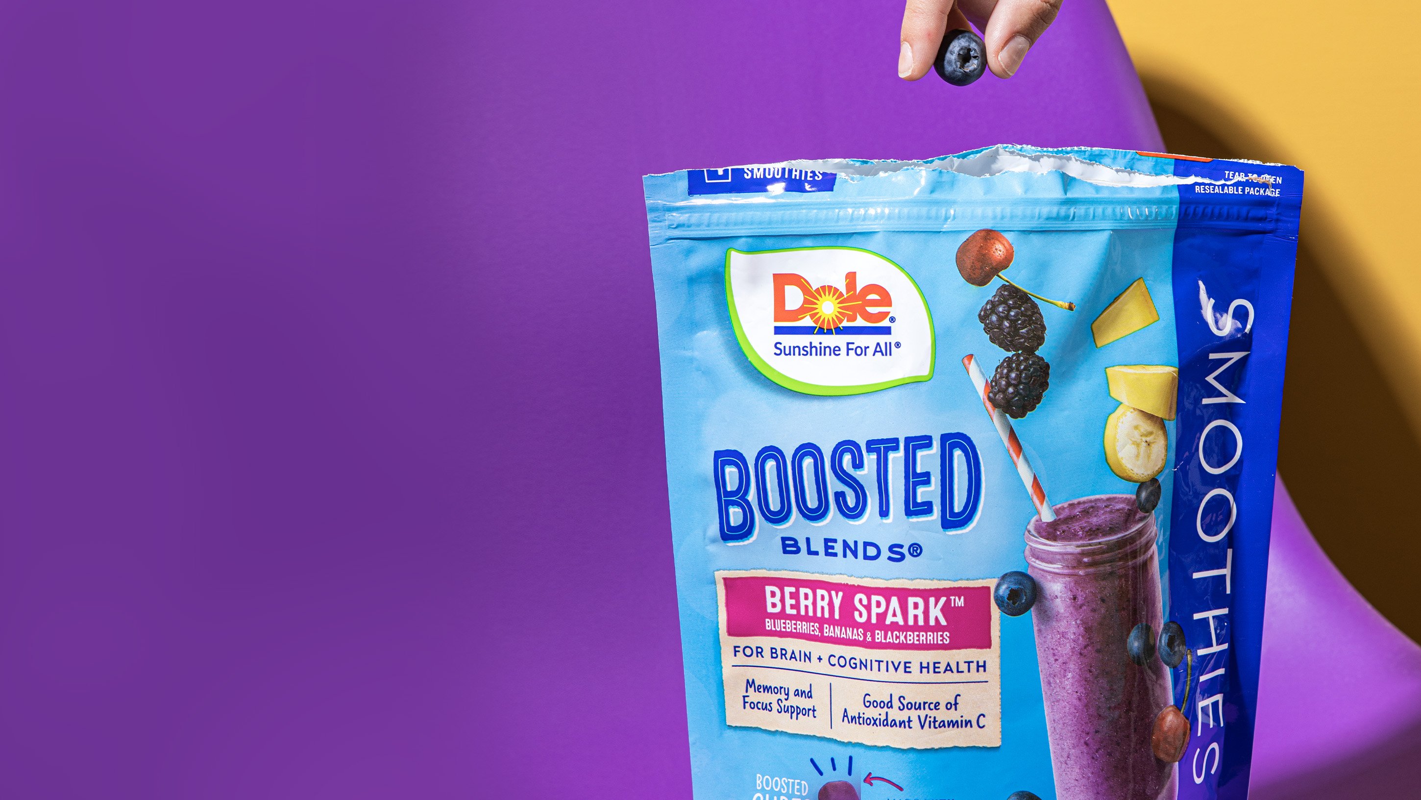
The new Berry Spark Boosted Blend respects the graphic structure of the Crafted Smoothies Blends, but presents a new, more modern and relaxed image where the glass and fruits are in motion with much more naturalness and freshness.
