- Cliente Cabrales
- Servicio Branding & Identity. Packaging design.
- Año 2019
Background
Cabrales is an Argentine company founded by Don Antonio Cabrales Vega more than 70 years ago and today is still managed by the third generation of the family. As a company and as a family, they have a strong commitment: to maintain the quality of their products at the highest level. They dedicate their knowledge, effort and technological vanguard, always seeking to satisfy the needs of their consumers and their own passion: to give their name to the best coffee.
With that mission, Cabrales contacted Grupo Berro to review the branding and design of all the company’s products.
Challenge
Achieve that quality in the new designs and that the name stands out at the point of sale.
In the initial strategy stage, which we developed together with Fernando Zerboni, we visited the factory in Mar del Plata and learned the differences between roasted and toasted coffees, between ground and grain coffees, or between coffee in bags, Instant coffee and capsules . Literally we immerse ourselves in the world of coffee.
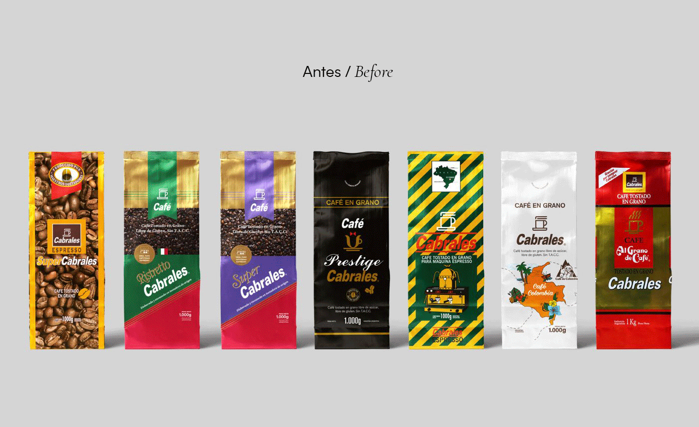
We group all the different packaging of the brand, which are more than 50 products and we meet with the client to understand ‘the color spot’ to which they referred. In the analysis we detected that of all the enormous family of products only 4 were the ‘motors’ that pushed to the rest of the line and clearly we had to focus on capturing what was the DNA of each of them.
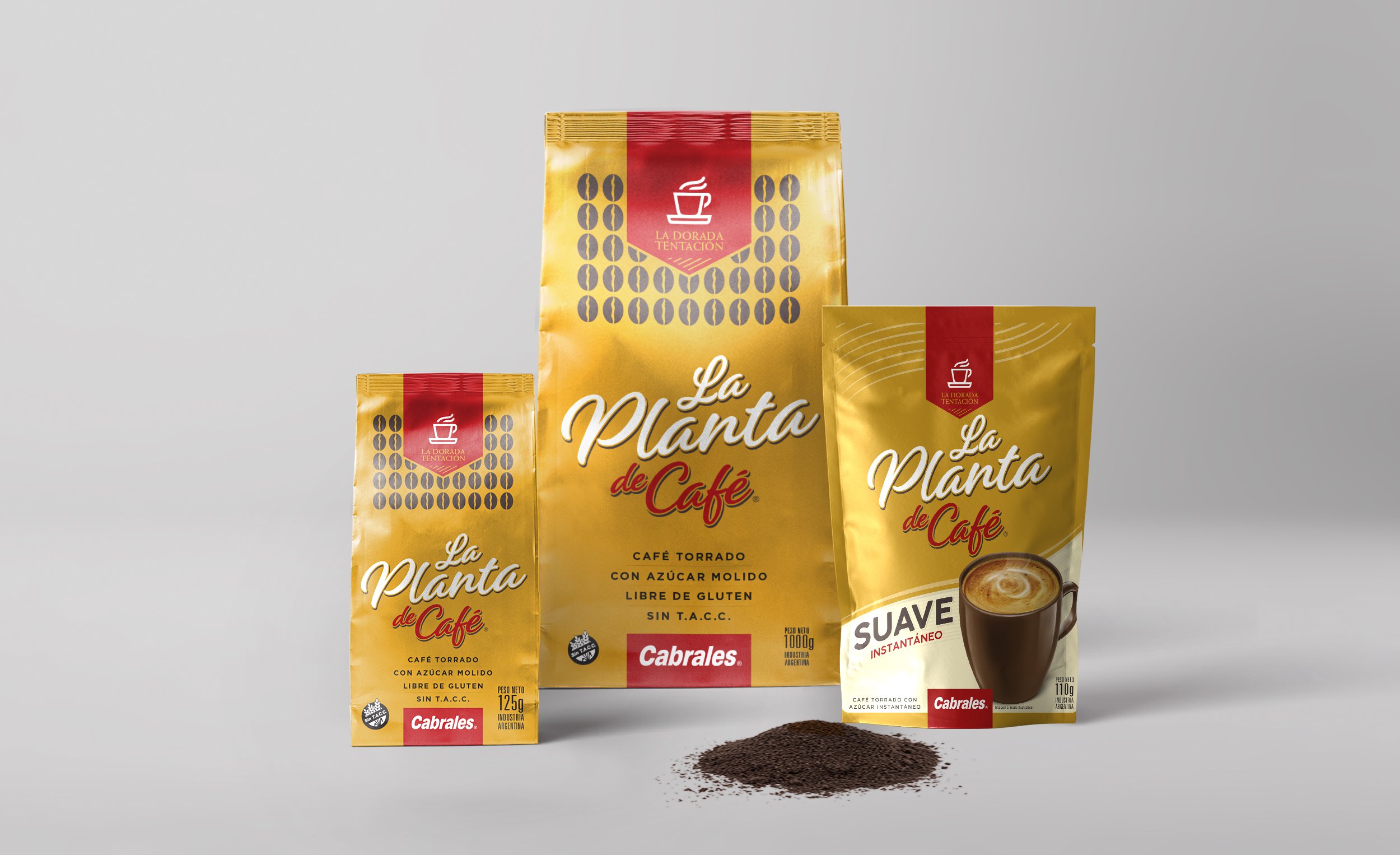
The diagnosis we arrived at was that the brand’s architecture and the design strategy would be based on being able to agglomerate and extend the identity of the two best-selling and most recognized products in the market: Súper Cabrales and La Planta de Café.
Together with the client we decided to organize the portfolio of products under two types of coffee: Cabrales for toasted coffees and La Planta de Café for roasted coffees.
The result
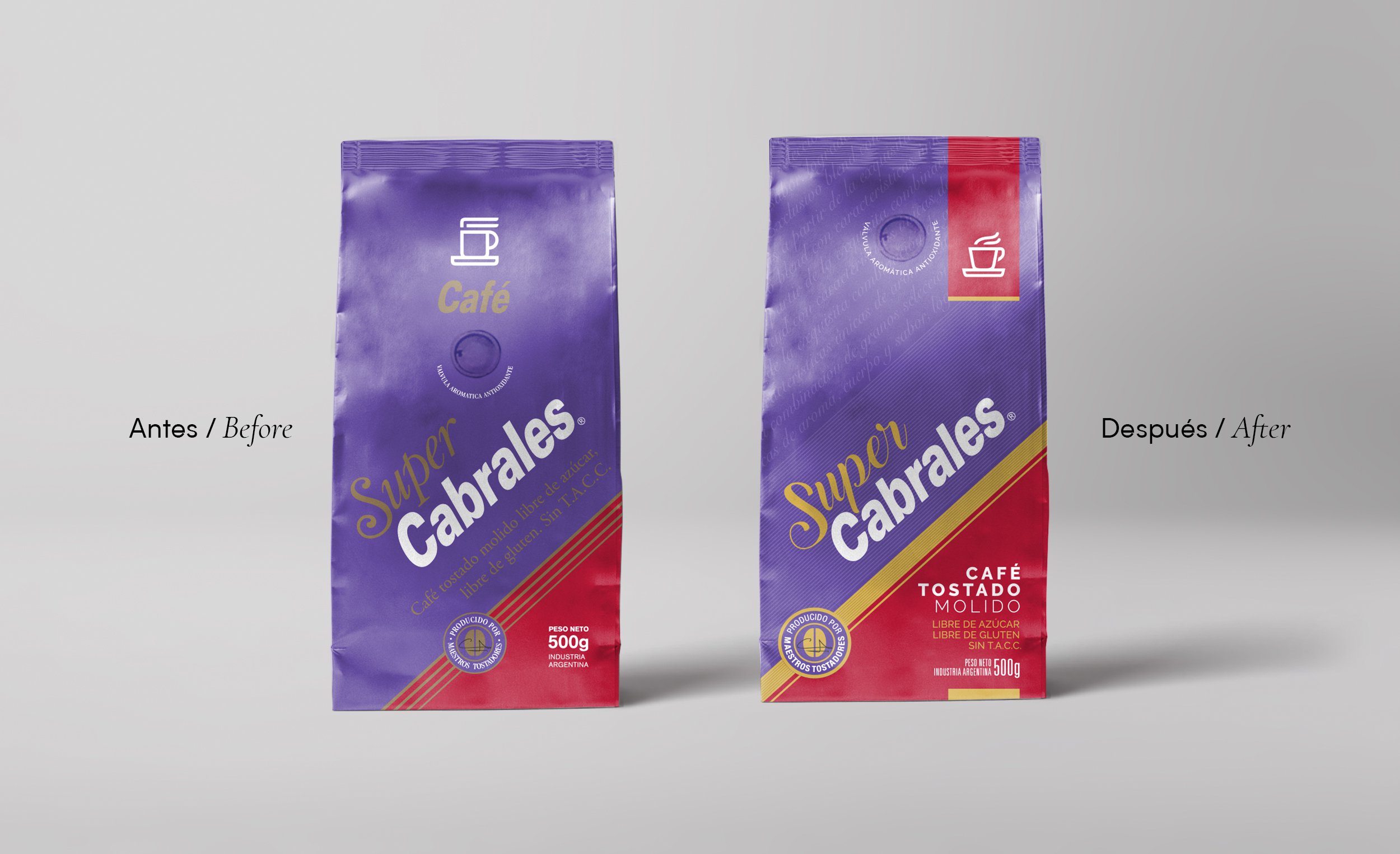
First, we redesigned the identity, with great care we modify the details of the ‘cup’ symbol, we leave the characteristic plate but modernize the cup with the more stylized silhouette and we also adjust the stram, generating a more relaxed movement, which highlights the idea of ’enjoying’ the moment of a good coffee ‘. For the logo, we respect the inclination of the typography but redraw it by adjusting details of shapes and spacing between letters, so that the reading is clearer.
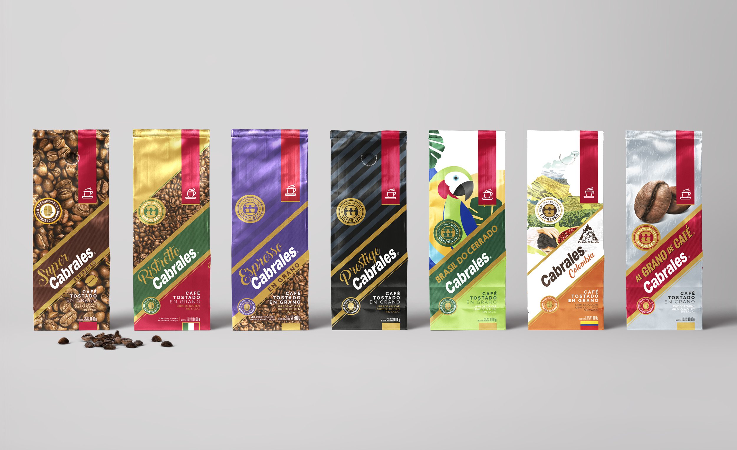
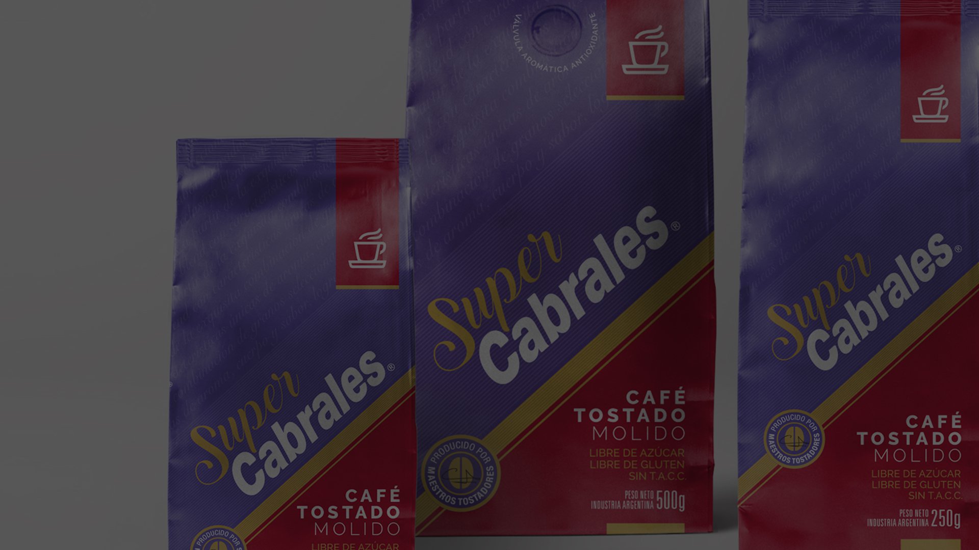
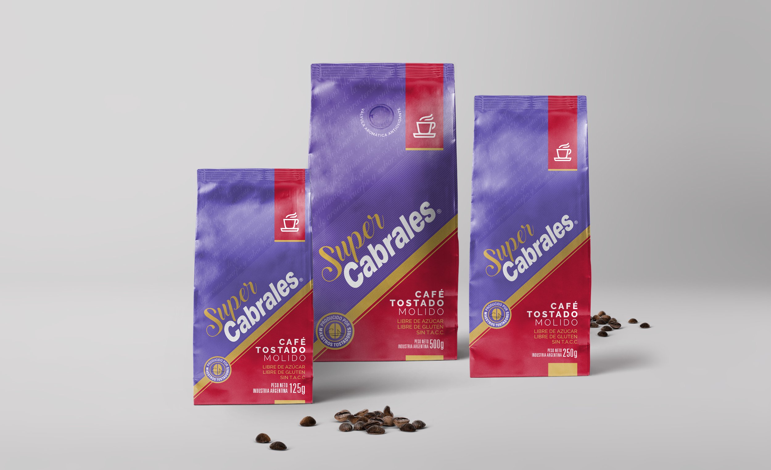
For the packaging design and the new branding of Cabrales was structured on the aggiornamiento of the design of the toasted coffee Super Cabrales.
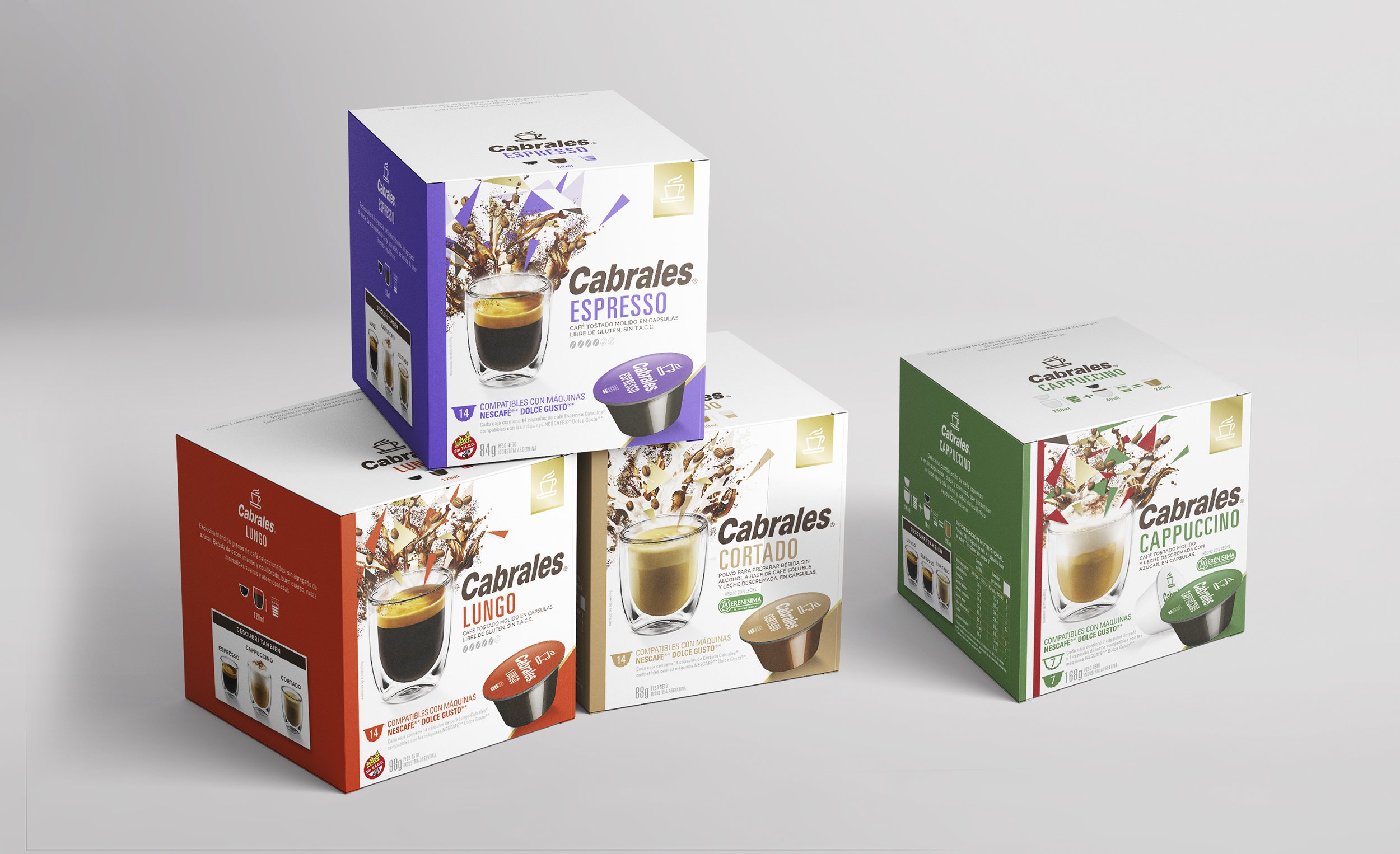
Once polished the details of that flagship product, we defined an architecture for the whole line, rescuing the application of the brand diagonally, the presentation of the symbol of the cup inside a ‘red tie’ and other attributes that the previous packs had.
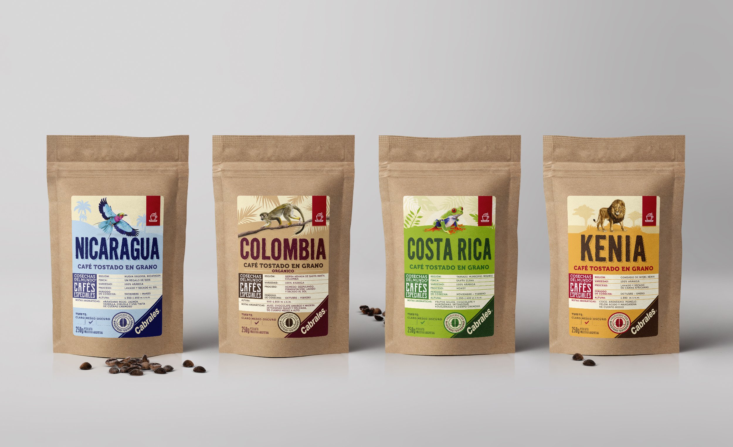
Based on this architecture, we design all products respecting that general concept and highlighting the personality of each type of coffee.
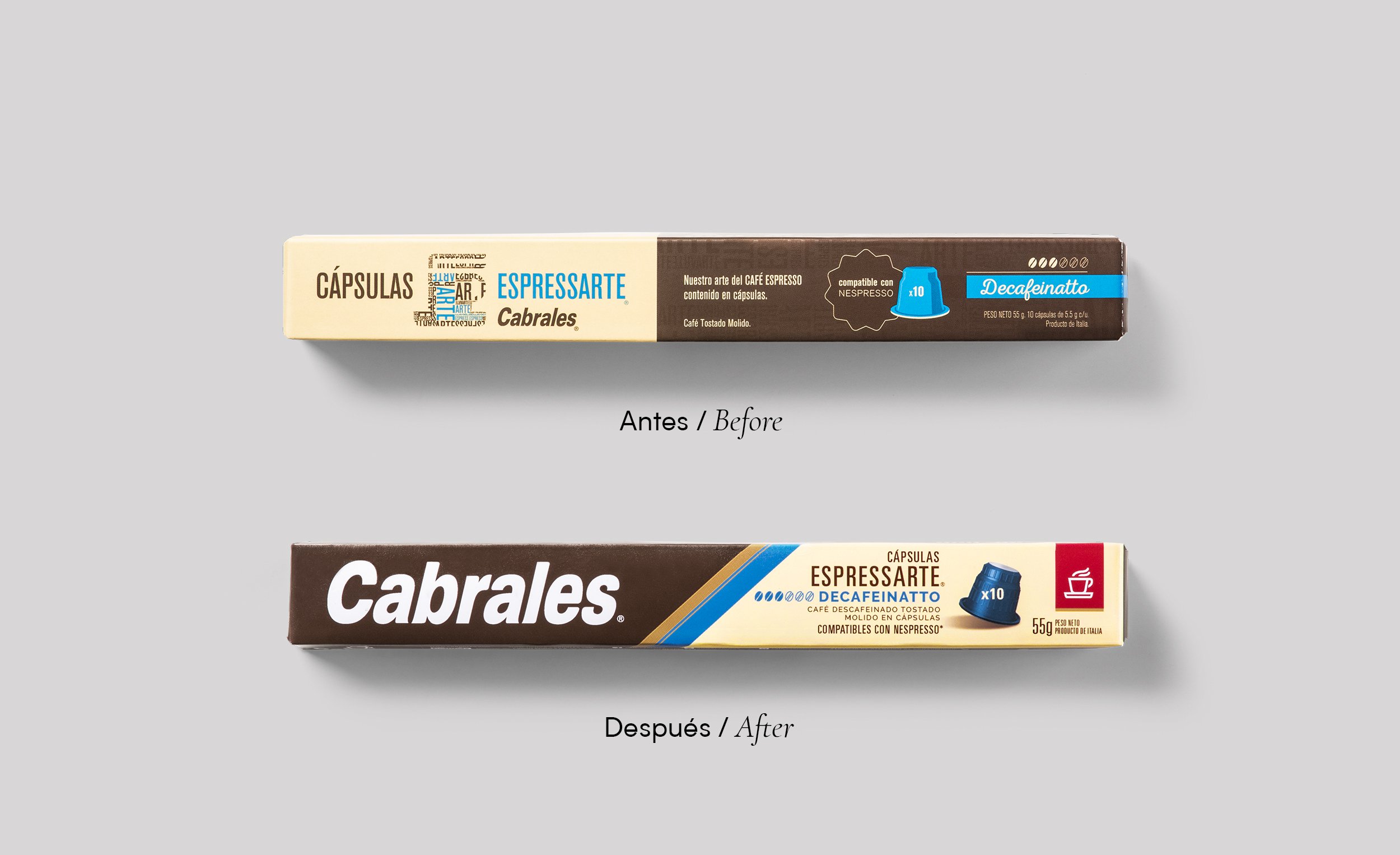
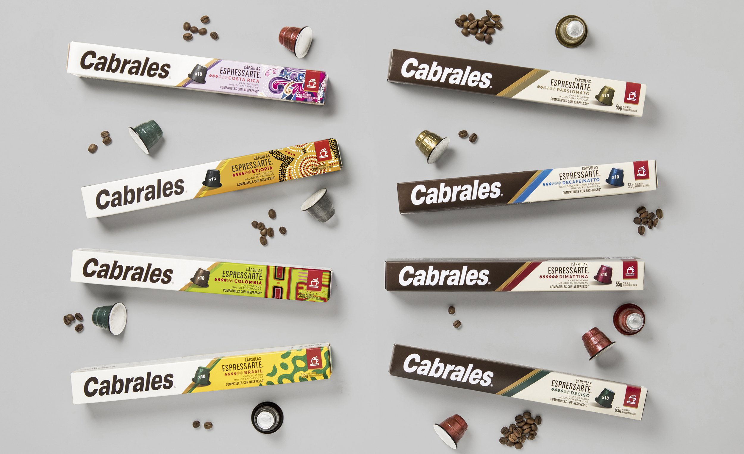
Beyond the bases defined for the products, each line has to be analyzed with its particularities. In the case of the Nespresso compatible capsules, which have a thin and elongated packaging, the lack of reading of the Cabrales logo was surprising, the brand was lost in the packaging. The design decision was to highlight the name, which is a guarantee of quality, and we went from a tiny application on the front of the pack to a strong standpoint so that the shelf reading is clear.
Today the brand and its products are presented with a strong and more consistent identity, highlighting the value of the name ‘Cabrales’ which is synonym of good coffee and respecting the ‘color spot’ that the client did not want to lose.
For the cup, we left the characteristic plate but modernized the silhouette. We also adjust the stram, generating a more relaxed movement, highlighting the idea of ‘enjoying the moment of a good coffee’.
We respected the inclination of the typography but redraw it by adjusting details of shapes and spacing between letters, so that the reading is clearer.
We defined an architecture for the whole line, rescuing the application of the brand diagonally, the presentation of the symbol of the cup inside a ‘red tie’ and other attributes that the previous packs had.