- Cliente Osborne
- Servicio Branding & Identity. Packaging design.
- Año 2016
Ampersand, new design, new flavor.
In Spain the rise of gin is remarkable. A market segment that has managed to create an industry around it like no other alcoholic beverage: ginning, tonics of different formats and flavors, botanicals, etc. All this gives a solid projection and makes it difficult to unseat it.
Two years after Grupo Berro launched Ampersand branding, Osborne called us again to work on a line extension, following the gin trends.
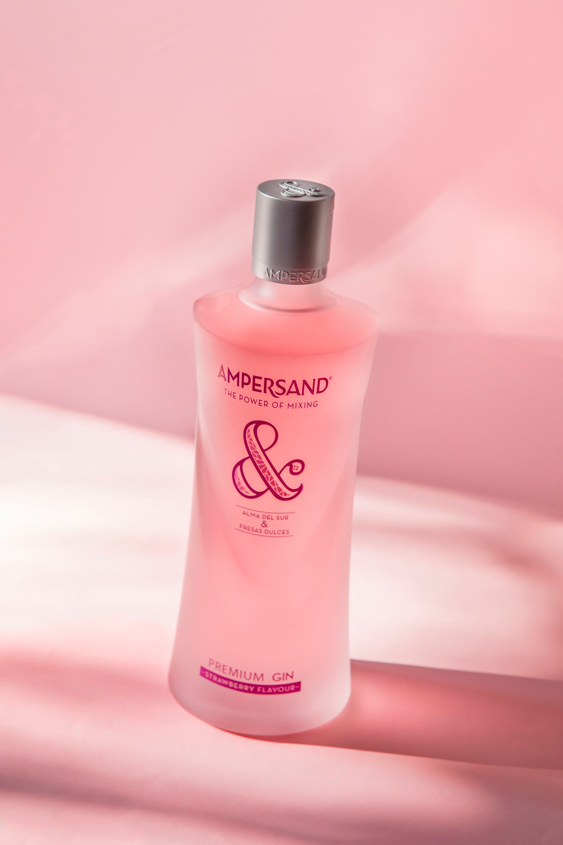
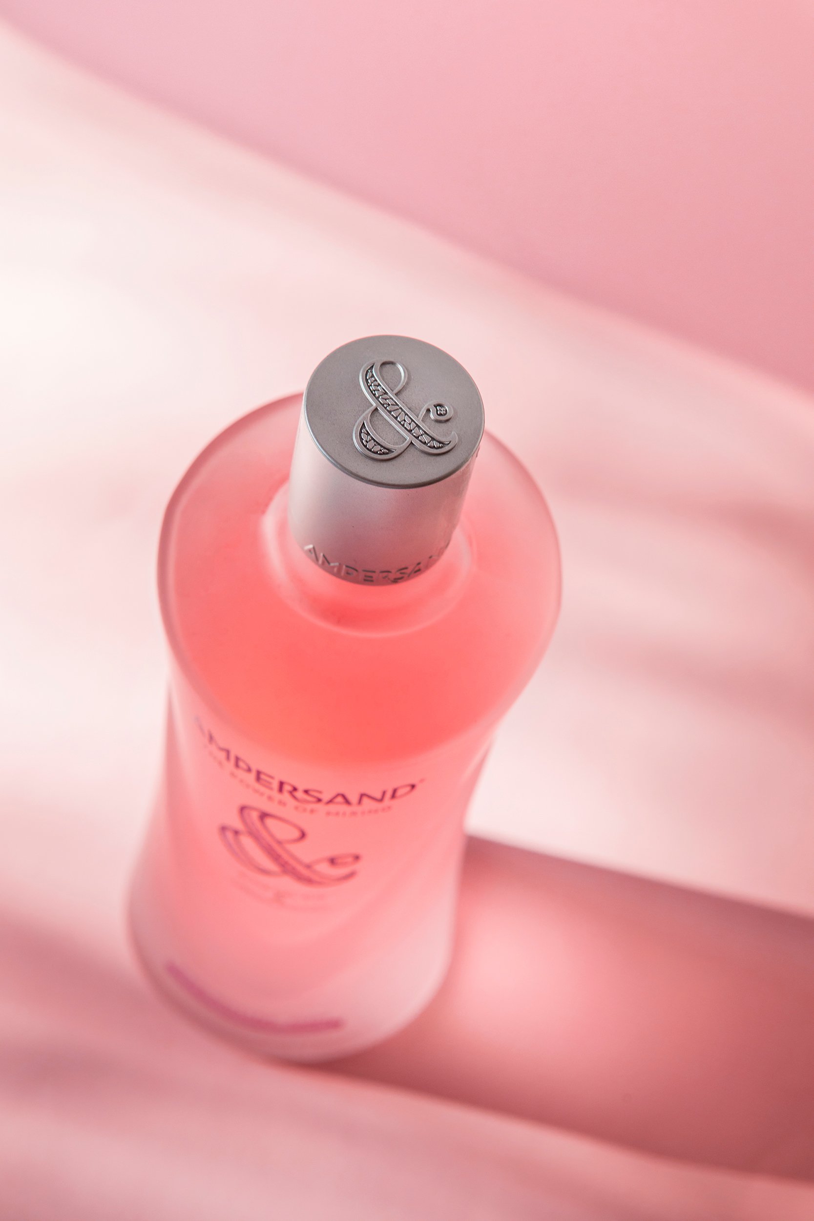
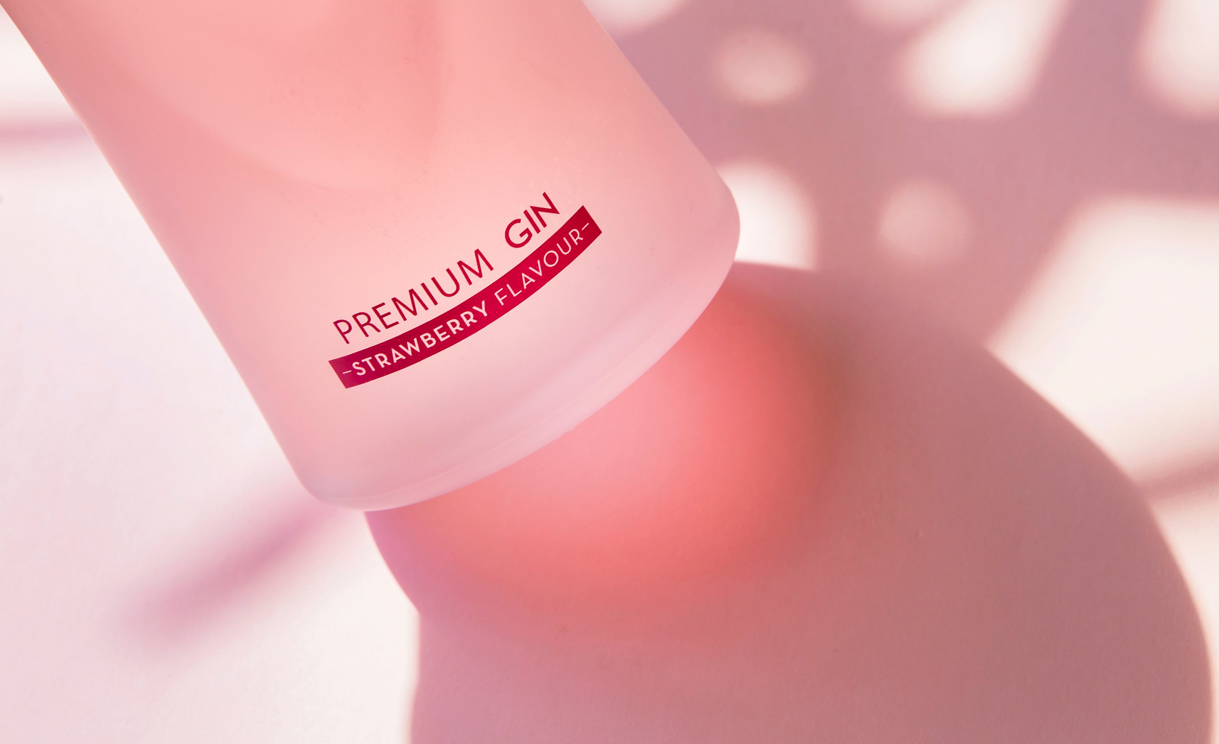
The new proposal is a pink gin with a light strawberry flavor. A type of gin ideal for women who increasingly enjoy cocktails combined with this type of taste. This soft flavor and its particular pink color are a great attraction for this audience.
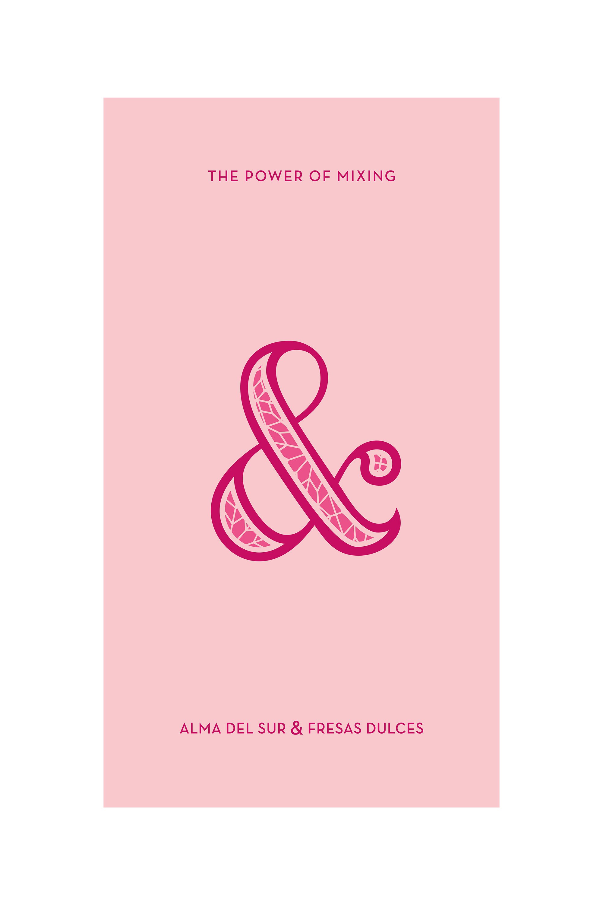
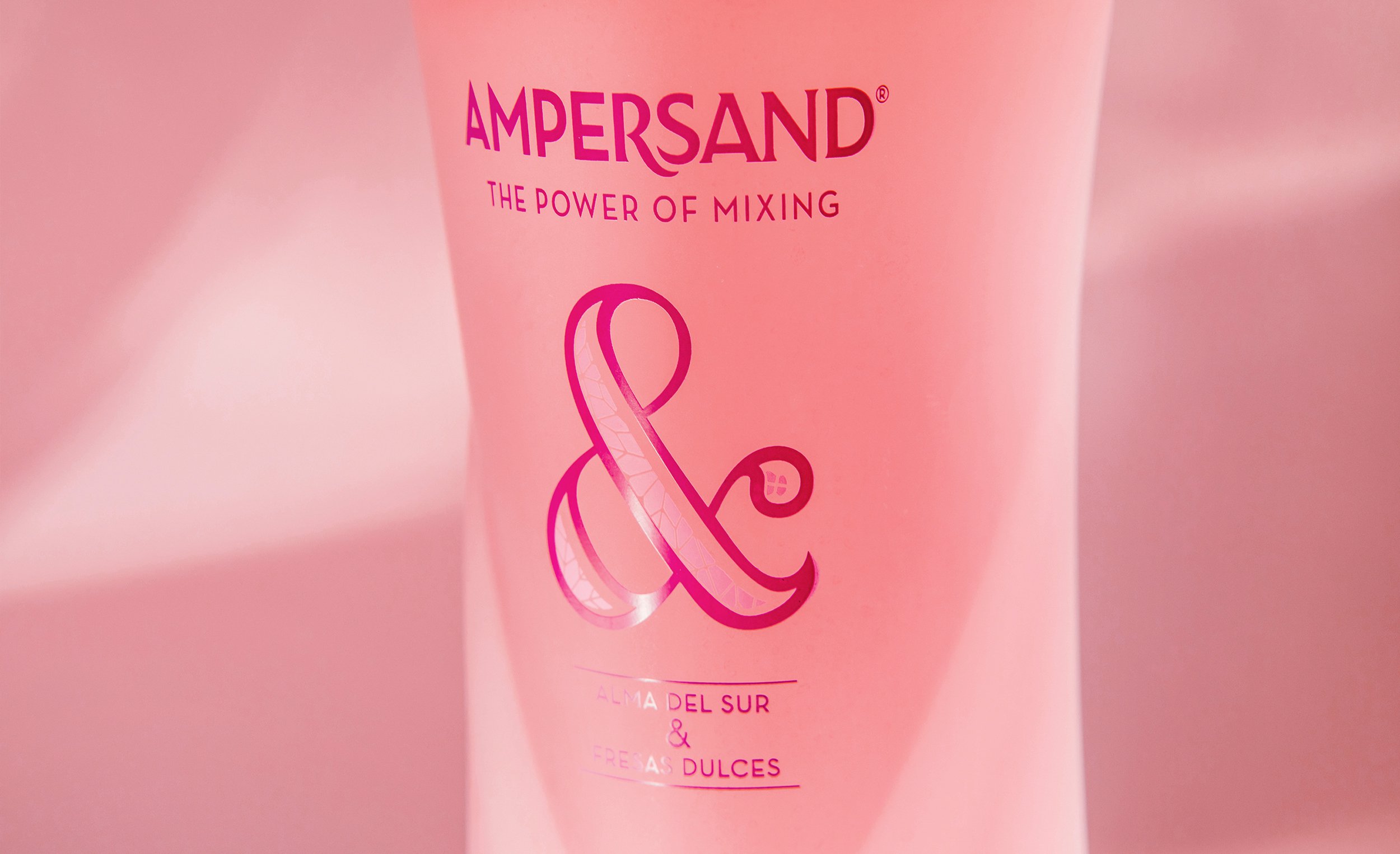
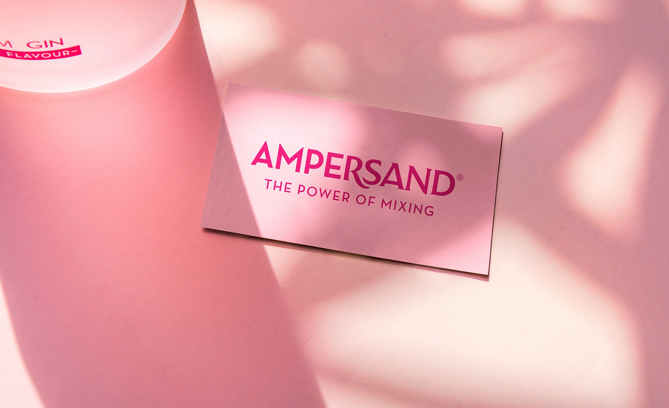
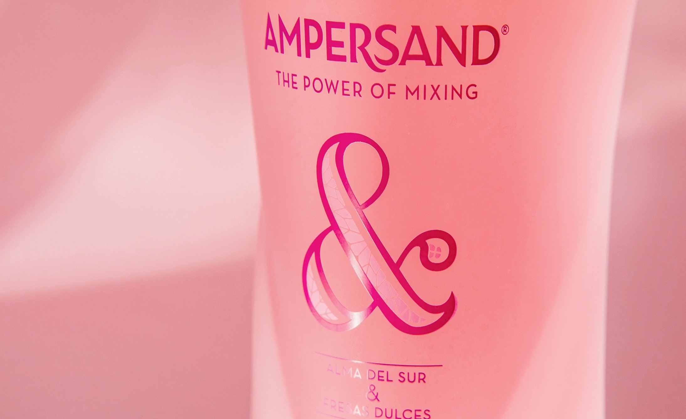
Using the same bottle that we had designed for the citrus flavor, the new proposal is anchored in the pink color of the gin to achieve a clear differentiation. Together with the launch of the new flavor, we also redesigned the logotype.
Now, Ampersand responds to the demand of its audience with its two high quality gins and striking presentations.
