- Cliente Ahorra Más
- Servicio Branding & Identity.
- Año 2020
Ahorramas is a supermarket chain in Spain, with a strong presence in local neighborhoods. It counts with more than 260 points of sales in Madrid, Toledo, Guadalajara, Cuenca and Ciudad Real.
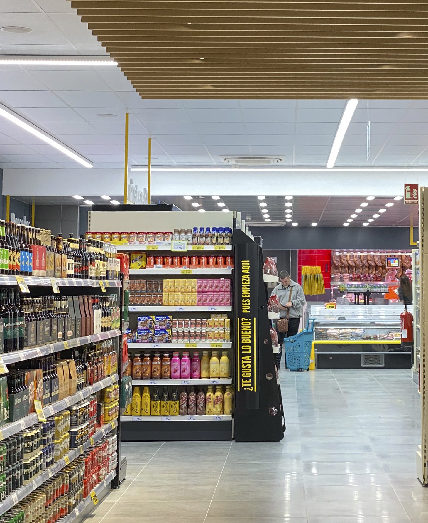
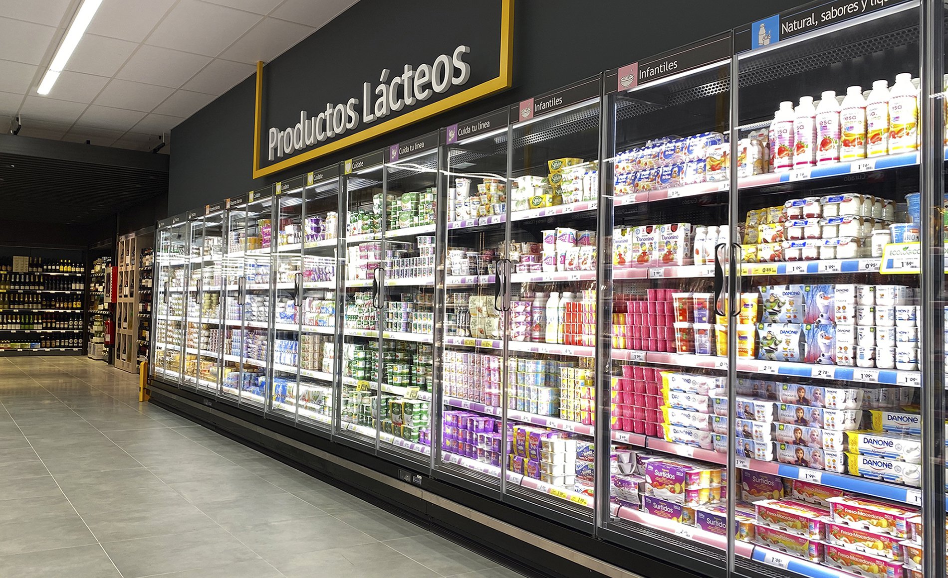
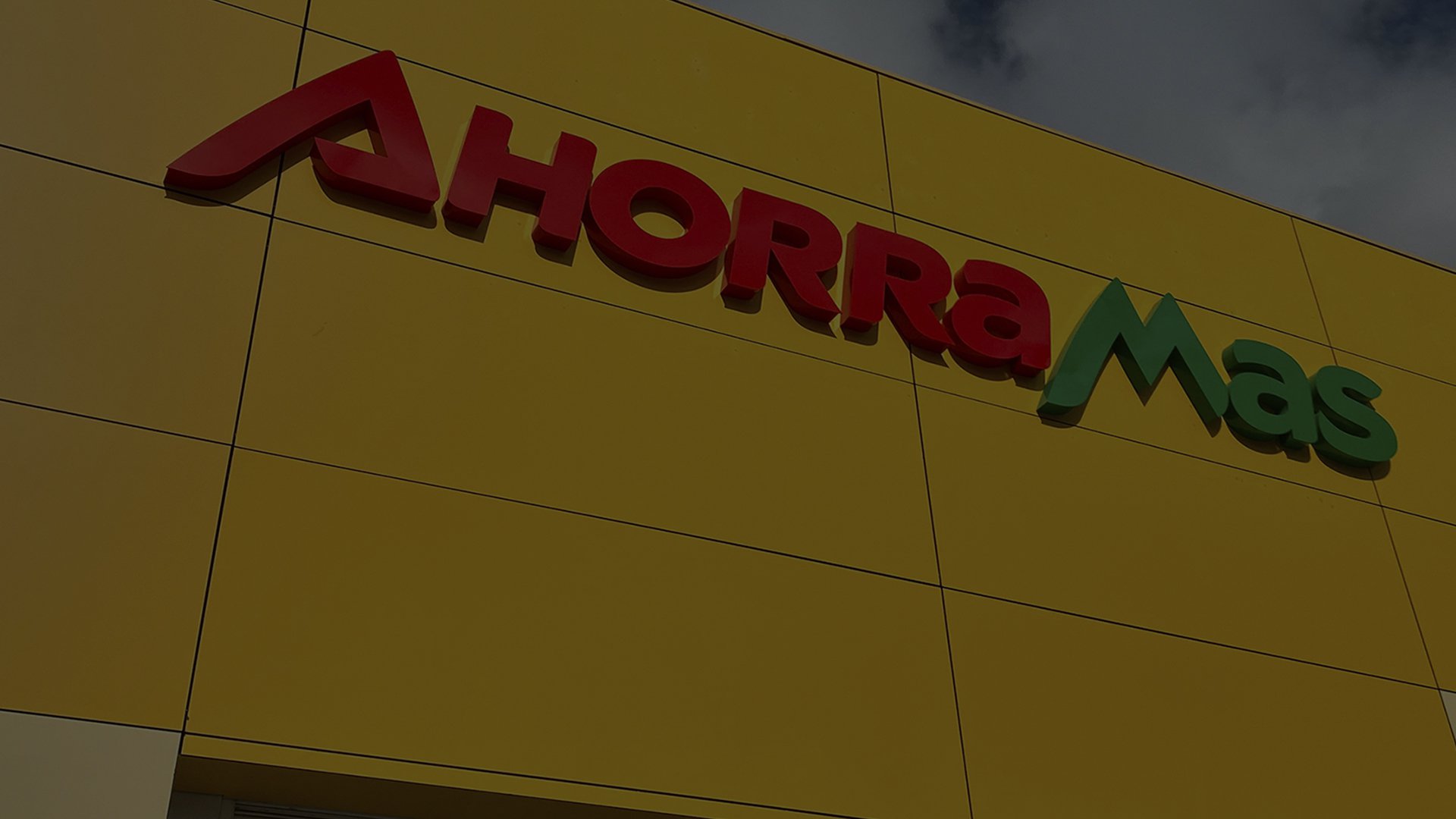
Taking advantage of an architectural renovation project of all their branches, the company decided to renew their identity, signalling and indoor design.
As the project developed, we focused on deciding which elements from Ahorramas’ DNA we should keep and which ones we should change. We worked during a whole year on the project.
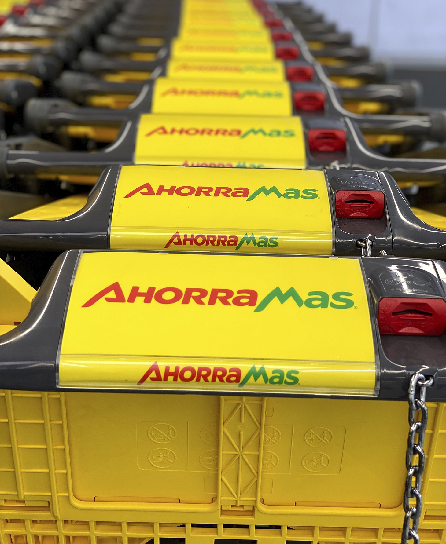
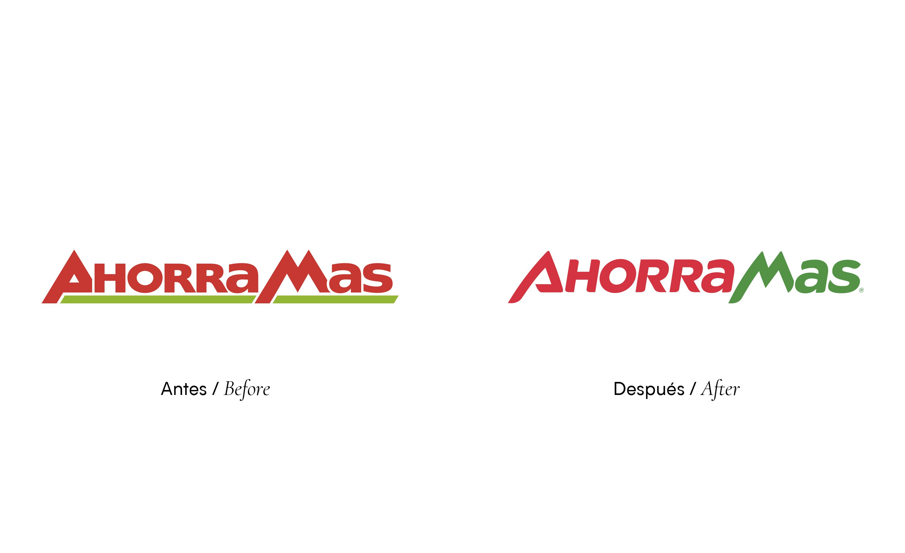
Respecting the brand’s case, we mantained the general composition and its chromatic, but adjusted the logotype presenting a typographical change that modernized it, while keeping its essence. The second part of the name (which means “more”) was highlighted with a green colour making an even bigger impact in the Ahorro -Savings’- concept.
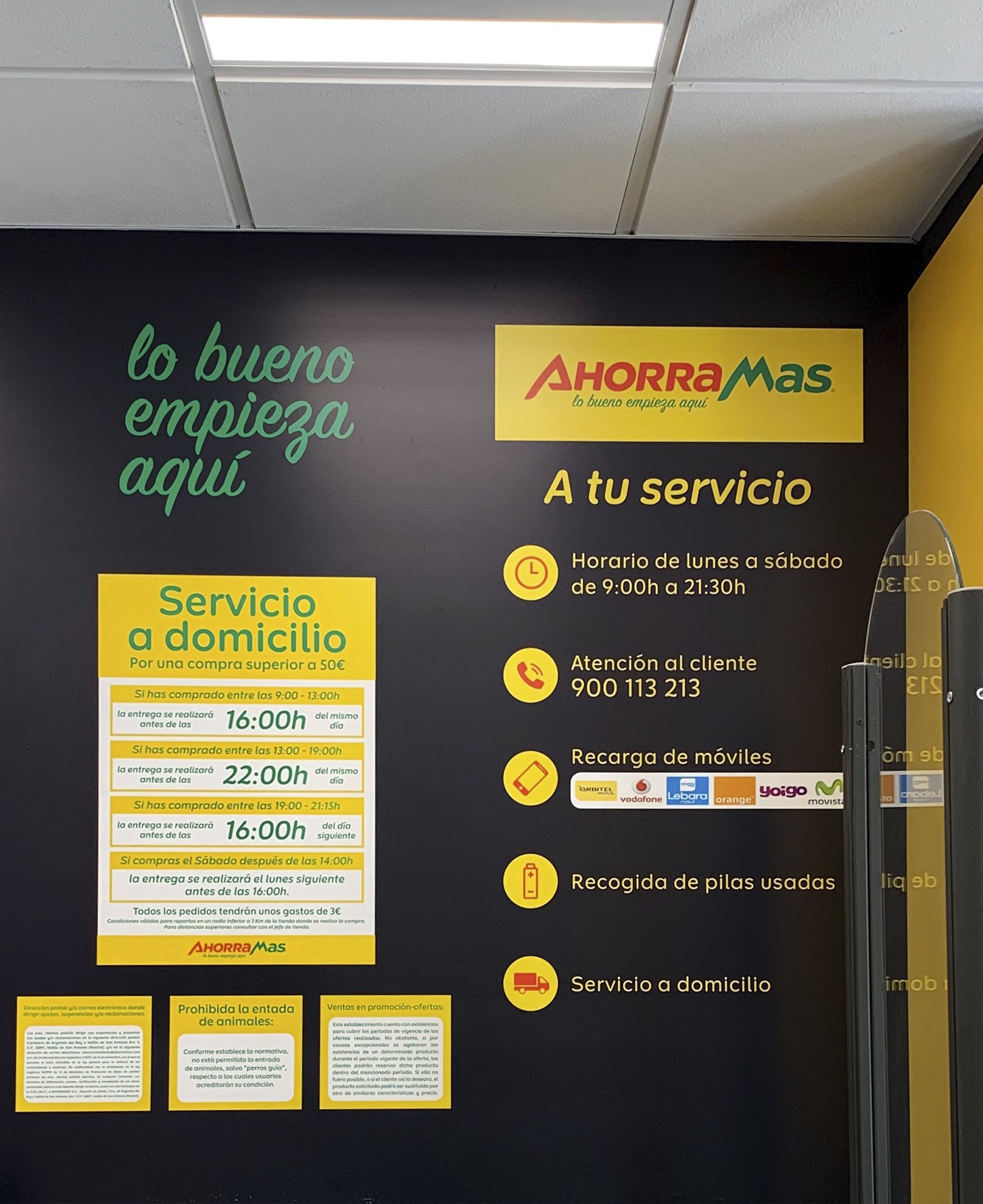
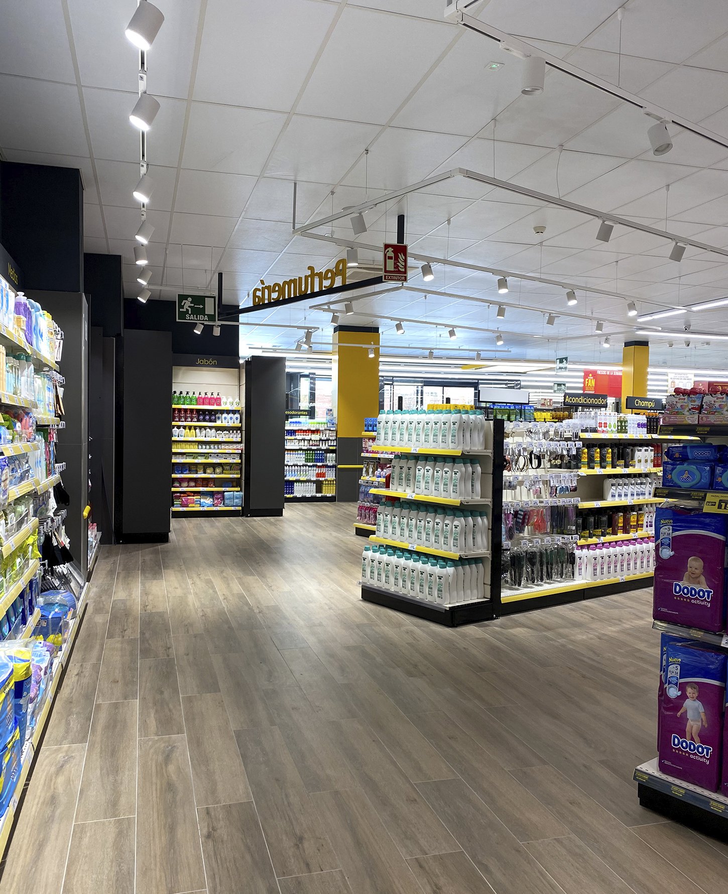
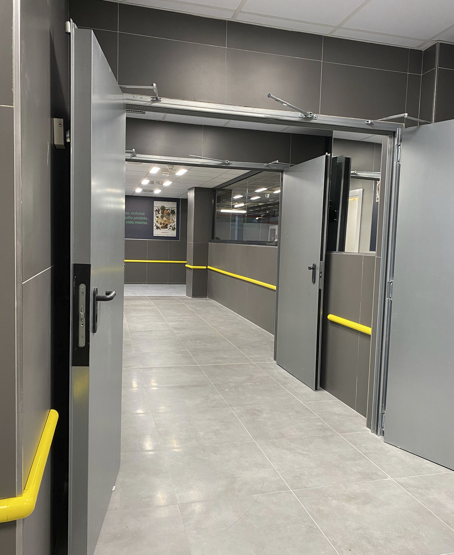
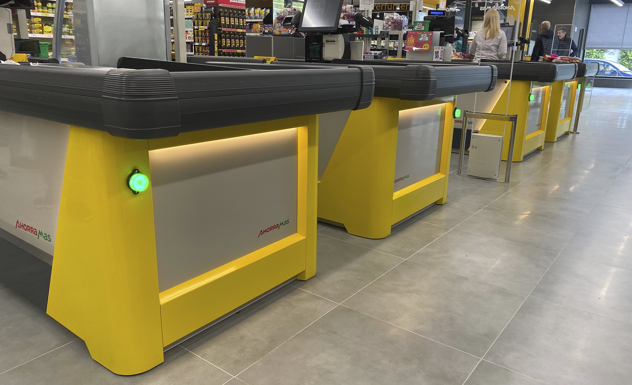
Afterwards, we worked side by side with the client’s team in the application of the new brand on its fachade and all the other components of the supermarket. Different indoor areas were renovated with the intention of generating a really overcoming experience with a wider and much modern proposal without losing warmth.
Nowadays, the Ahorramas’ new identity offers the public an innovative proposal. And what’s best is we were able to do so with materials and terminations of excellent quality. These not only were able to show a great visual change, but also represented an important budget’s optimization, which, when escalating to the whole number of franchises, meant a huge investment rather than a cost.
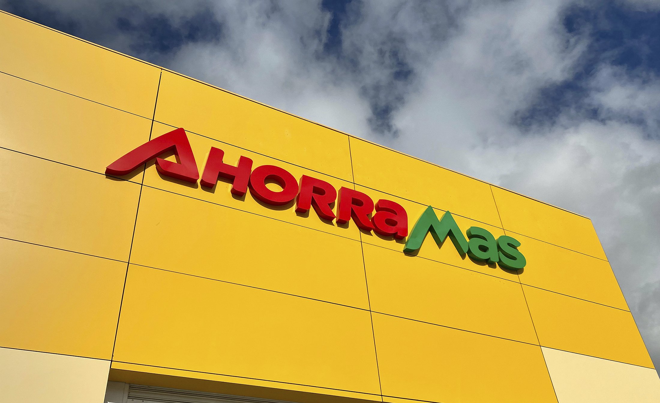
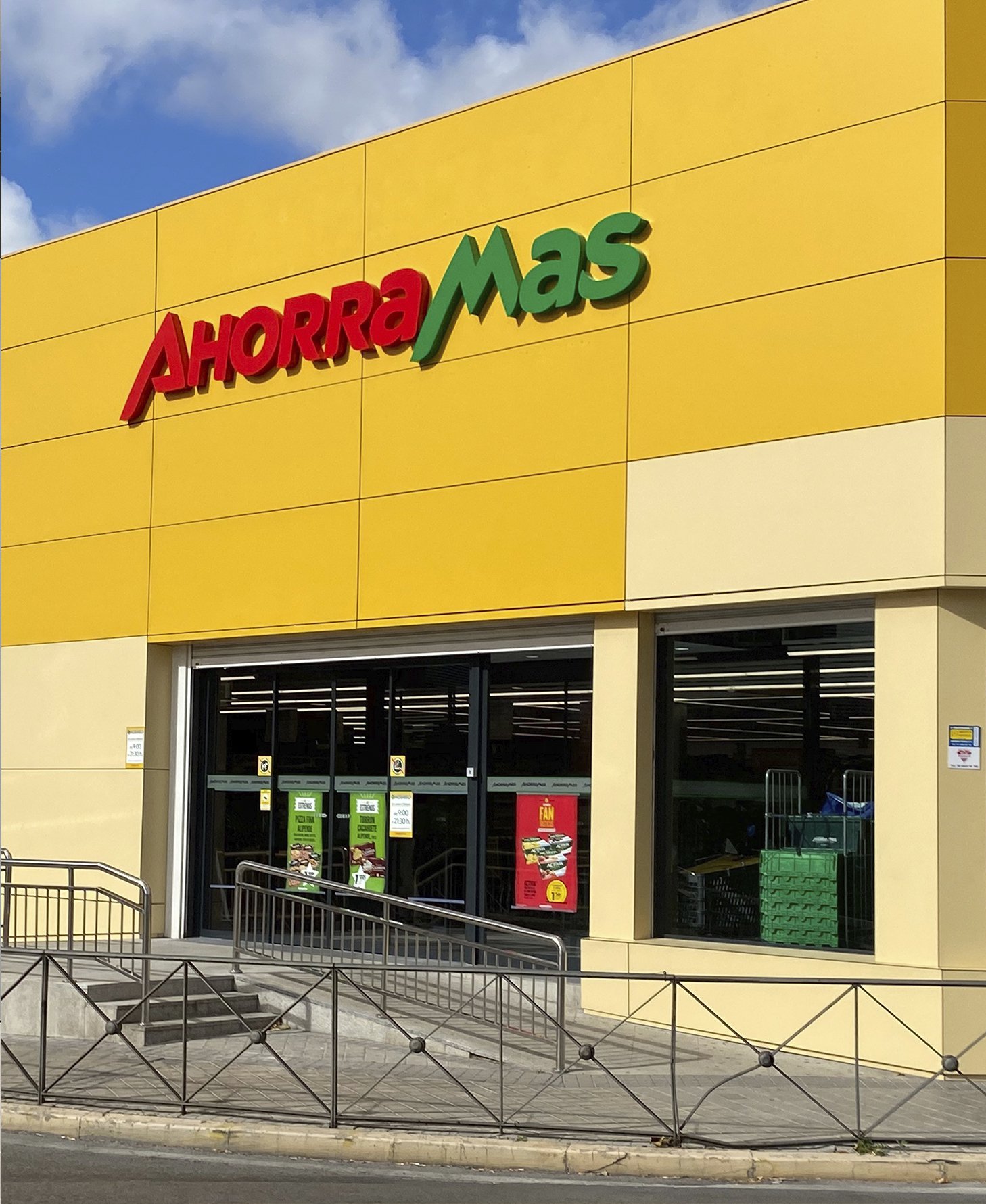
Respecting the brand’s case, we mantained the general composition and its chromatic, but adjusted the logotype presenting a typographical change that modernized it, while keeping its essence.
