- Cliente Molinos Rio de la Plata
- Servicio Branding & Identity. Packaging design.
- Año 2020
Background
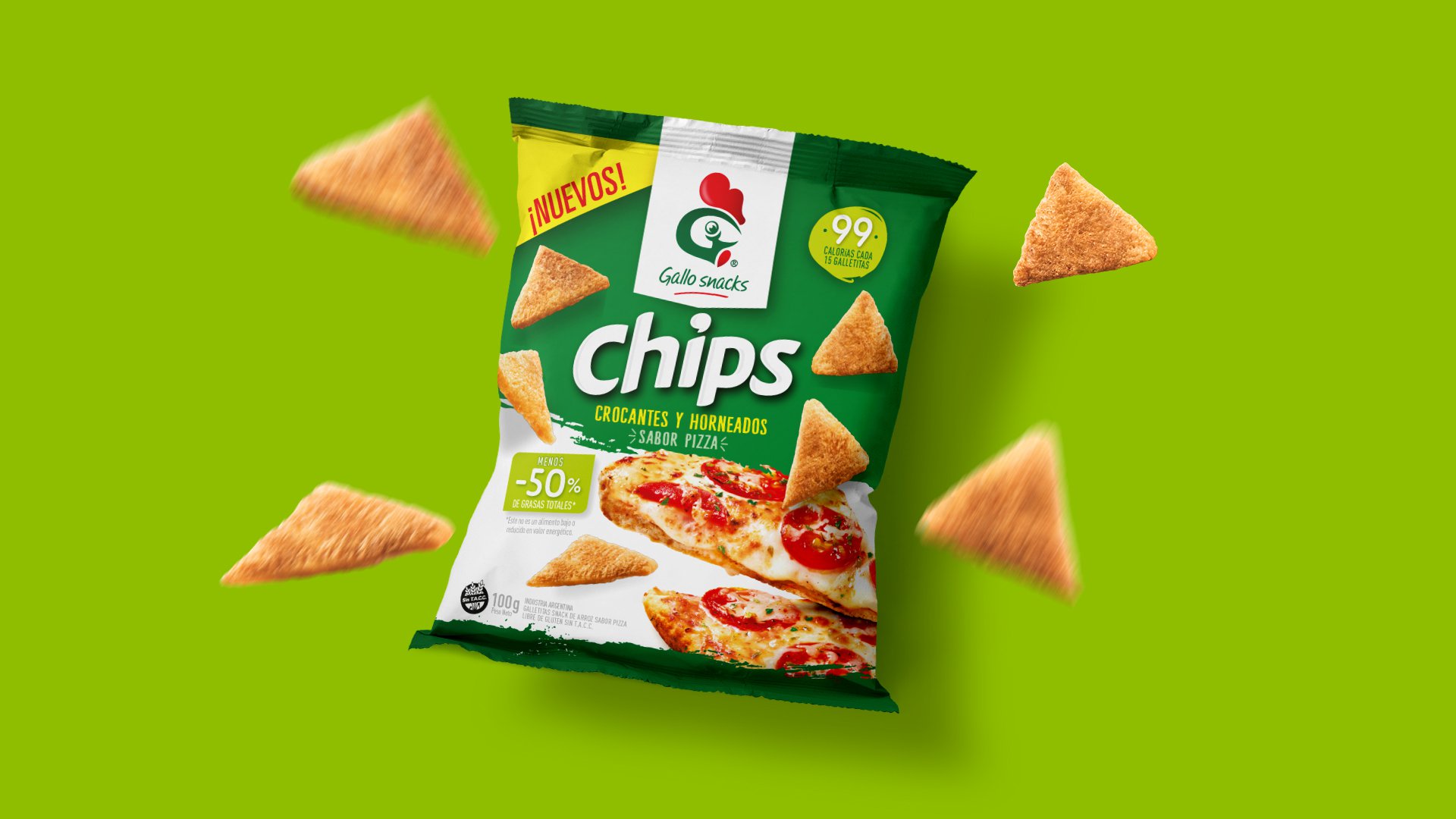
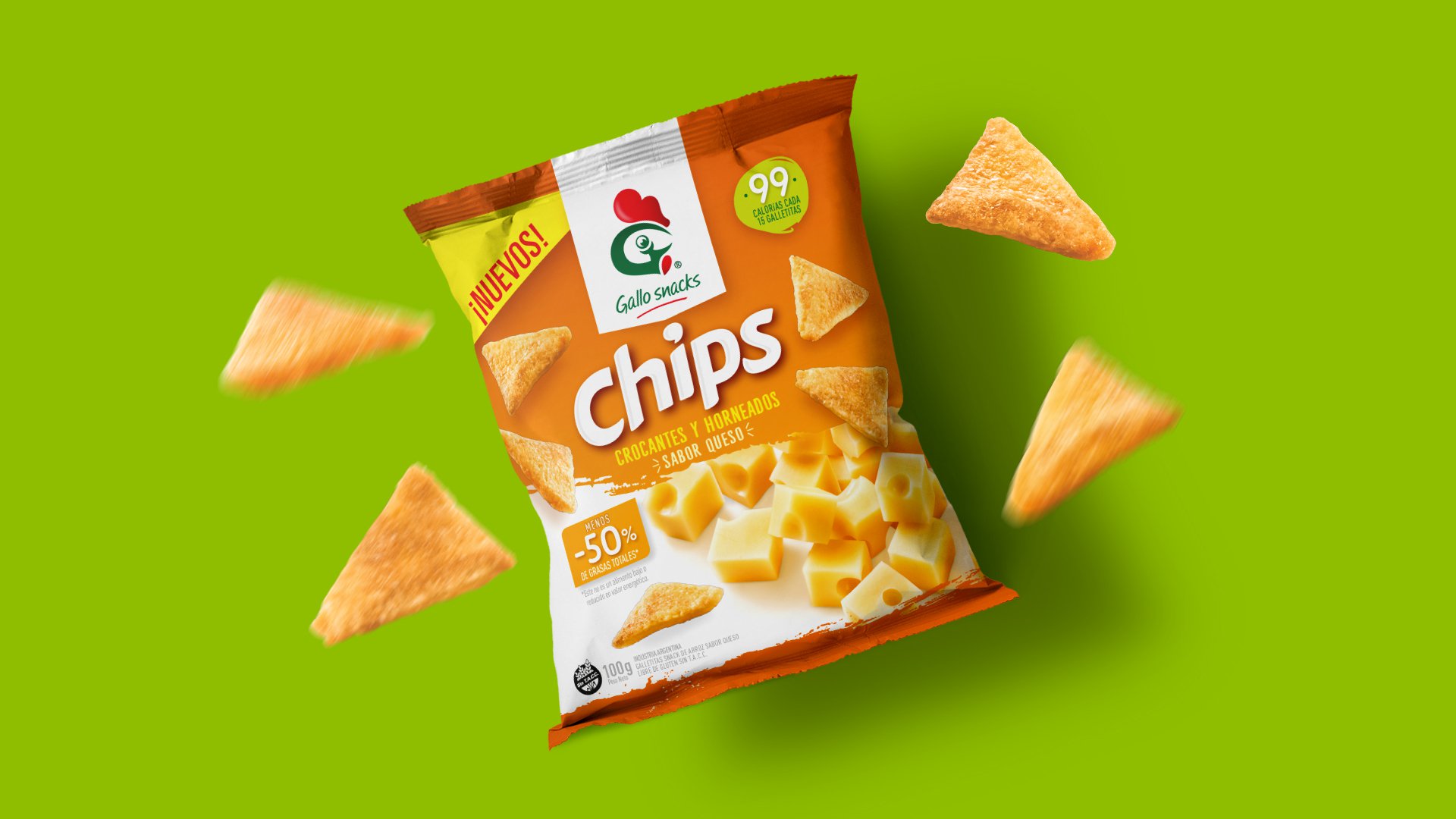
From the launch of Gallo Snacks brand, in 2012, Grupo Berro was chosen by Molinos Río de la Plata to develop its identity and the whole line of products. Today, 8 years later, with a consolidated leadership in the healthy snack category, Gallo Snacks launches their brand new flavored chips. Seizing the moment, Grupo Berro suggested a brand’s redesign.
Project
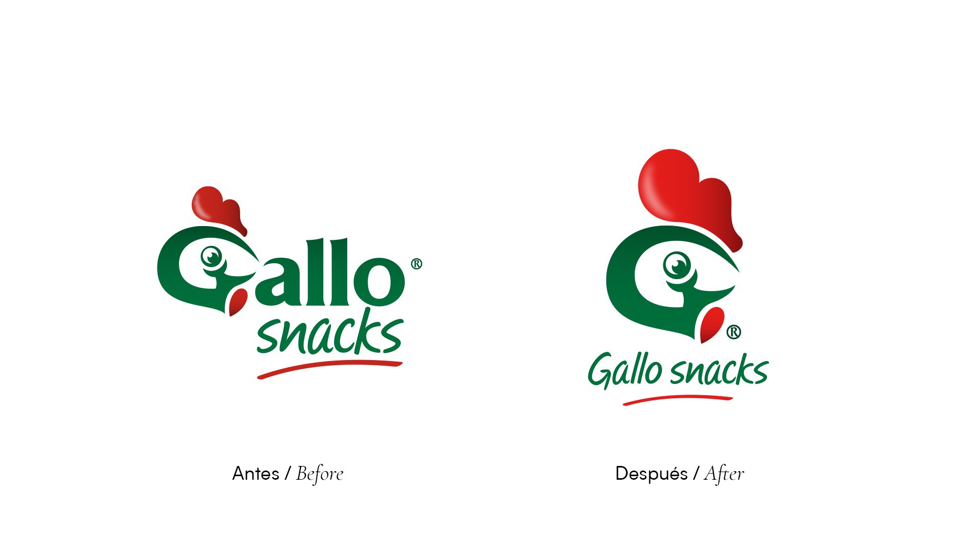
“Less is more” used to say the reknown architect Mies Van Der Rohe. In that line of thinking, we proposed a synthesis of Gallo Snack’ identity by removing four letters of their main name, emphasizing just the symbol of the rooster (Gallo in Spanish) applied over her letter “G”. Few are the brands that are naturally recognised by the consumers without needing to read the complete word. With the new design, Gallo proves to belong in that privileged group.
In the case of the new Chips, the packaging design shows new features that, in the future, will start being transferred to the rest of the consolidated family.
Result
The decision places Gallo Snacks over the top of avant-garde design and shows a clear decision of the client to offer constant innovations.
The new identity is boiled down to just the symbol and highlights the hierarchy of a century-old brand.
At the same time, the launch of Chips expands and strengthens the Gallo Snacks family.
