- Cliente Danone & Nutricia Bagó
- Servicio Packaging design.
- Año 2019
Background
Nutrilon is the first brand in sales of infant formula foods, it is the most recommended by pediatricians and the best qualified brand by mothers.
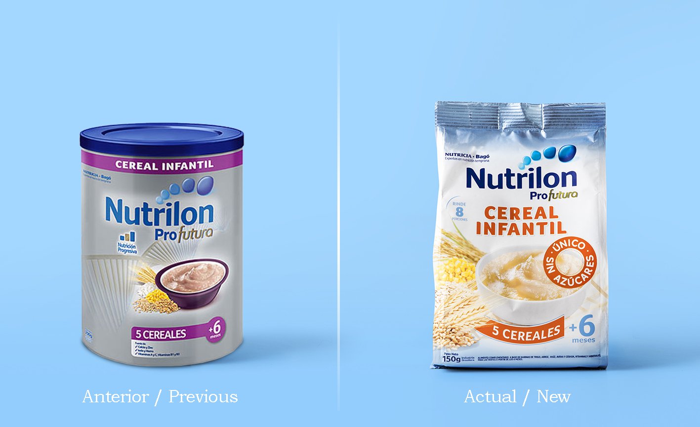
There was a problem with the packaging since the containers of cereal were similar in format and color to those of formula. At the same time, its design was far from the cereal codes, creating greater confusion.
The Project
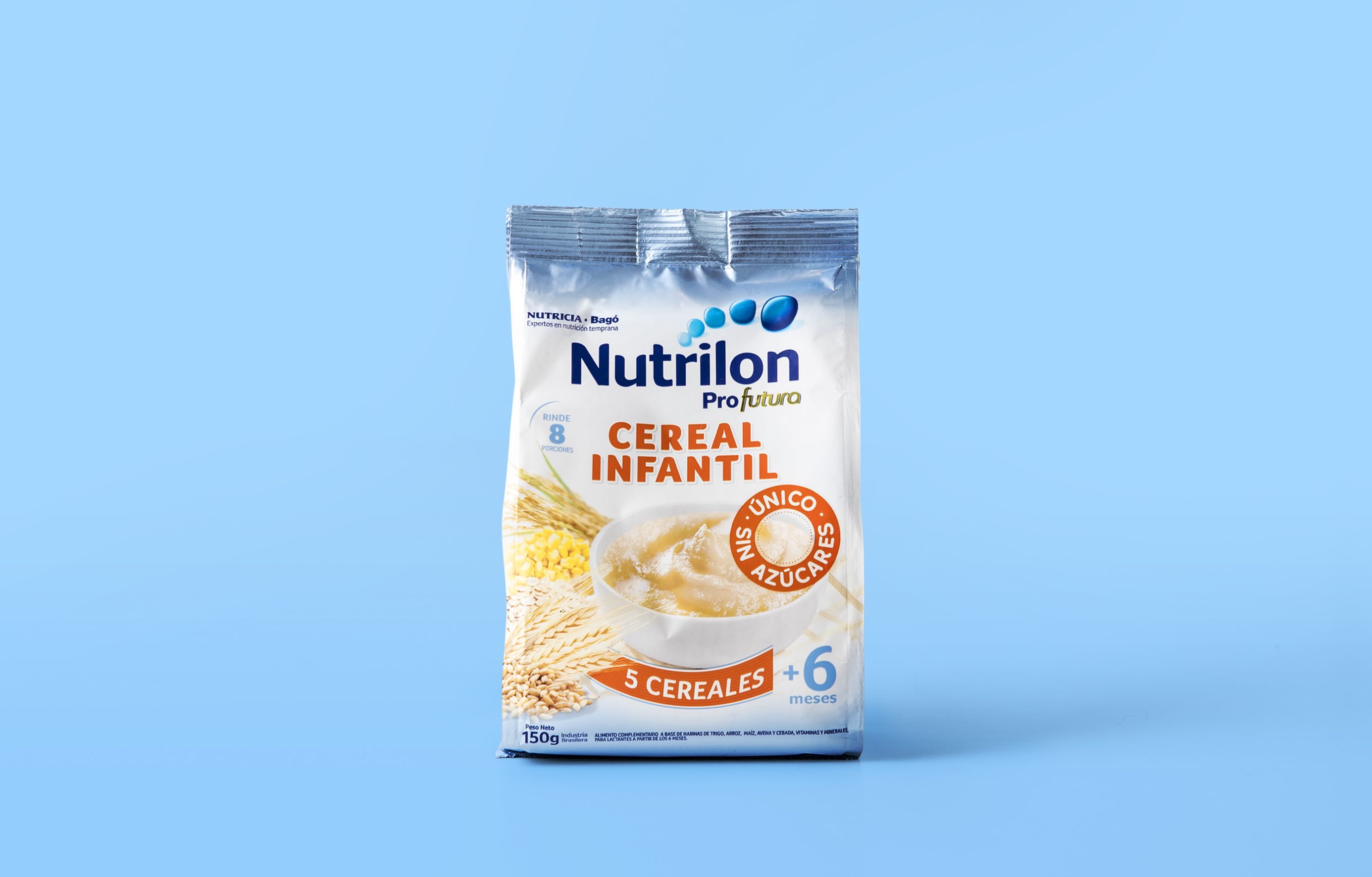
The Project had three defined objectives. The first and most important was that consumers didn’t get confused between formula milk and cereal. The second was changing the package from can to flow pack without losing its presence at the shelf. And finally, the design had to make the packaging attractive and with appetite appeal.
The Result
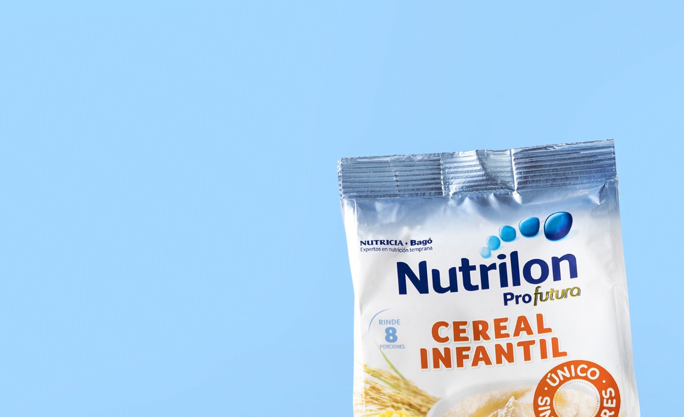
Following the guidelines of the brand in other markets, the new design presents a new color code, clearly separating cereal from infant formula. The 'Nutrilon' logo, which is a strong asset, stands out, and the image of the product presents an appetizing combination of the ingredients with the prepared food.
