- Cliente Morel
- Servicio Branding & Identity.
- Año 2024
Morel: A Strategic Redesign Reflecting 10 Years of Excellence
Jorge Morel approached us on the occasion of his company’s 10th anniversary with a clear challenge: to redesign its identity to support its growth and consolidation in the market.
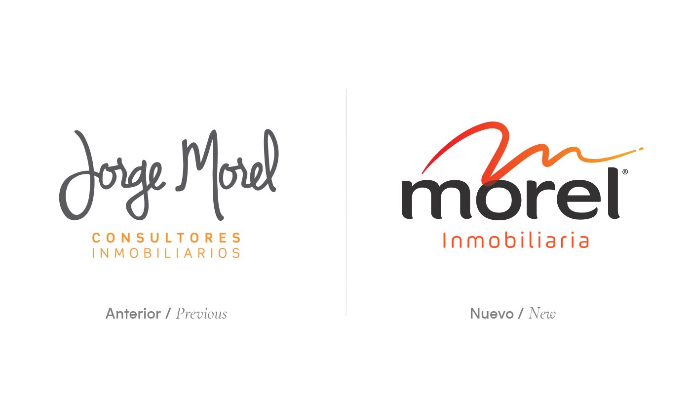
The original name, “Jorge Morel,” reflected his leadership. However, while collaborating with a talented team, we recommended simplifying it to “Morel.” This strategic decision not only made the name more memorable but also positioned the brand as a team of experts, going beyond the personal figure to represent the talent and professionalism of the entire group.
Morel stands for top-tier real estate services, combining innovative in-house technology with a uniquely personalized approach. The new identity had to convey these values: modernity, professionalism, and approachability.
The Redesign:
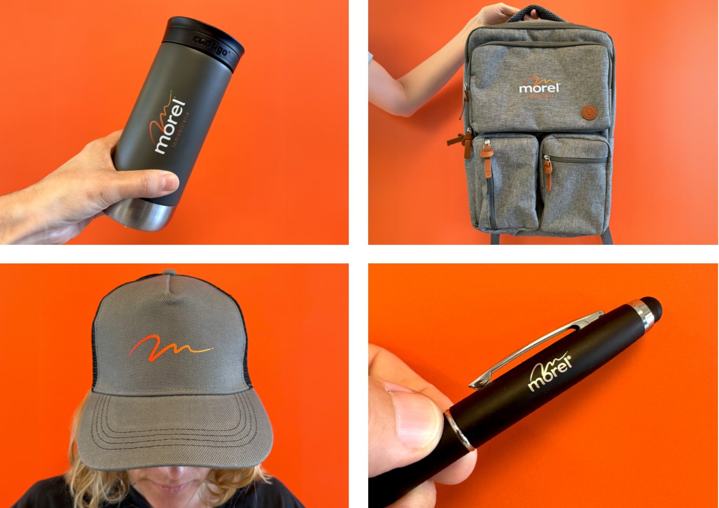
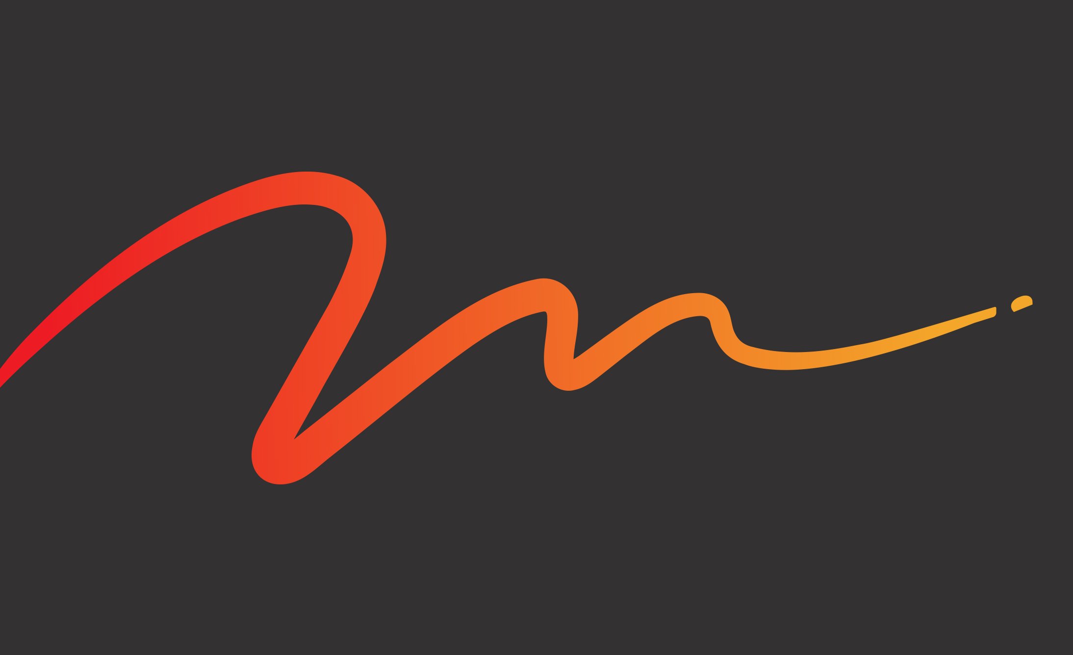
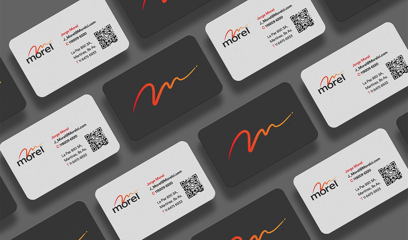
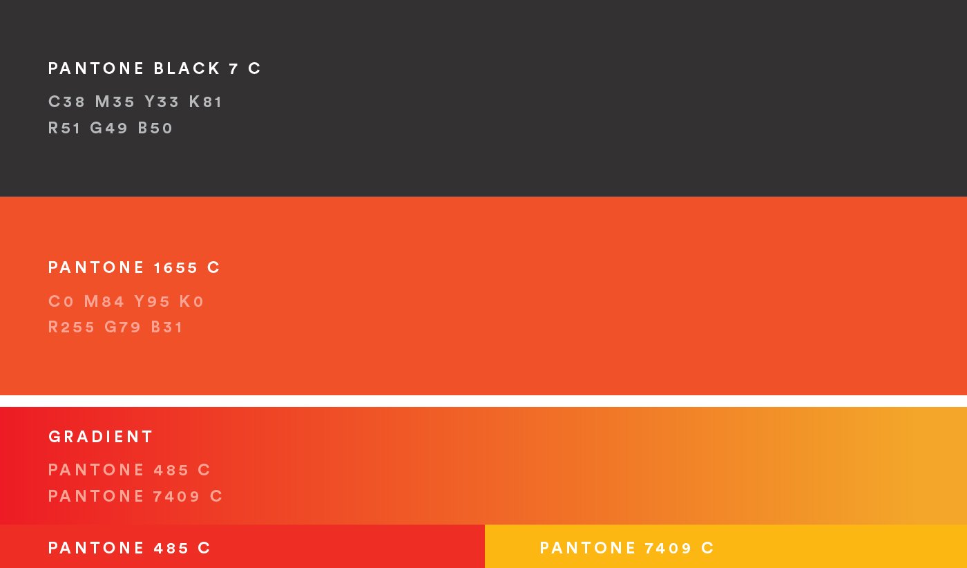
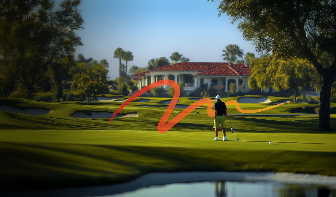
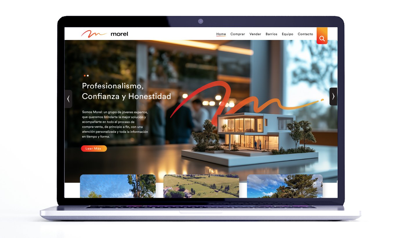
We drew inspiration from the original logo’s gestures but reinterpreted them with a contemporary focus. We created a distinctive signature-like symbol based on the letter “M,” using warm tones like red and orange to convey dynamism and confidence. The symbol was complemented with a custom-designed typeface for the “Morel” logo, achieving a unique and memorable visual identity.
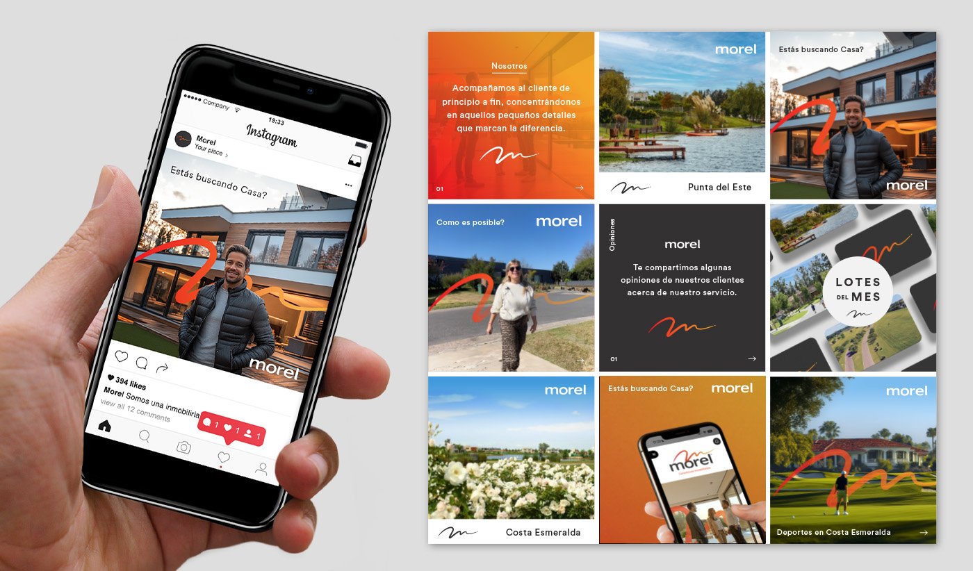
Additionally, we designed the website and defined the visual style for social media, ensuring a cohesive, modern, and engaging brand experience across all touchpoints.
The Result:
A new identity that not only celebrates Morel’s 10 years of history but also projects its future with a refreshed style. This redesign positions the brand as a leader in the sector, standing out for its innovation and commitment to excellence.
El nombre original, “Jorge Morel”, reflejaba su liderazgo, pero al trabajar con un equipo de grandes talentos, propusimos simplificarlo a “Morel”. Esta decisión estratégica no solo facilita la recordación del nombre, sino que también posiciona la marca como un equipo de expertos, trascendiendo la figura personal para representar el talento y la profesionalidad de todo el grupo.
Nos inspiramos en la gestualidad del logo original, pero lo reinterpretamos con un enfoque contemporáneo. Creamos un símbolo distintivo en forma de firma, basado en la letra “M”, utilizando tonos cálidos como el rojo y el naranja para transmitir dinamismo y confianza. Complementamos el símbolo con una tipografía diseñada exclusivamente para el logo, logrando un conjunto visual único y memorable.