- Cliente Club Atlético River Plate
- Servicio Branding & Identity.
- Año 2022
Founded more than 120 years ago, River Plate is one of the most important clubs in the history of Soccer. Its influence exceeds any sporting field to be present in all corners of culture and society.
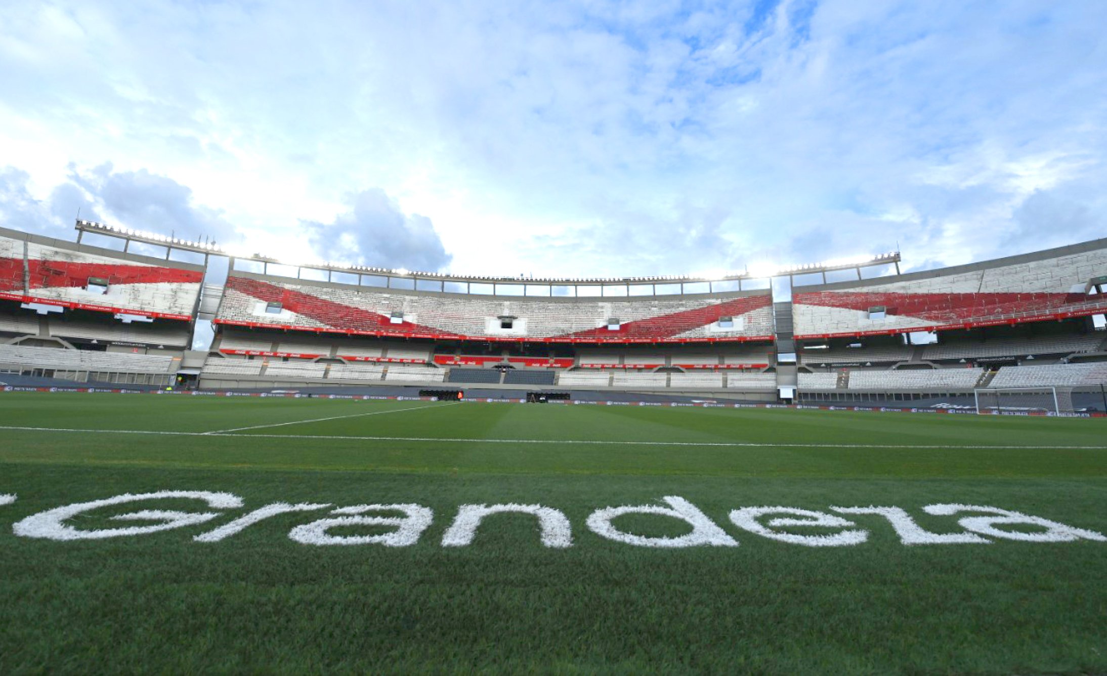
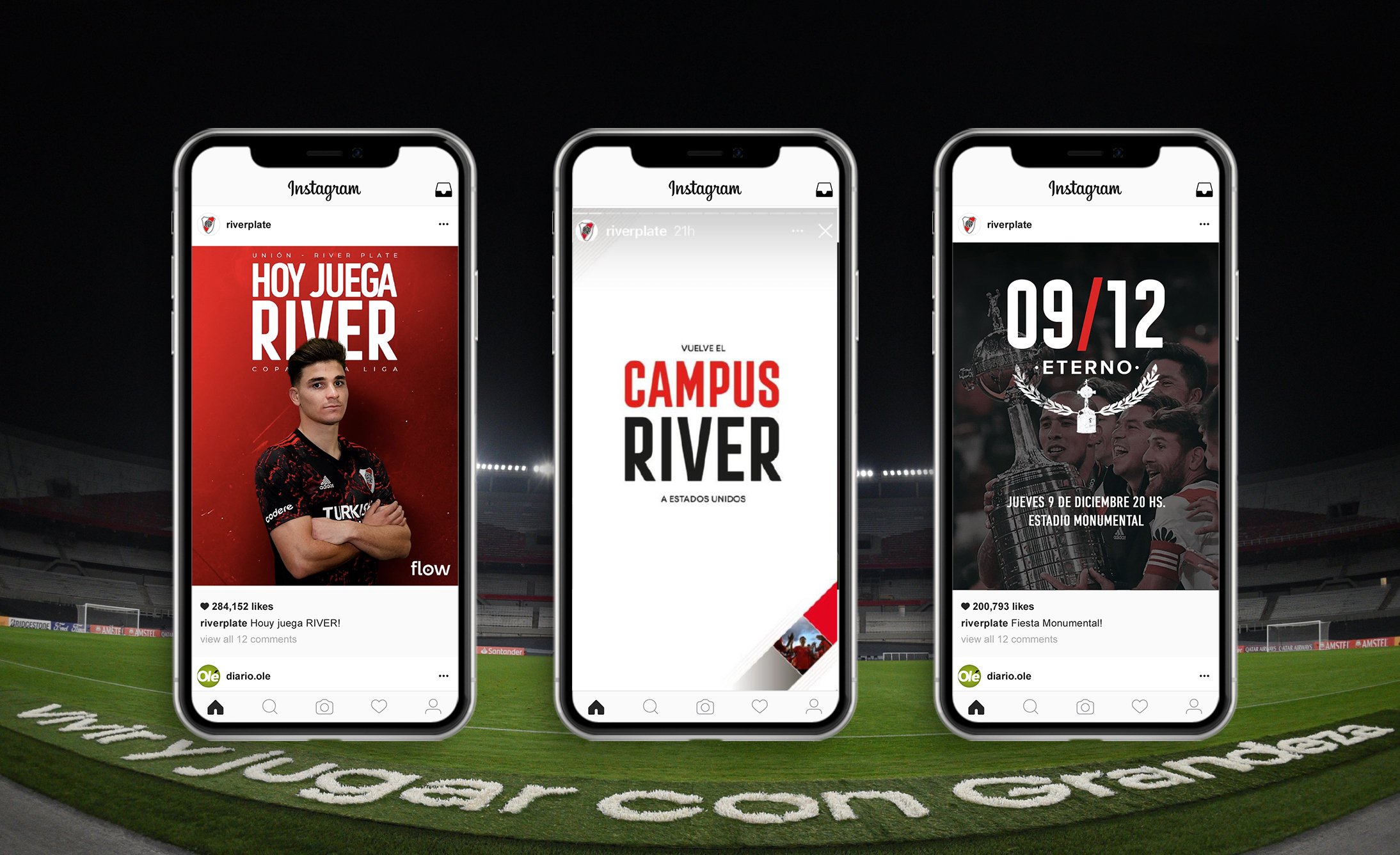
River’s brand has had many changes throughout its history. Its red band, its shield, its acronym “CARP”, its claim "El Millonario", the Monumental stadium are personified in tattoos, graffiti, newspapers, drawings, t-shirts, billboards and television. River's DNA is everywhere.
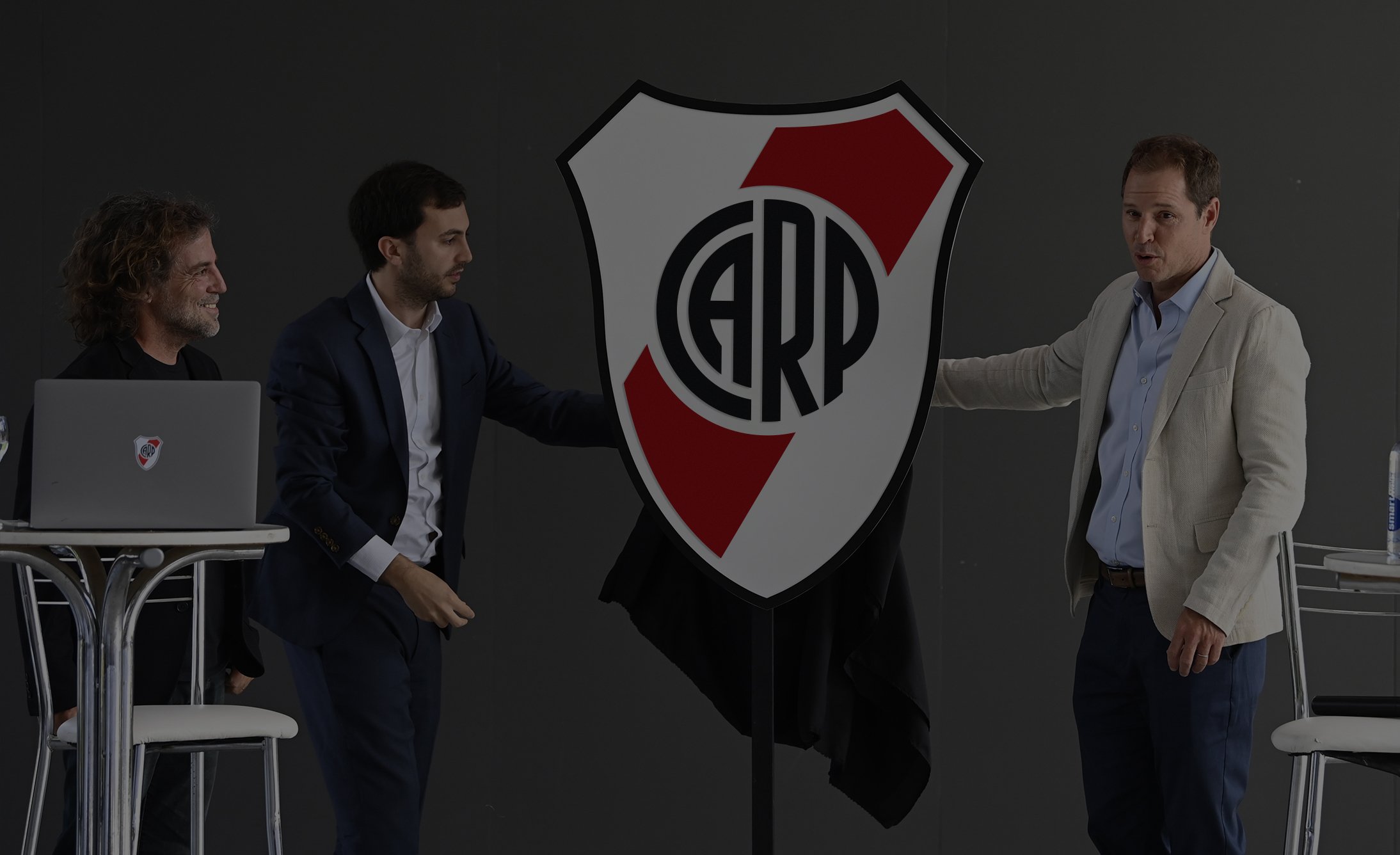
Its first official insignia dates back to 1901. The acronym “CARP” registered by the Club, which was soon transferred to official stationery and then to some jerseys that appeared sporadically. The first shield made its appearance later. The acronym guarded by a robust white banner with a diagonal red band.
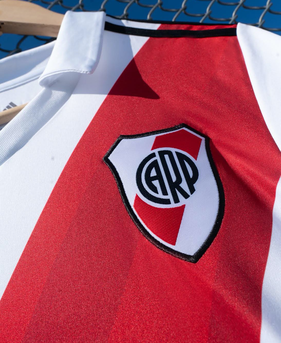
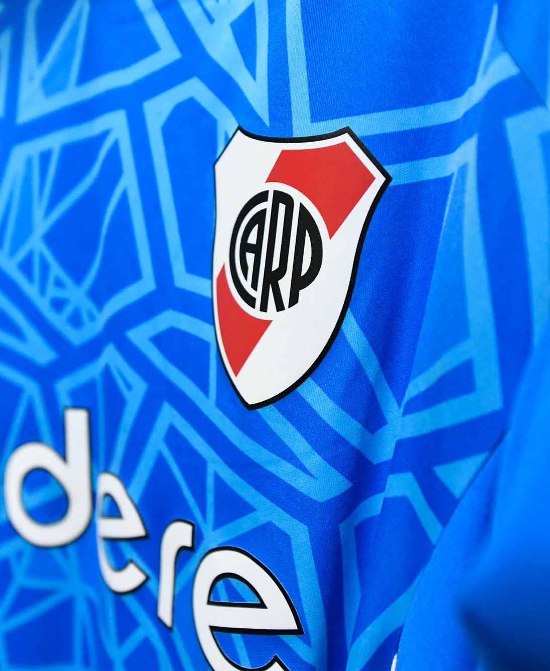
Throughout the years, many were the modifications in its emblem. But its essence has remained the same. Its greatness, just as immaculate: the white shield, the red band and the “CARP”.
Its greatness, just as immaculate: the white shield, the red band and the “CARP”.
For the evolution of the shield, we respect the special inclination of 59.88 degrees of the red band. We made minor adjustments to the 4 letters that make up the acronym “CARP” and we also made a subtle cleaning of the fine lines of the previous shield, to facilitate and improve reading and visibility of the symbol on all communication platforms.
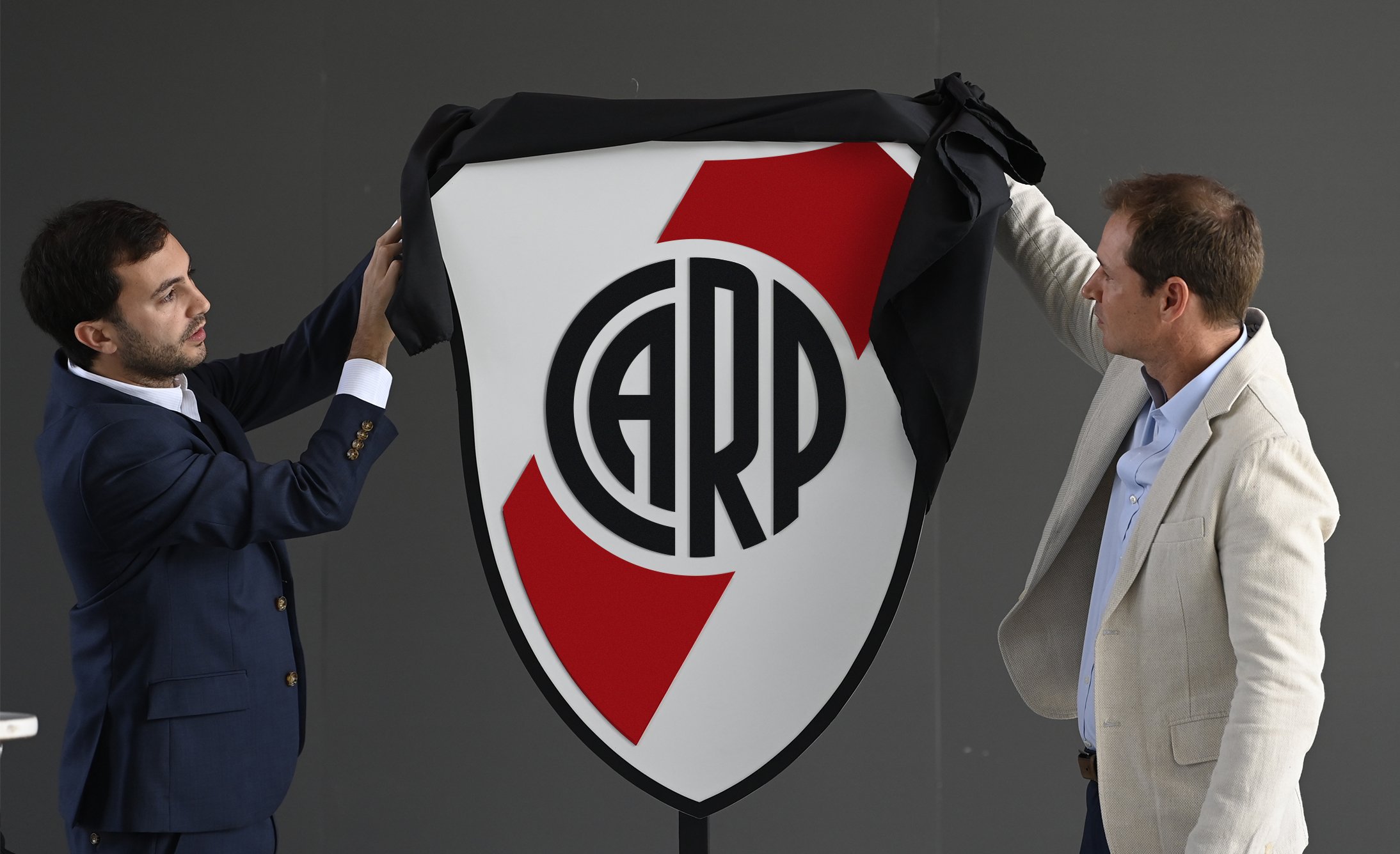
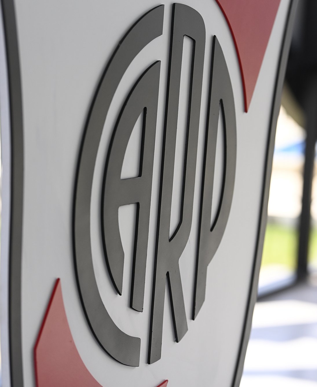


The objective of the design was to take the DNA of River Plate’s brand and work on the next evolution. We analyzed the history of the Club's identity and, as happens in centenarian brands, we registered 25 changes in the shield and 15 in the “CARP” symbol.
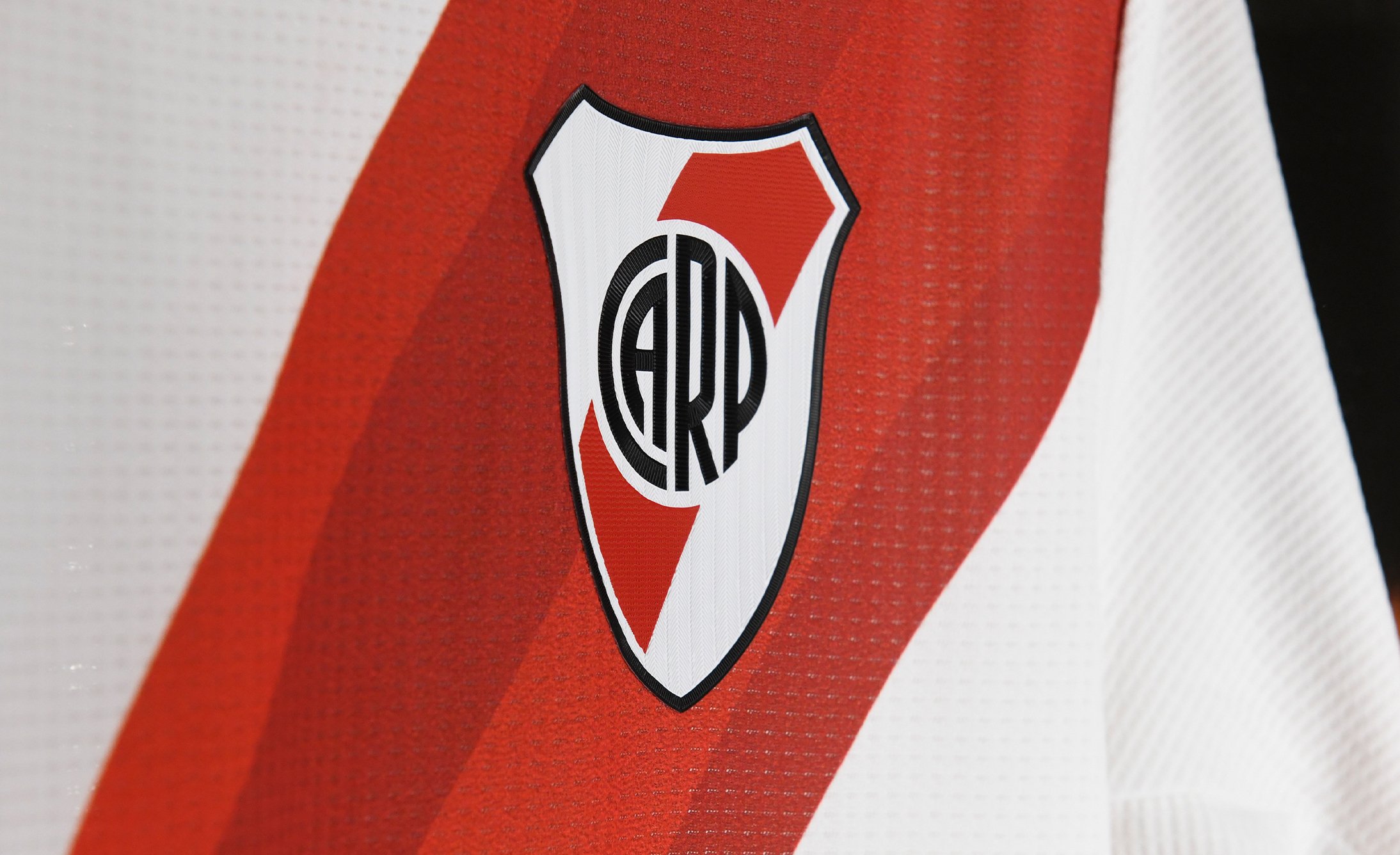


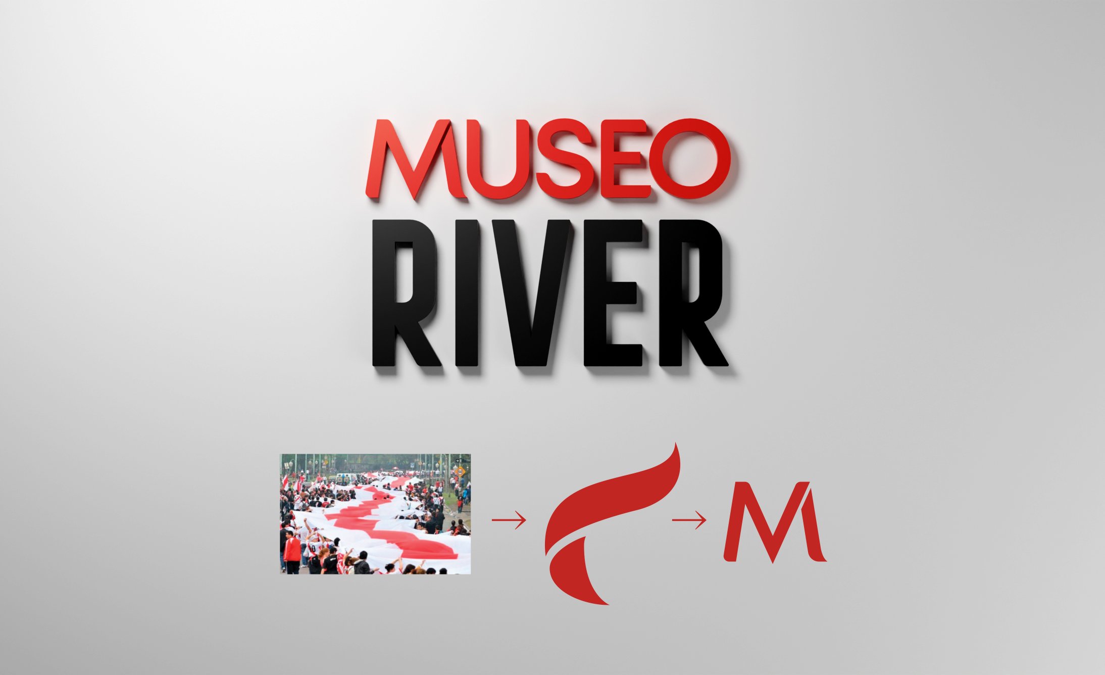
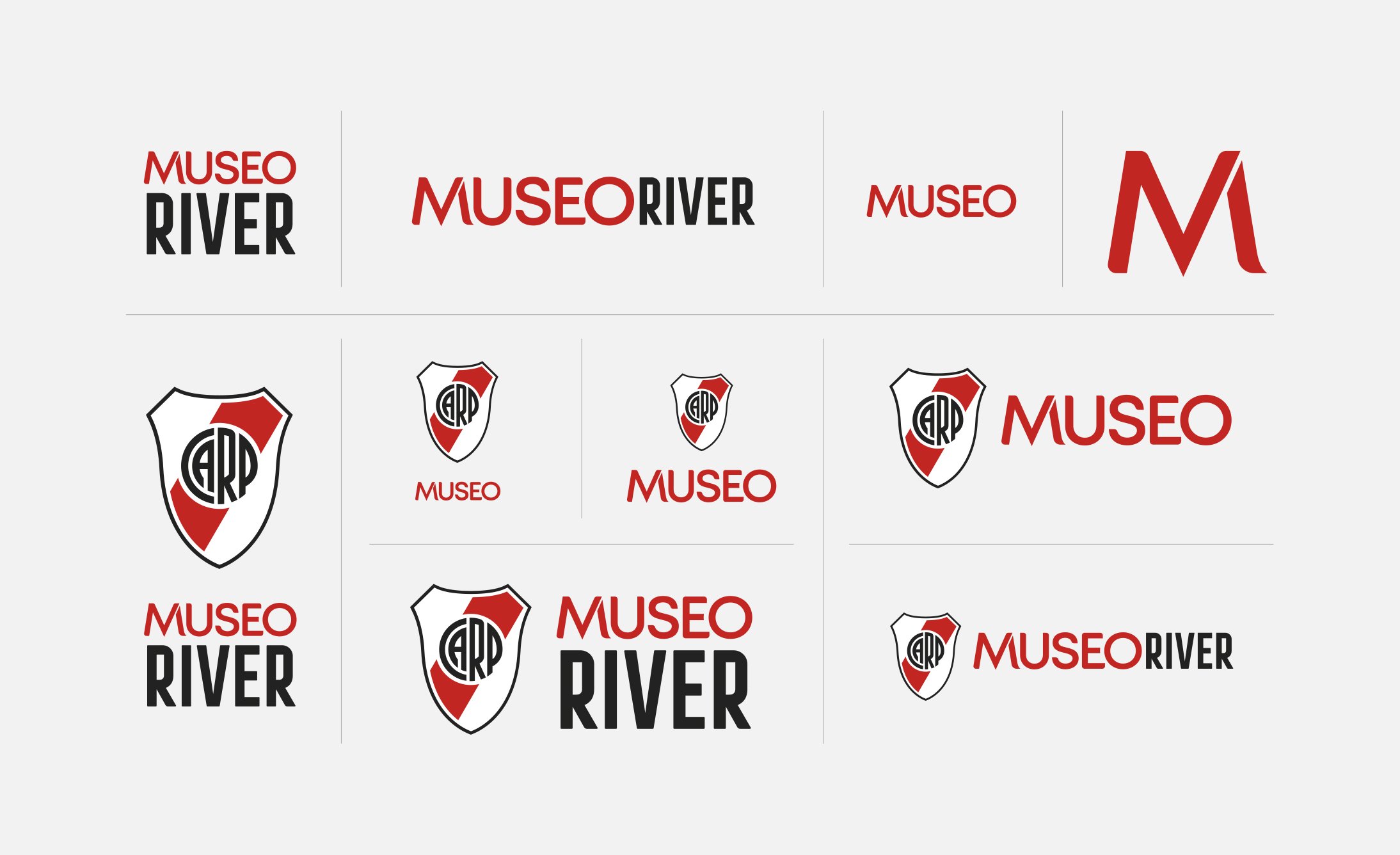
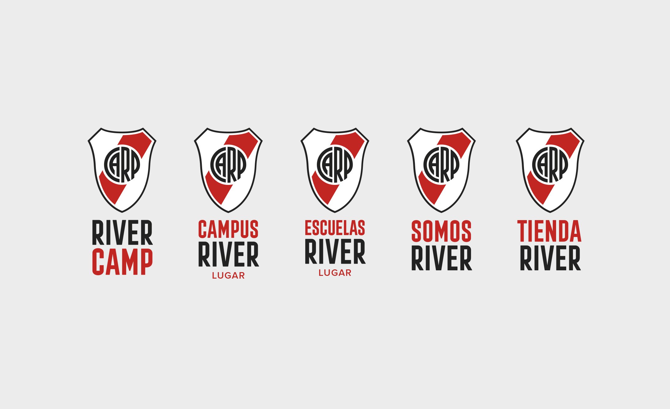
The spirit of the sub-brands arises from the band taking life within any flag and transferred to the typography of the word that distinguishes each one.
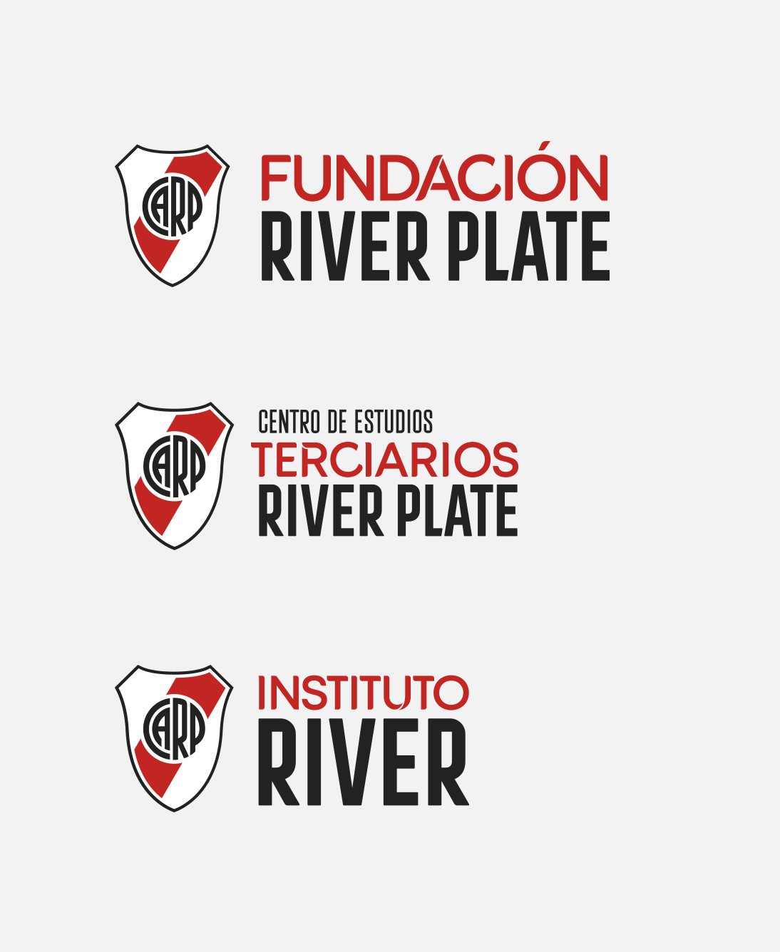

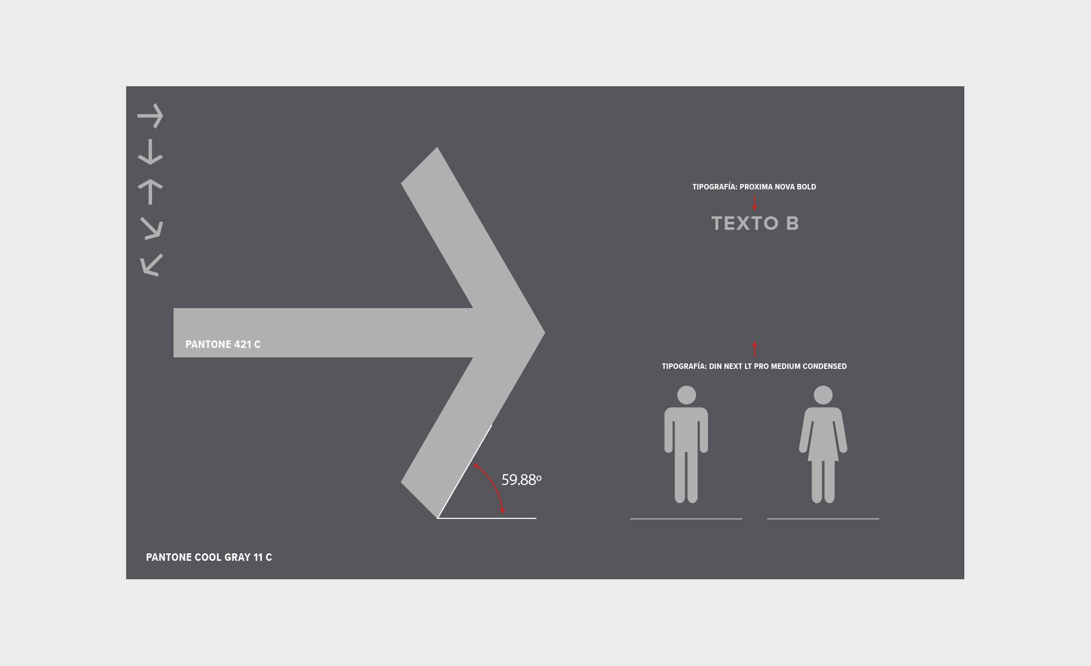
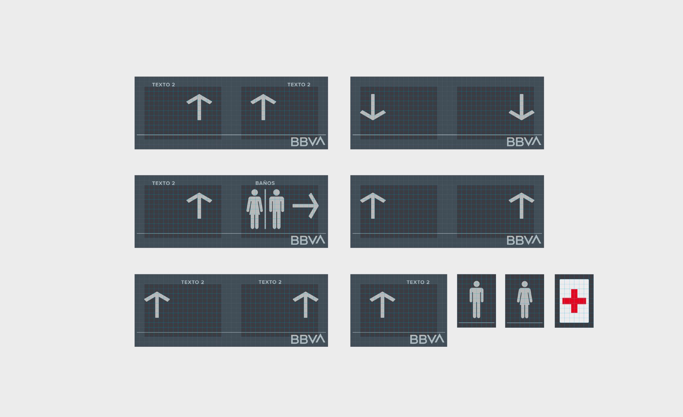
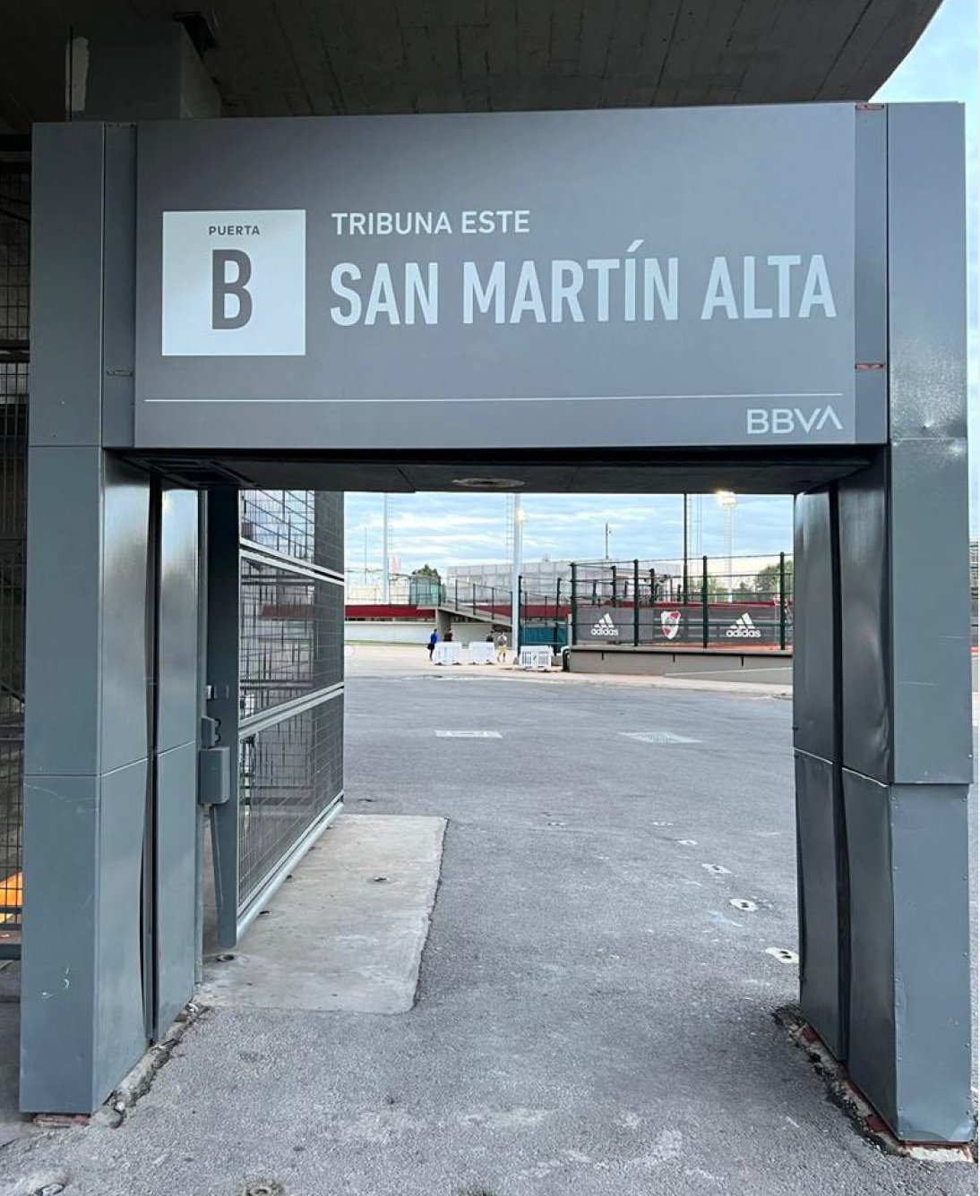


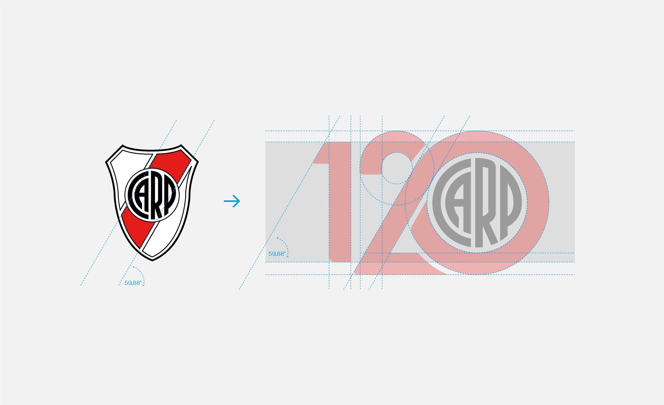
We respect the 59.88º angle of the band for all designs.

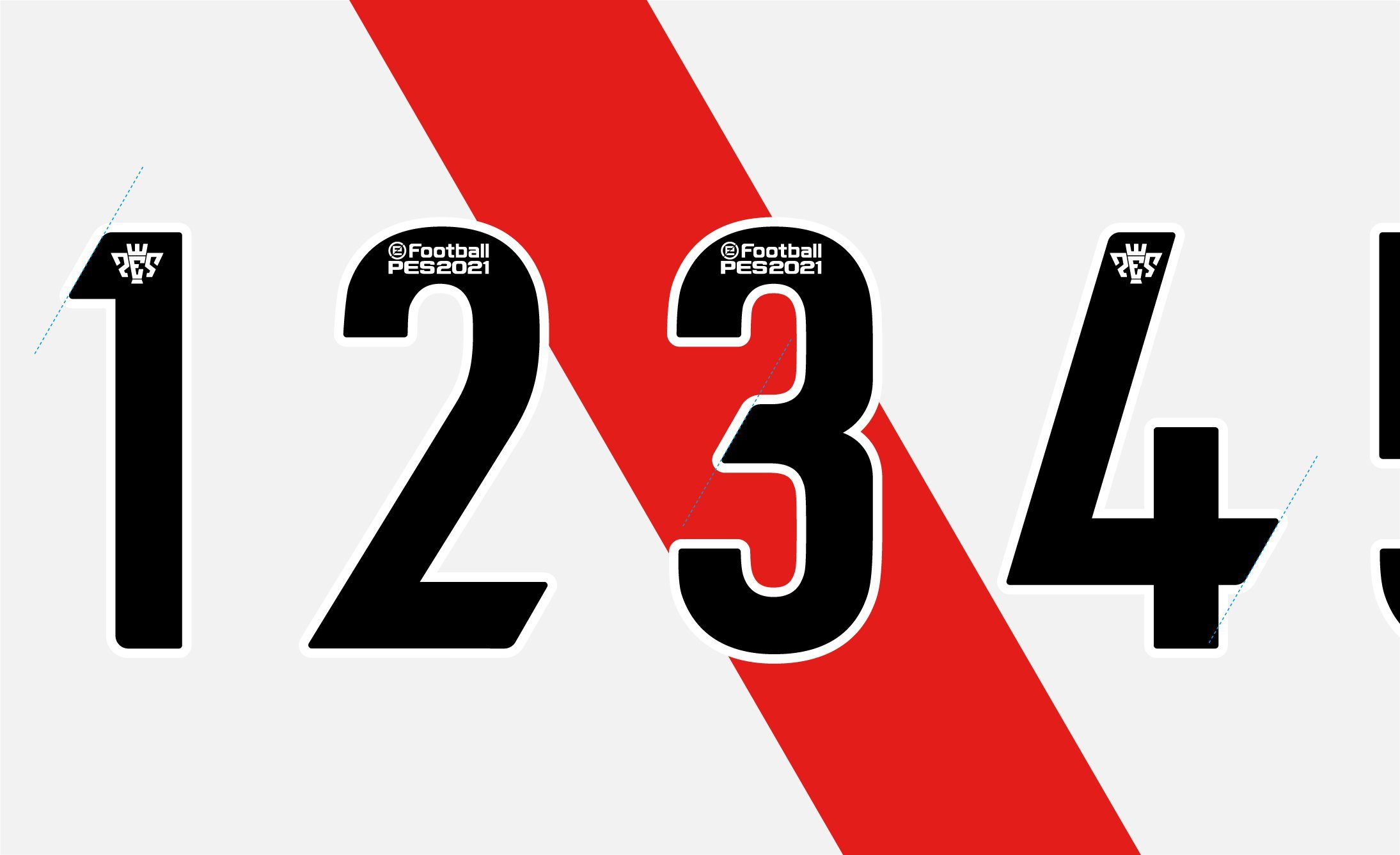
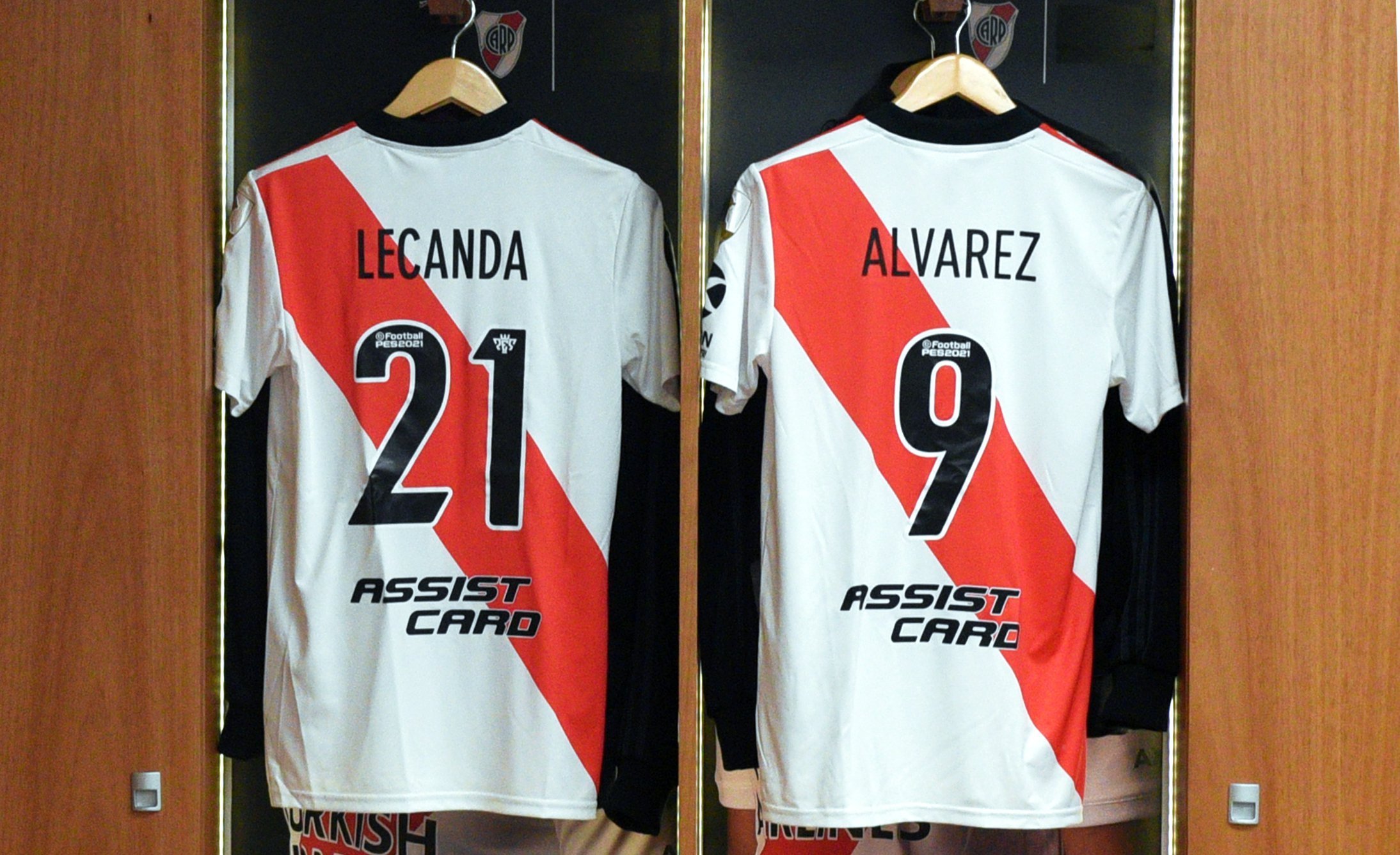
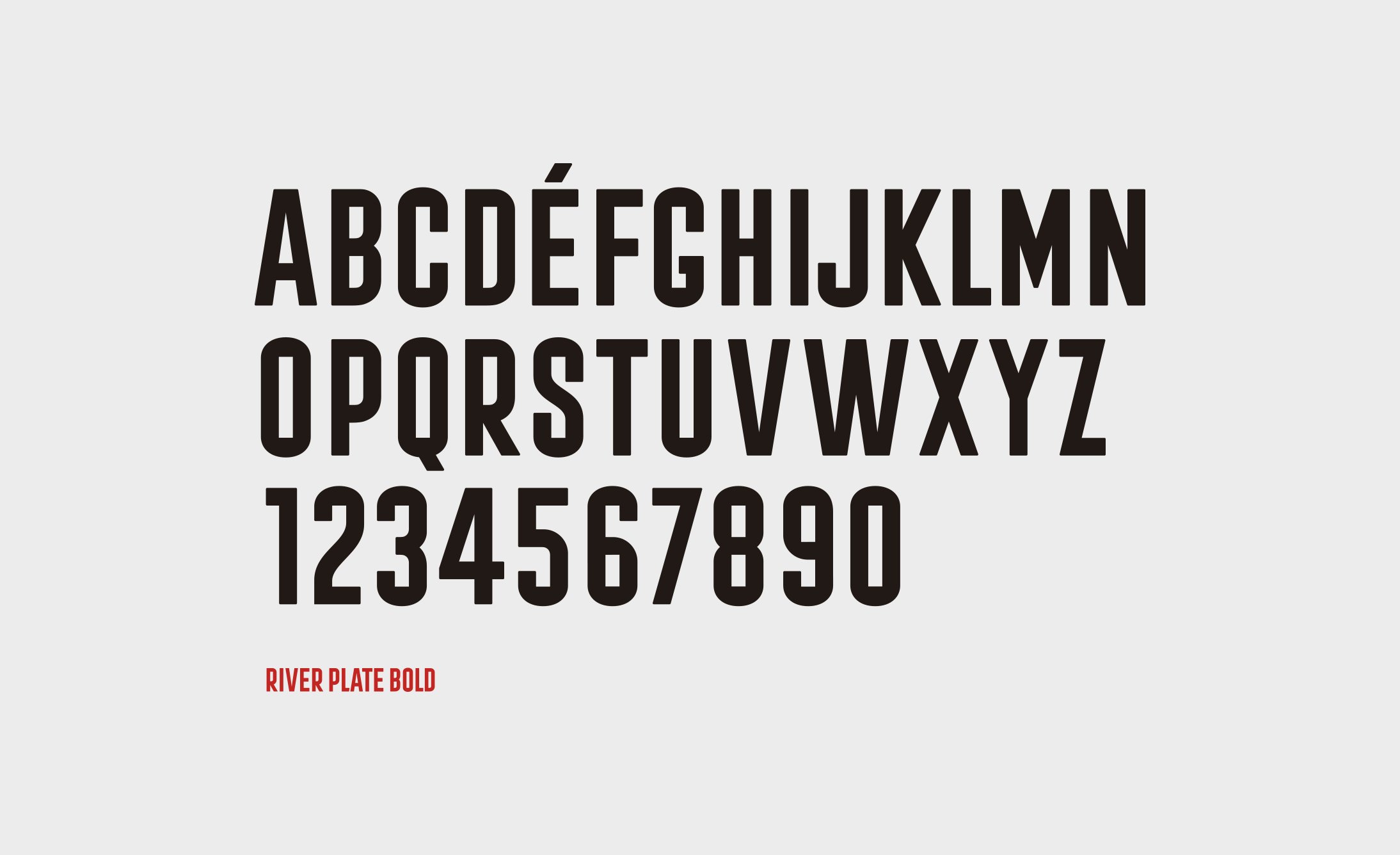
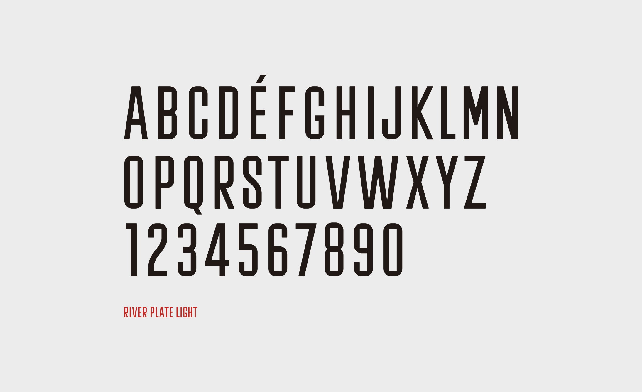
We developed the typography of River, taking as a starting point the typographic assembly of "CARP" within the shield.
