- Cliente Molinos Rio de la Plata
- Servicio Packaging design.
- Año 2019
Molinos convened Grupo Berro to rethink the design of this emblematic brand in Argentina.
It is key that a leading brand be attentive to what consumers want and knows how to react in time.
Background
As the market leader, it is key for Gallo to be attentive to how trends are changing and what the consumers expect. After 8 years of our last design for Gallo it was time for a change and the brand reacted on time.
The project
At the beginning of 2018, 4 territories were considered to guide the new design. The territory we call ‘Gourmet’ was chosen by consumers.
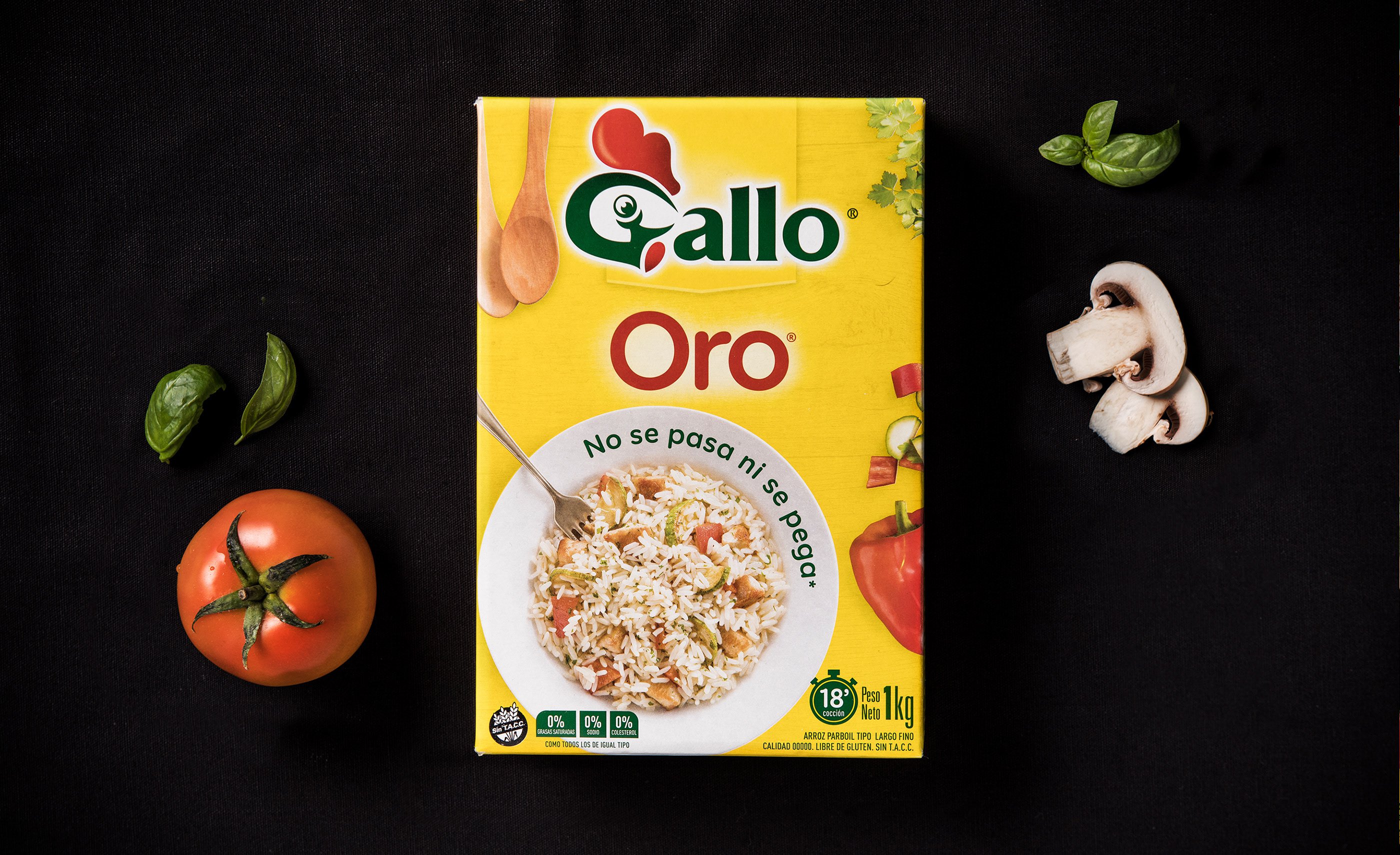
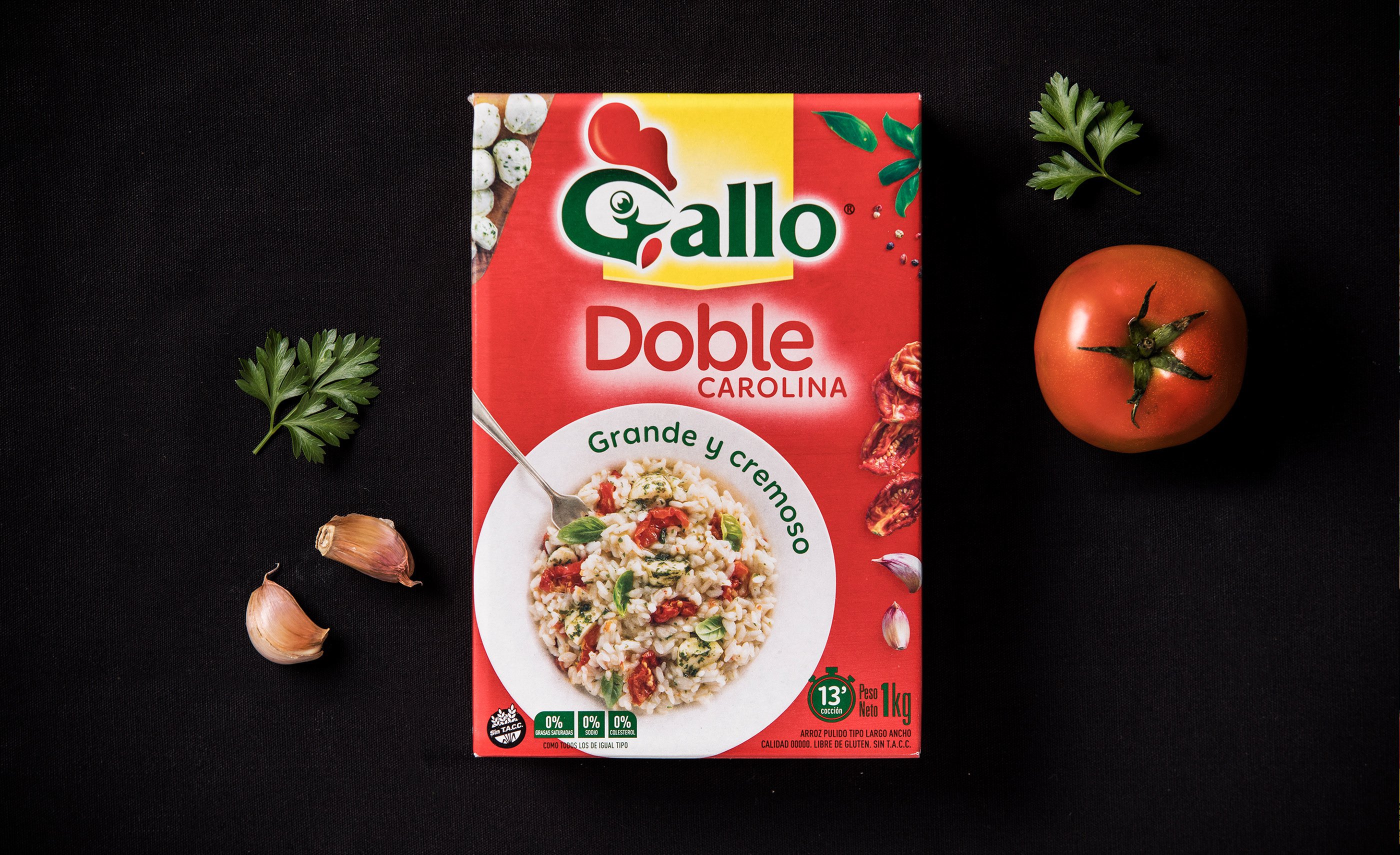
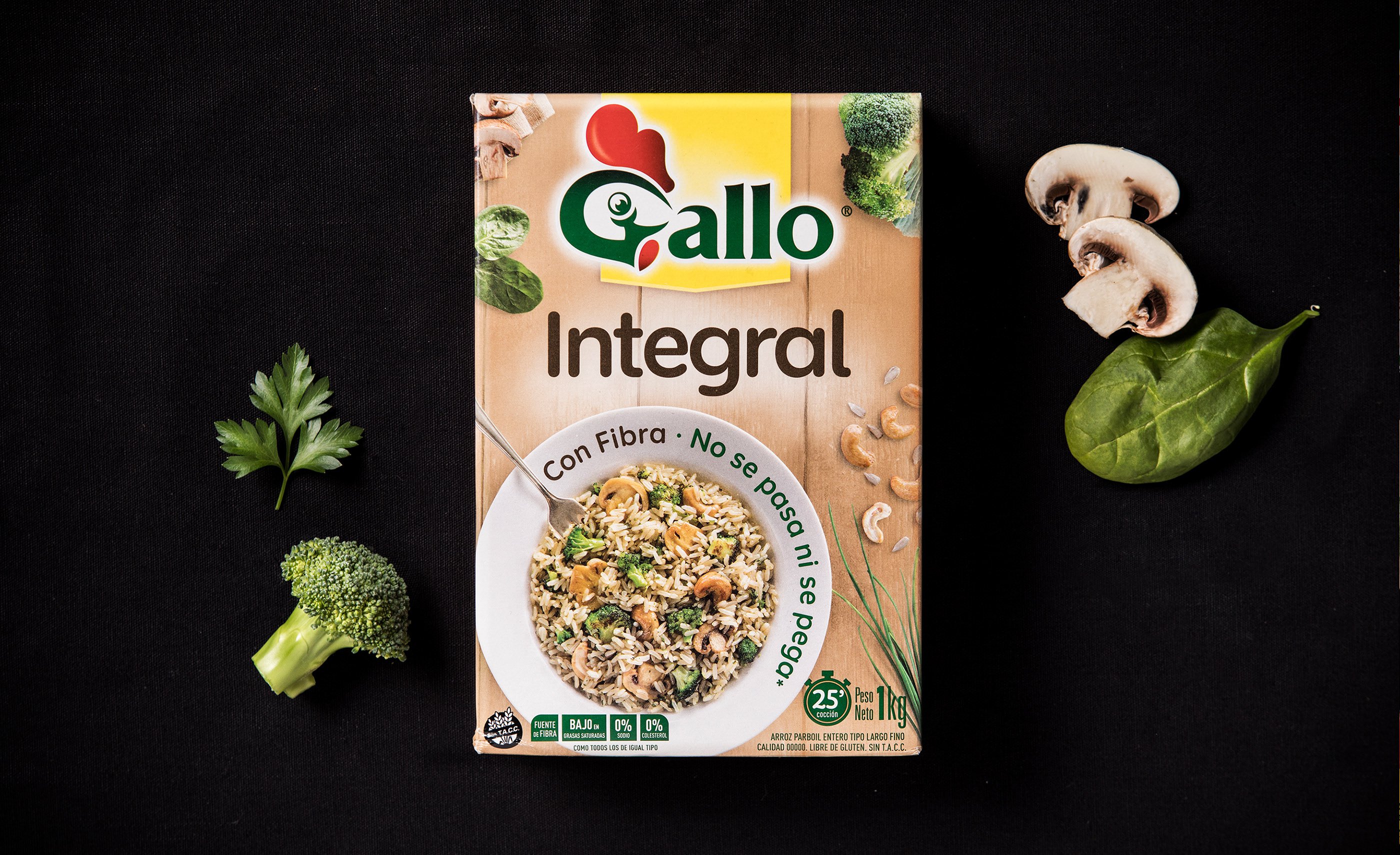
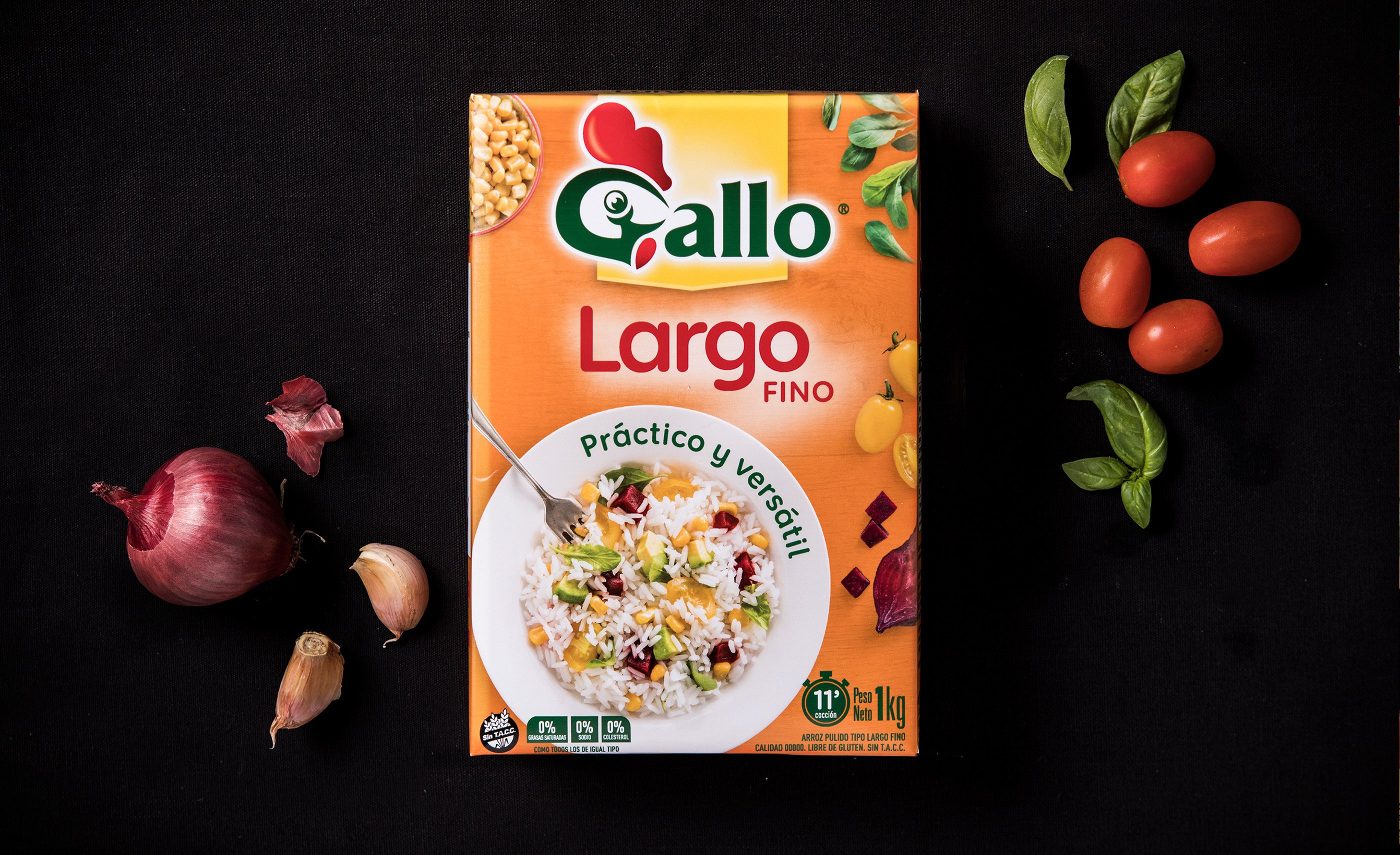
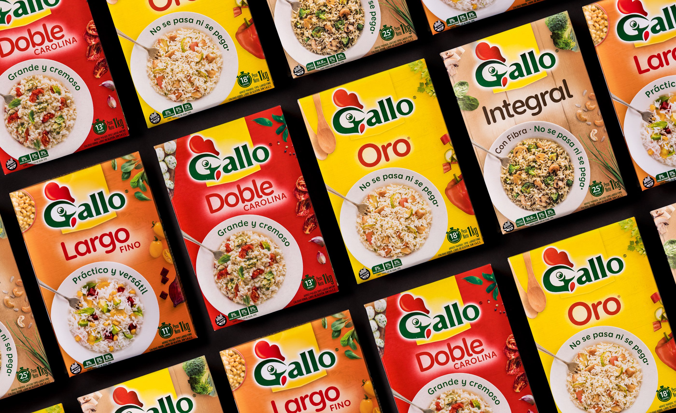
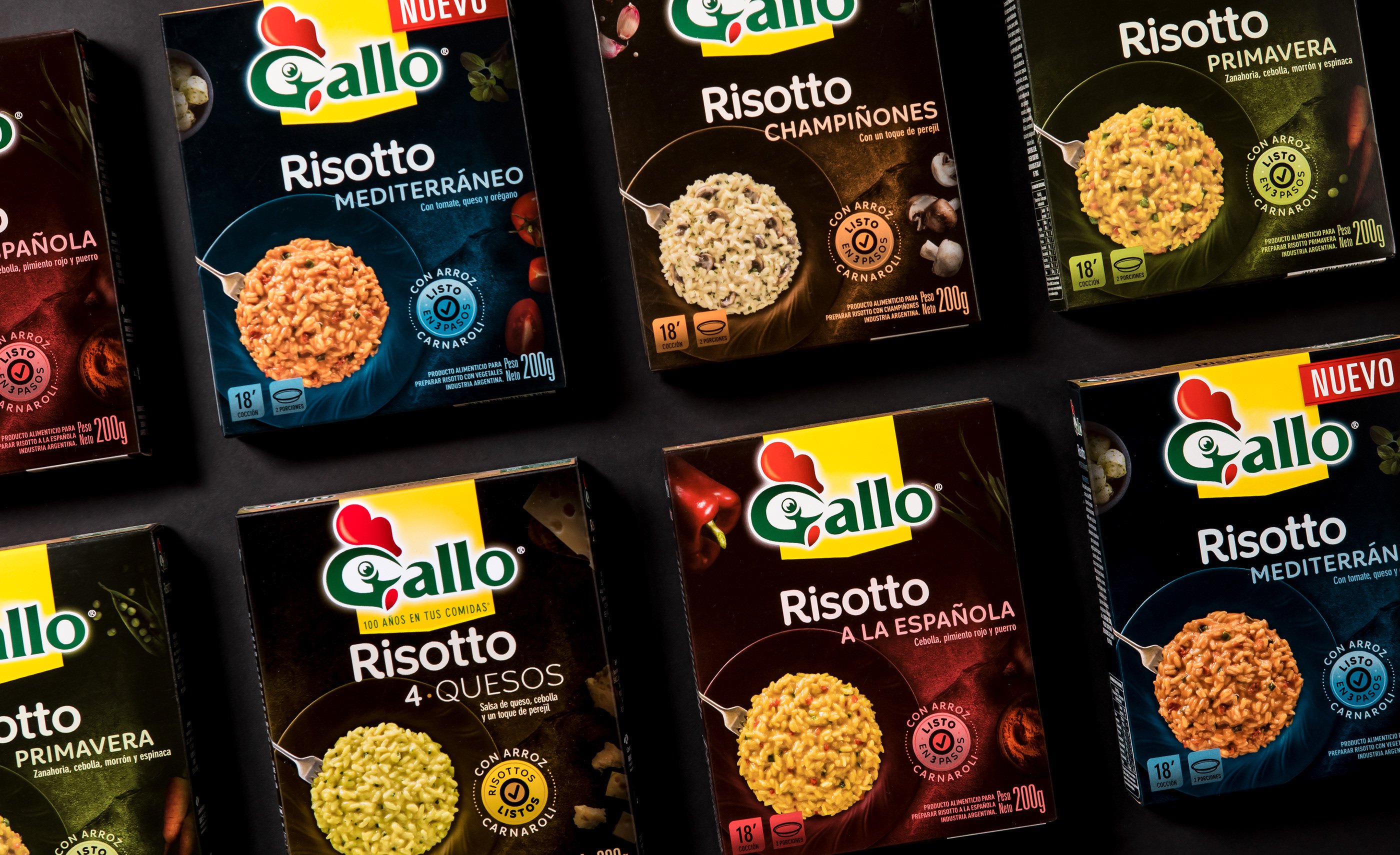
The redesign work prioritized adding ‘flavor’ and appetite appeal to the packs. Rice can be presented tasty and tempting, respecting the codes built by the brand over the years.
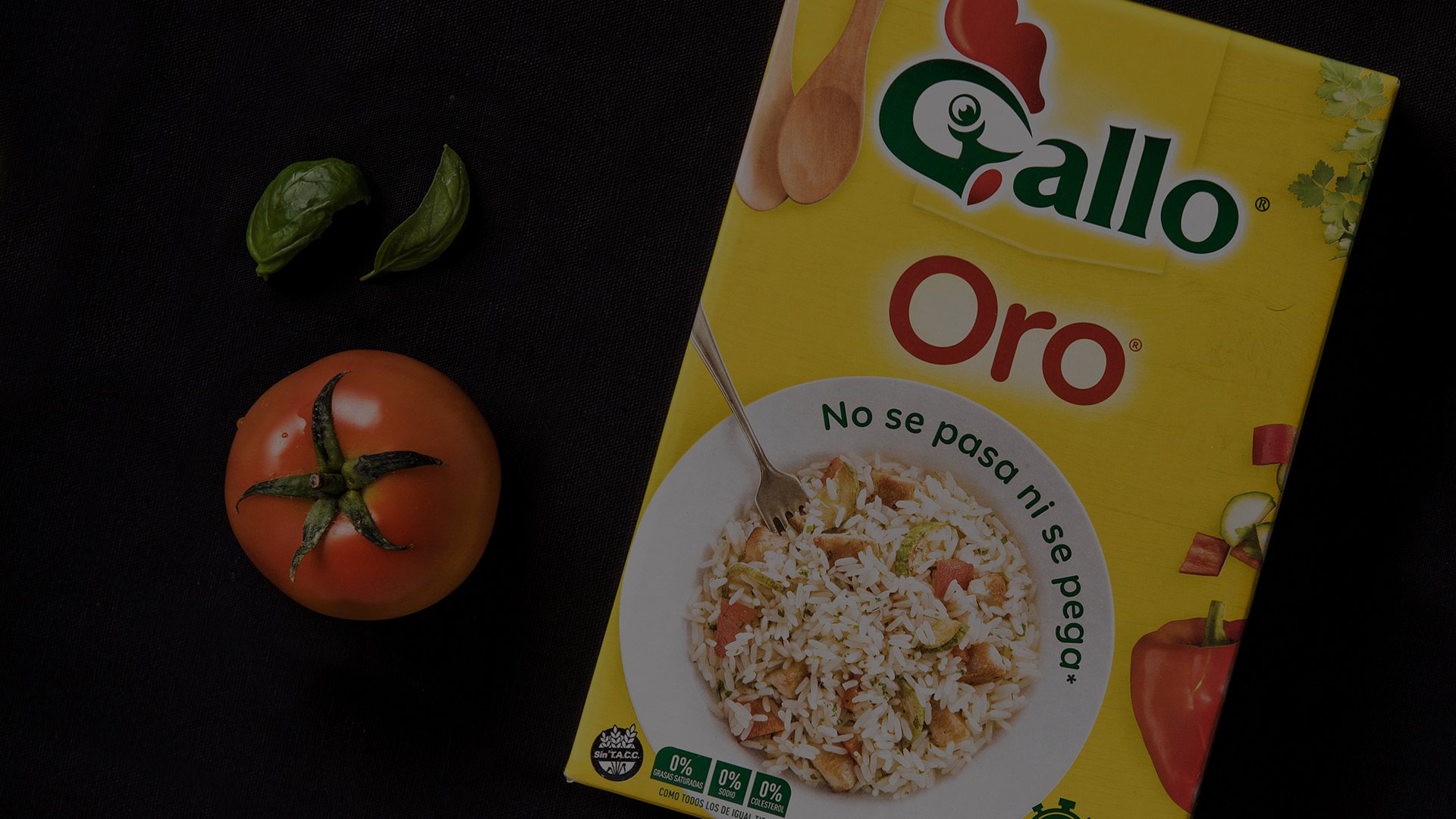
For years, Gallo carried out his communication campaigns with the slogan ‘Arroz Gallo Oro, the one with the yellow box’ and the parboil rice was always the standard of the brand.
Taking this in consideration, we defined to incorporate the ‘mythical’ yellow color in all the other presentations of the brand to strengthen the global concept of Gallo.
The result
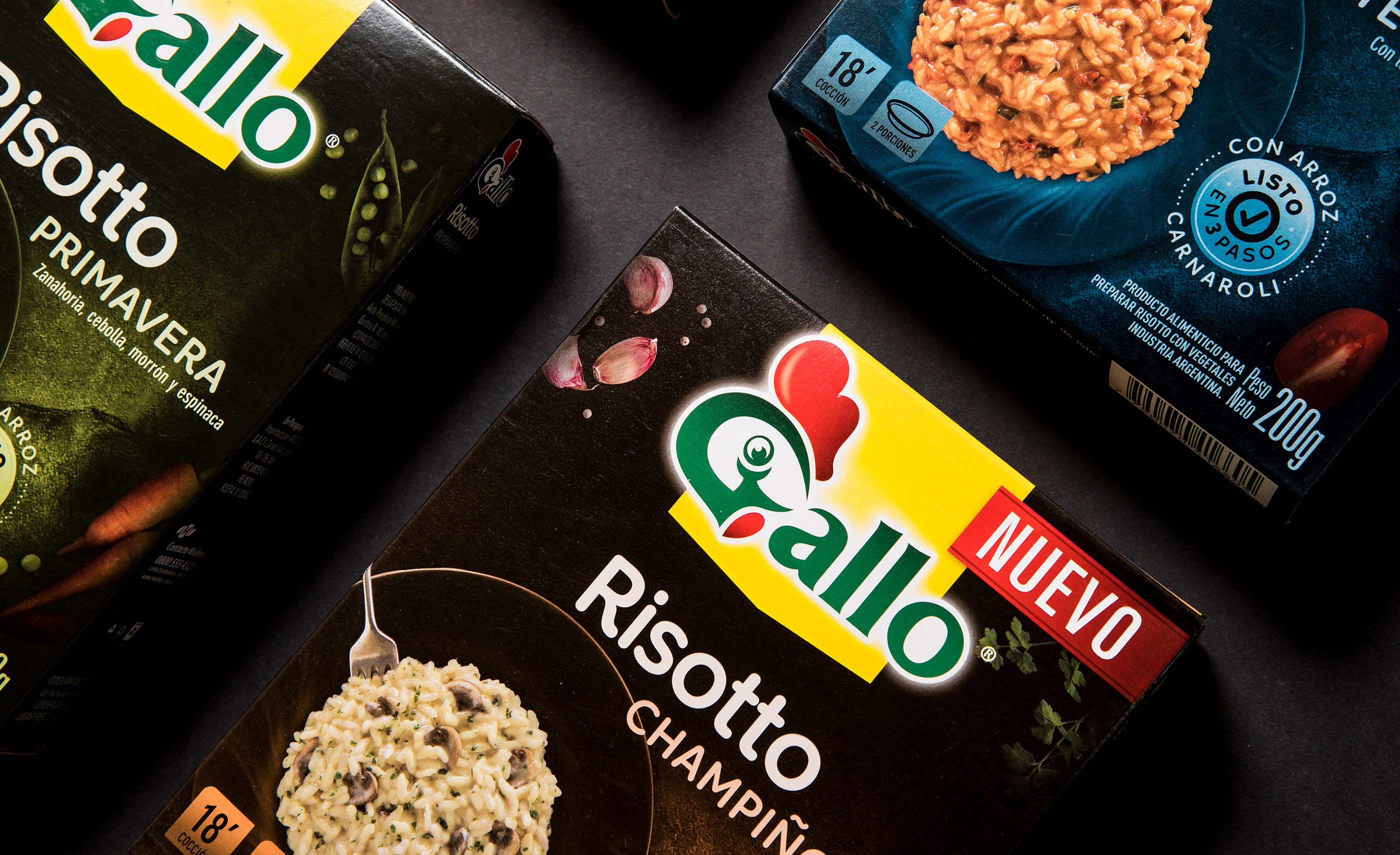
The new design present, on the front of the packs, overhead photographs of dishes accompanied by different ingredients, giving more flavor and color to the presentations. Behind the logo we add a plate with the yellow color so that it becomes part of the DNA of the whole line.
The interesting thing is to see how evolution respects everything previously built and also incorporates new fundamental features to keep the global proposal of the brand competitive.
