- Cliente Osborne
- Servicio Branding & Identity. Packaging design.
- Año 2013
Starting a project from scratch is an excellent way to deliver the best design work. Osborne, one of the most important beverage companies in Europe, invited us from the first moment to think and focus, together, on their new release.
THE CHALLENGE
In 2013, the star of the world of spirit drinks in Europe was gin, or "ginebra", as they call it in Spain. A category with huge competition from many renowned brands and a varied proposal, both in flavors and presentations. While distributing an imported gin brand, Osborne saw the large volume in sales, and so decided to launch a new brand of his own. Therefore, we developed different “brand territories”, looking for the best profile to establish a significant brand, original and with character.
THE OPPORTUNITY
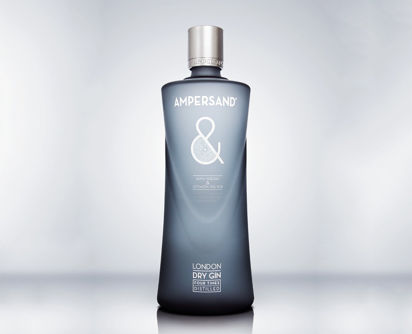
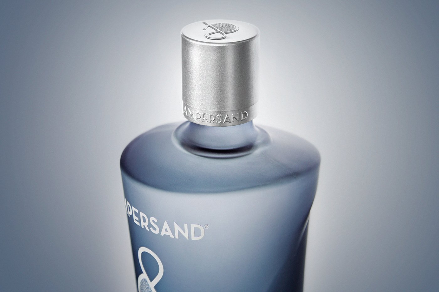
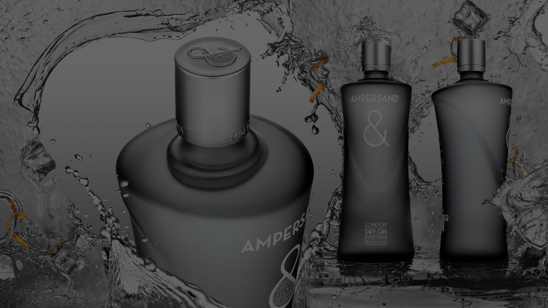
Having analyzed the category, and bearing in mind the competition, it was decided to combine the flavor of English gin with the characteristic Spanish warmth. Could we gather together two different identities into one single packaging? Ampersand was the brand chosen. With a mix of Anglo-Saxon and Latin personality, we designed a “double bottle”, with a profile on front and a different one from its sides, generating, in addition to an innovative object, the idea of a whole integrated by its parts.
THE RESULT
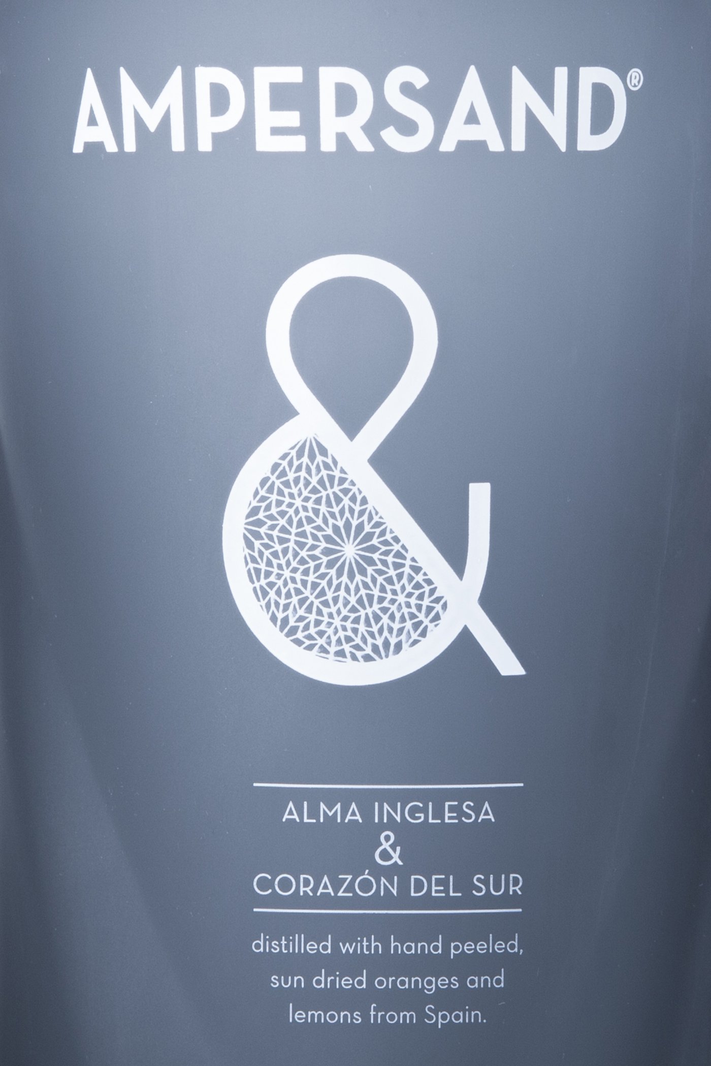
Ampersand´s essence is synthesized in the “&” icon, which stands for the fusion between the typical English gin flavor and the Spanish elaboration process. This being said, the packaging is bilingual: it speaks proudly of its “English soul and southern heart” to indicate, later on, in plain English, that it is a product distilled with hand-peeled oranges. Ampersand today ranks among the leading gin brands in the world, standing out for its elegance and distinction.
