- Cliente Séenz Briones
- Servicio Branding & Identity. Packaging design.
- Año 2020
Background
When we designed 1888 in 2015, even though many didn’t think it was possible, we knew that we were going to change a whole category. We were aware that the quality of such a product, if accompanied by an excellent presentation, was going to change the consumers’ perception.
Today, five years later, sider has repositioned in the Argentinian market and 1888 is, without a doubt, the best of the market and is presented with an elegance for any moment. In the final of Palermo’s Polo or in a home among friends, today 1888 occupies the place it deserves.
The Challenge
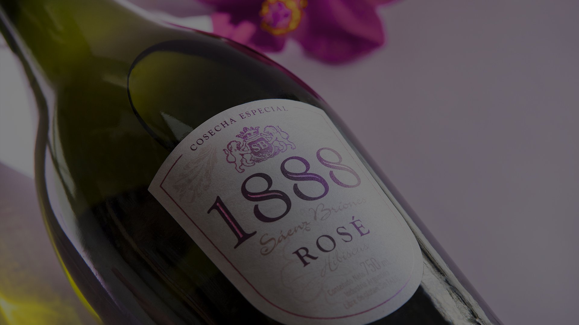
At the beginning of the year and deep into the quarantine, Vanina de Martino, marketing manager of siders, wines and spirits of CCU Argentina, invited us to the challenge of launching 1888 Rosé.
This new launching looked to keep innovating and generating situations of consume, reaching new consumers.
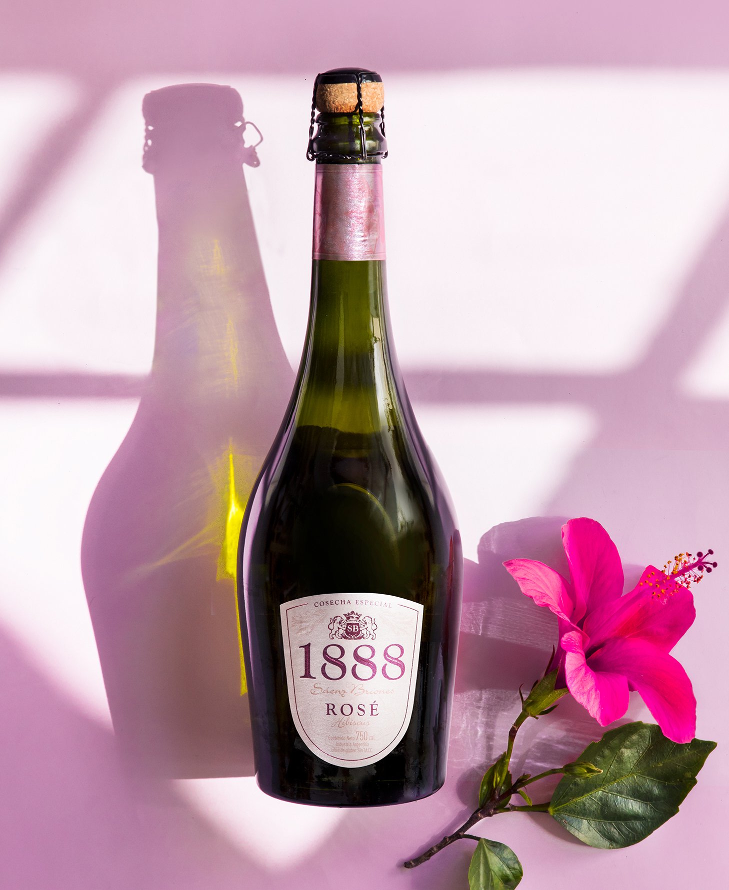
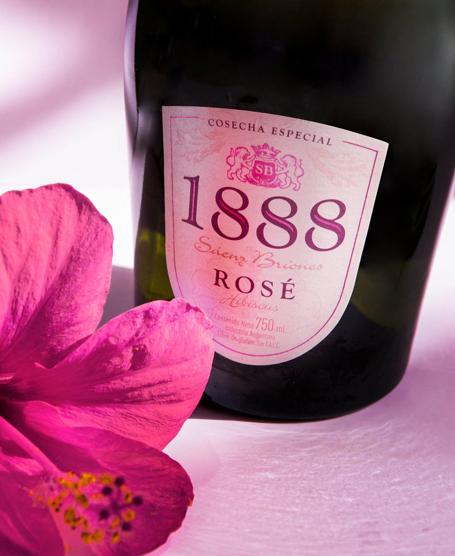
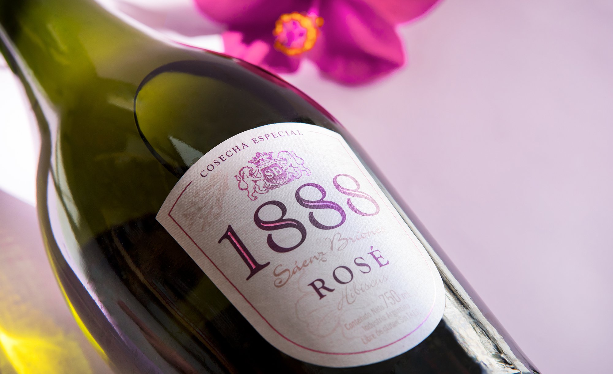
A new proposal that combines the flavor of the apples of the Alto Valle in Río Negro with the freshness of the hibiscus flower that adds a flowery smell and gives a pinkish tint to the color of the sider.
The Project
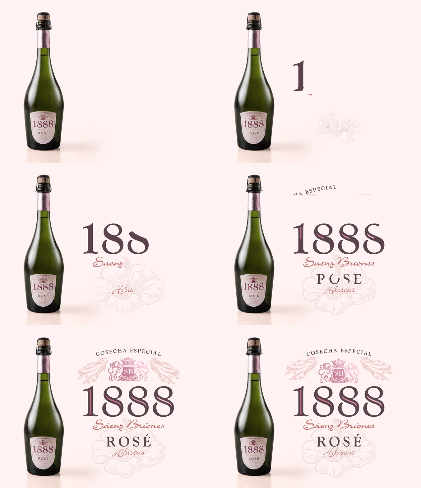
From the branding point of view it was a clear job because the identity basis of 1888 were well defined. The challenge was in how to develop the whole proyect remotely. One of Grupo Berro strengths is work as a team. A team in the inside, a team with the client and a team with the others partners of the project.
The Result
The team adapted perfectly and the entire process was carried out distantly achieving an elegante and distinctive design which reflects what 1888 Rosé has to offer, a noble sider of great quality that continues to surprise and gain new consumers.
